






























.avif)
.avif)
.avif)























Get a guide to creating pitch decks presentation



.png)
A presentation is the live event. A slide deck is the visual file used to support it and may also be shared before or after the meeting. A handout is a separate supporting document built around a specific audience task: following the session, taking notes, reviewing evidence, or acting afterward. The three may share the same core story, but the amount of context, detail, and navigation should reflect how each one will be used.
This distinction changes what you include, how much context you add, how you structure the page, and when you distribute the document. An effective handout can keep detail off the slides, give the audience a place to capture notes, preserve evidence that is better read than projected, and make follow-up easier.
This guide explains what a presentation handout is, how it differs from slides and leave-behinds, which format to choose, how to make presentation handouts step by step, and how the workflow changes across PowerPoint, Google Slides, Canva, and InDesign. You will also find practical presentation handout examples for business, workshops, education, and conferences.
Prepared by the Whitepage team and reviewed for accuracy by Tanya Slyvkin, Founder and CEO. Drawing on more than 12 years of presentation work, the team treats the deck and the handout as two outputs from the same narrative: the message stays consistent, while context, density, and structure change for the moment of use.
A presentation handout is a supporting document designed to help an audience follow, remember, apply, or revisit a presentation. It may contain selected slide content, explanations, data, note-taking space, resources, exercises, contact details, or next steps. The exact mix depends on what the audience needs to do with the material.
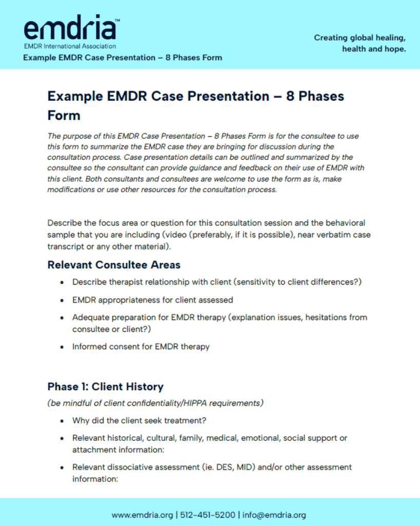
For example, a business plan presentation may use simple visuals on-screen while the handout carries assumptions, supporting numbers, and reference details that would slow down the live story.
When creating a presentation handout, start by defining its use case. Decide what the audience should be able to do with the document before, during, or after the session; then choose the format and template that support that task.
For example, a board presentation might use a slide to show the recommendation and two headline metrics. The handout can add the assumptions behind those metrics, a comparison of options, key risks, the decision owner, and the required next step.
A slide deck is usually optimized for on-screen delivery: it prioritizes distance, pacing, emphasis, and the speaker’s explanation. The same file may also be shared before or after a meeting, but it can remain presentation-led. A handout is organized for reading or participation at the audience’s pace. Its context and structure should match the intended moment of use.
A common presentation design mistake is trying to make one file do both jobs. The result is often slides that contain too much text but still fail as a useful reference document.
The terms are often used interchangeably, but the distinction is useful. A handout can be designed to accompany the live session – for example, a worksheet, a three-slides-per-page note sheet, or a reference page. A leave-behind is designed to work after the meeting without the presenter. It therefore needs more context, clearer transitions, and a stronger next step.
This difference is especially important in high-stakes executive, sales, and investor work, where professional presentation design services may need to produce both a live deck and a self-contained follow-up document from the same core story.
A useful handout solves information problems that slides are not meant to solve. It can hold the detailed material that would make a live slide too dense, give participants a structured place to take notes, preserve sources and definitions, or turn a talk into something the audience can act on later.
The easiest way to plan a presentation handout is to start from the same narrative logic as the presentation outline, then decide which details belong on-screen and which details belong in the document.
Research on guided notes provides useful context for training and educational handouts. A systematic review of 22 studies found that students generally viewed guided notes positively and that they improved results in some knowledge domains, particularly when the material was complex. These findings apply most directly to structured learning materials rather than every type of business handout.
The important qualification is that a handout only adds value when it has a defined purpose. Adding pages because "presentations are supposed to have handouts" creates more material, not more clarity.
Examples of presentation handouts vary because different formats solve different audience needs. The four types of handouts for presentations below cover most business, training, and conference situations.
This is the fastest option when the audience needs a recognizable connection to the deck. Each page includes a slide thumbnail or selected slide content plus explanatory notes. It works well for technical briefings, internal meetings, and sessions where the audience needs to revisit the speaker's explanation later.
The risk is duplication. If the notes simply restate the slide, the handout adds little. Use the notes for context, definitions, assumptions, or explanations that were spoken but intentionally kept off-screen.
A note-taking handout provides the structure of the session while leaving deliberate space for the audience to add their own observations. Common formats include three slides with note lines, key-point outlines with blank space, and partially completed diagrams or frameworks.
This format is particularly useful in training and workshops because the document becomes part of the activity rather than passive reading material.
A standalone leave-behind is closer to a short report than to a printout of the deck. It should explain the argument without relying on the speaker. For a sales or investor conversation, that may mean adding short explanations, data labels, sources, proof points, and a clear next step that were unnecessary during the live presentation.
Worksheets are designed for action: completing an exercise, making a decision, capturing inputs, or applying a framework. Reference guides are designed for later use: checklists, process maps, definitions, formulas, source lists, or step-by-step instructions. They may include very little of the original slide deck.
Planning comes before layout. If you start by choosing a template, you may end up filling boxes rather than solving an audience need. A stronger process starts with purpose, context, and timing.
Write one sentence that describes the job of the handout. For example: "Help workshop participants apply the framework after the session" or "Give the buying committee enough context to review the proposal internally." If you cannot state the job clearly, the document is likely trying to do too many things.
A sample handout for a presentation should change when the audience changes. Executives may need a concise decision summary. New employees may need definitions and examples. Technical specialists may need detailed tables and source references. Conference attendees may need a one-page summary that still makes sense weeks later.
Also consider the room and delivery mode. Printed materials need enough margin and contrast to survive real printers. Digital materials may be opened on a phone, forwarded to someone who did not attend, or read with assistive technology. A virtual workshop may need editable fields; a conference handout may need a QR code instead.
Decide early whether the output is printed, digital, editable, or a combination. This affects page size, link behavior, note-taking space, and the amount of visual detail you can use.
If you are deciding how to write a handout for a presentation, be selective. Include enough information to perform the document's job without turning it into a transcript of the talk.
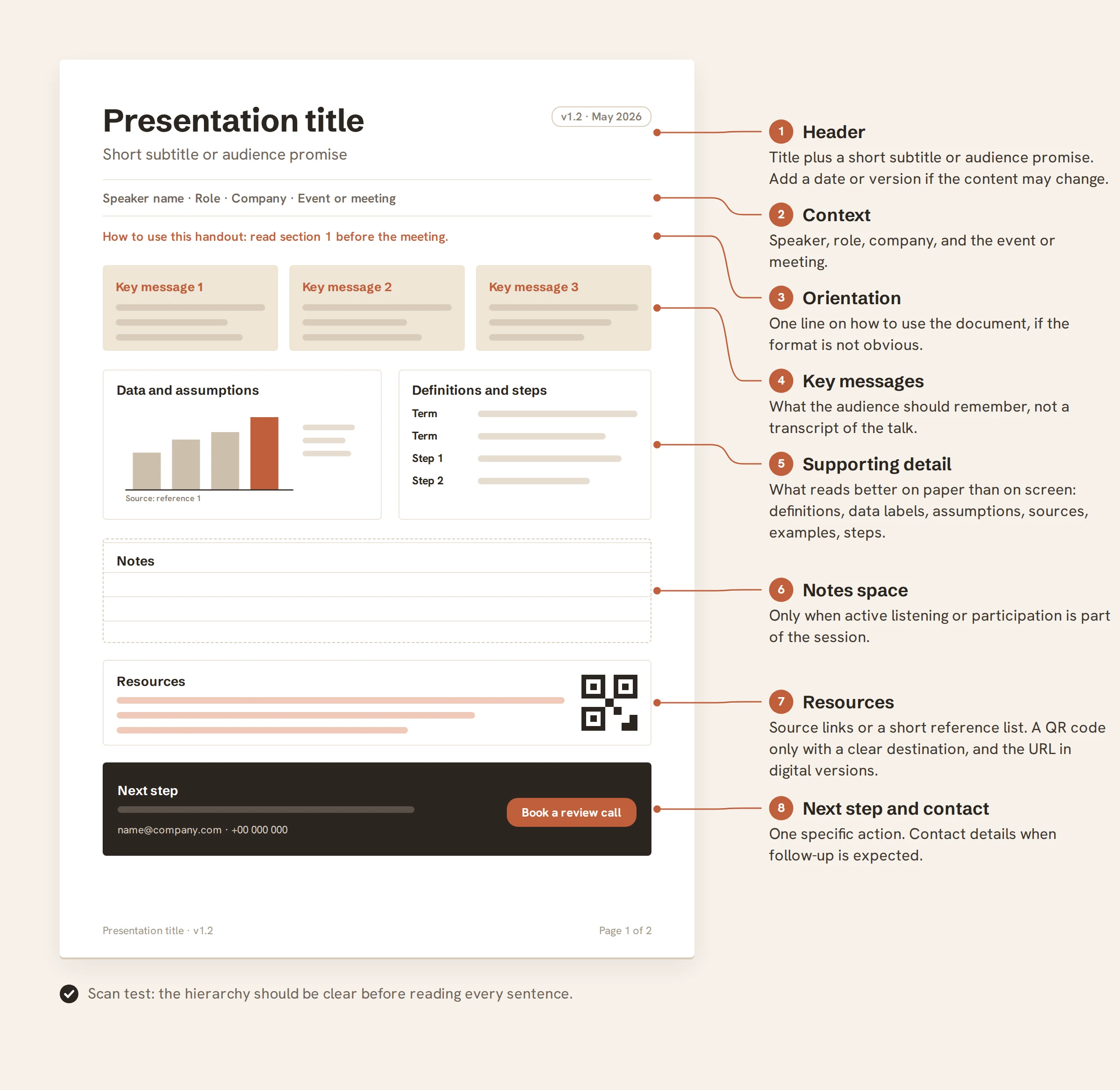
Carry over the ideas the audience should remember, not every point the speaker says. Then add the information that is more useful in reading form than on-screen: definitions, data labels, calculation assumptions, source references, examples, process steps, or brief explanations.
For a strong presentation handout design, the reader should be able to scan the page and understand the hierarchy before reading every sentence. Headings, summaries, labels, and visual grouping matter as much as the wording itself.
If you are wondering how to make a handout for a presentation – or how to create a handout for a presentation from scratch – use the six-step workflow below. The sequence intentionally starts with content rather than design.
Start with the presentation outline, not the finished slides. Mark the ideas, data, frameworks, or instructions the audience should still understand after the presentation. Remove material that only works because the speaker is present – transitional phrases, dramatic reveals, repeated setup, or decorative slide moments.
Now identify what the reader will need when the live explanation is gone. Add short definitions, units, data labels, source references, assumptions, or one-sentence explanations. A good handout is often more detailed than the deck, but the detail should answer a reader question rather than duplicate the script.
Group the content by what the reader needs to do: understand, compare, remember, decide, or act. Keep the sequence aligned with the presentation when the handout is used during the session. For a standalone leave-behind, reorganize if a different reading order makes the argument clearer.
Use a small number of consistent text levels. Make the main takeaway, section labels, data callouts, and supporting explanation visually distinct. Use white space as structure, not as decoration. A reader should be able to identify the page purpose, the key message, and the next place to look within a few seconds.
Reuse charts or diagrams when they remain understandable at handout size. Simplify them if necessary. Add tables when comparison is the task, checklists when action is the task, and note fields when participation is the task. Use QR codes and links as extensions of the handout, not replacements for essential information.
Review the handout separately from the deck. Check factual accuracy, labels, sources, page breaks, link destinations, contact details, spelling, print output, and digital readability. If the file is a PDF, test that text remains selectable and that the reading order and important visuals are accessible where required.
Presentation handout design is closer to document design than slide design. The reader is closer to the page, can spend longer with the material, and may use it in a different environment from the original presentation.
Use a body-text size that is comfortable at normal reading distance, adequate line spacing, and a clear hierarchy. Avoid shrinking text to fit one more paragraph onto a page. If the content only fits when the type becomes uncomfortable, edit the content or add a page.
The handout should clearly belong to the same presentation system, but it does not need the same layout. Reuse the brand palette, typography, logo treatment, illustration style, and chart conventions while adapting spacing and hierarchy for reading.
A chart copied directly from a widescreen slide may become illegible on an A4 or Letter page. Redesign for the page if needed: enlarge labels, remove secondary detail, move explanations closer to the data, and use the caption or surrounding text to state the takeaway.
For digital handouts, use sufficient contrast and provide text alternatives for meaningful visuals. As a widely used accessibility benchmark for digital content, WCAG 2.2 specifies a minimum 4.5:1 contrast ratio for normal text and 3:1 for large text, and it requires text alternatives for non-text content when the visual carries information.
The World Health Organization estimates that 1.3 billion people – around 16% of the global population – experience significant disability. Readable contrast, real text, logical reading order, and text alternatives should therefore be part of handout planning from the start.
The best tool depends on whether you need speed, connection to the deck, document-style editing, print control, or collaboration. You do not need the most sophisticated software for every handout.
PowerPoint offers several distinct workflows, and choosing the right one matters. The built-in Handout Master is useful when you want multiple slide thumbnails on a page and need consistent headers, footers, orientation, or page layout. Notes Pages are useful when you want one slide plus explanatory notes. For more editing freedom, PowerPoint can also export handouts to Microsoft Word.
Microsoft documents that Handout Master changes apply to all printed handout pages, and that Print Layout can generate several slides per page, including a three-slide layout with note-taking lines. PowerPoint can also send handouts to Word through File > Export > Create Handouts.
For a polished standalone leave-behind, a separate portrait-oriented PowerPoint file can be more flexible than forcing the live 16:9 deck into a handout layout. This keeps brand assets in the same software while allowing a page-based design.
Google Slides is useful when the goal is simple printing or collaborative preparation. In Print settings and preview, you can choose a handout layout or print one slide with speaker notes. This is sufficient for basic slide summaries and note-taking sheets.
Google's current help documentation directs users to File > Print settings and preview, where you can select a Handout layout or 1 slide with notes before printing.
For a heavily customized leave-behind, build a separate document in Google Docs or create a dedicated portrait layout rather than relying only on the print preview. Google Slides is strongest when collaboration and speed matter more than advanced page-layout control.
Canva is practical for one-page summaries, worksheets, branded reference sheets, and teams that need easy collaborative editing. It is also useful when the handout needs a more document-like visual layout than a slide printout.
Canva provides a Design Accessibility checker that can flag issues involving contrast, typography, and alt text. It also supports PDF export, but the exported file should still be reviewed for reading order, text alternatives, and real-world usability.
Adobe InDesign is a stronger choice for longer handouts, detailed typography, multi-page print systems, reusable styles, and production-ready PDF output. It also supports tagged accessible PDF workflows when reading order, headings, and alt text are configured correctly.
Adobe documents both print-ready PDF export and accessible PDF workflows in InDesign, including structured tags, logical reading order, headings, and alternative text.
AI can speed up the first draft of the handout, but it should support the editorial process rather than decide what the audience needs. Useful tasks include summarizing long notes, generating alternate levels of detail, proposing headings, converting paragraphs into a checklist, drafting alt text, or checking whether the tone is consistent.
AI is especially useful for reduction and variation. It is less reliable at deciding which business evidence is strategically important, whether a claim is defensible, or which detail a specific audience needs to act.
The best examples of presentation handouts are tied to a use case, not a decorative style. Use these presentation handout ideas as starting points, then adapt the format to what the audience needs to understand, decide, participate in, or act on.
For a sales presentation, the live deck may focus on the buyer's problem, the solution, proof, and the conversation. The handout can carry the detail the buying committee needs afterward: feature comparison, implementation steps, proof points, pricing assumptions, contact details, and the agreed next step.
For an investor presentation, a pitch deck design agency may keep the live pitch visually focused while producing a more self-contained leave-behind for internal investor review.
In training, the handout often works best as a workbook. Instead of summarizing every slide, give participants the framework, exercise instructions, prompts, examples, and enough blank space to record their own answers. The document becomes evidence of participation and a tool they can reuse later.
Illustrative structure: one-page overview, one page per exercise, a final checklist, and a resource page. In a team-prioritization workshop, for example, the slides can introduce the framework one step at a time while the handout provides scoring criteria, space for individual ratings, a discussion summary, and an agreed-action checklist. If the workshop changes based on participant input, keep the printed material focused on the stable framework and let participants fill in the contextual detail during the session.
For a conference session, a compact one- or two-page handout can preserve the research question, key findings, one or two readable charts, sources, and a QR code to the full paper or resources. For an educational lecture, a guided note format can include definitions, key diagrams, prompts, and a short further-reading list.
The main constraint is portability: conference attendees may carry many materials, while students may need a document they can annotate and revisit repeatedly. The same presentation topic may therefore need a different handout format in each context.
There is no universally correct moment to distribute a handout. The right timing depends on whether the document prepares the audience, supports an activity, or works as a self-contained follow-up.
There is no universal best time. Distribution timing should match the handout's job.
If the handout is necessary for the audience to complete an exercise or interpret complex data, distribute it before that moment. If the handout contains a self-contained commercial story that could distract from the live conversation, sending it after the meeting may be stronger. Make the timing intentional rather than habitual.
Many of these problems overlap with broader presentation design mistakes, but the handout adds another test: it must work for its intended moment of use. If it will be shared before or after the presentation, include enough context for the reader to use it without the speaker.
Before you send or print the file, check the handout as a standalone audience experience.
The central rule is simple: the presentation, slide deck, and handout should share the same message but perform different jobs. The deck organizes the visual story for delivery and may also be shared. The handout supports what the audience needs before, during, or after the presentation.
You can create an effective handout yourself when the purpose is clear, the material is straightforward, and you have time to test the output. The work becomes more demanding when the document must support a high-stakes decision, serve several audiences, preserve a complex data story, or stay on-brand across live and standalone formats.
In those cases, professional presentation design services can help turn the presentation and handout into a coordinated communication system rather than two disconnected files. Whitepage starts with the message, audience, and moment of use, then adapts the content and design to each format.


Its purpose is to support what the audience needs before, during, or after a presentation. Depending on the context, that may mean providing reference detail, note-taking space, a worksheet, sources, a self-contained leave-behind, or a clear next step. The handout should complement the presentation rather than reproduce it.
Include the presentation context, key messages, supporting detail that is better read than projected, and any resources or next steps the audience needs. Add notes space, sources, links, contact details, or exercises only when they support the handout's specific purpose.
There is no universal page count. A concise executive or sales leave-behind may work in one to four pages, while a workshop workbook or technical reference guide may be much longer. Use the shortest format that still lets the handout perform its intended job without making text uncomfortably dense.
Yes, but only when the slide content remains useful at handout size and the audience does not need much additional context. PowerPoint and Google Slides both provide built-in handout print layouts. For strategic, technical, or external presentations, a separate handout is often more useful because it can add detail, sources, and navigation without making the live deck denser.
A well-structured PDF is usually the safest default when you need consistent layout across devices. Use an editable document when participants must type, update, or reuse the content. For accessible PDFs, preserve real text, logical reading order, meaningful link text, and text alternatives for informative visuals. Test the exported file rather than assuming accessibility from the source document alone.


867 BOYLSTON ST
BOSTON, MA 02116


