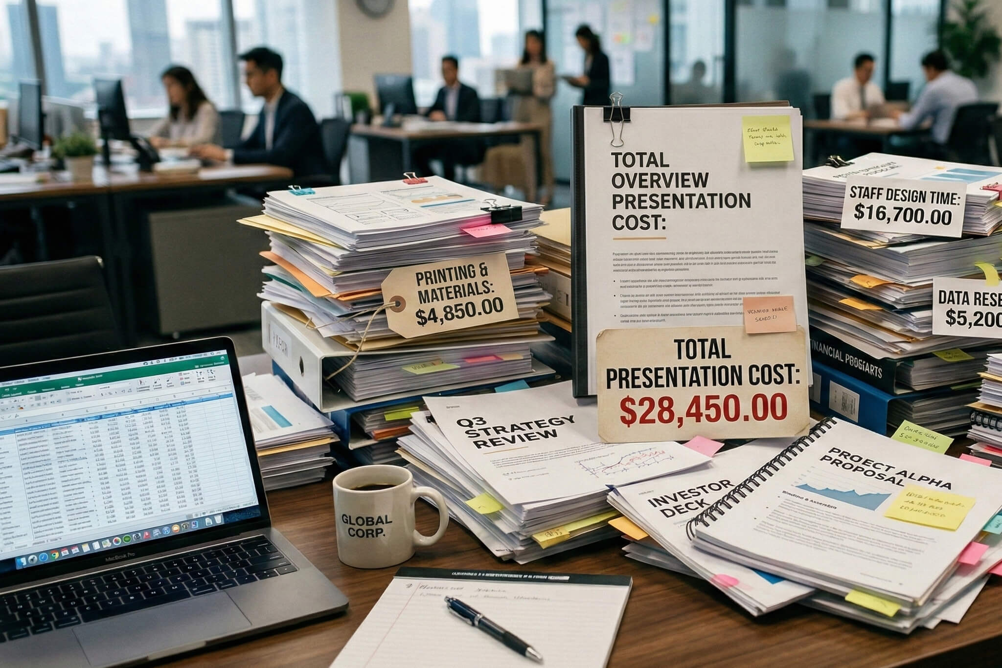
Common Presentation Design Mistakes

An effective presentation has two main components: it must be a) informative and b) memorable. Concise, relevant material presented in an engaging manner can truly capture the attention of investors, business partners, and others.
A presentation that meets these criteria can be a powerful marketing tool, giving you a competitive edge in the market while showcasing your expertise and vision. But how do you achieve that? What do people expect to see? And ultimately, how do you create an eye-catching yet easy-to-understand presentation?
One thing is certain - learning from best practices can always improve your results. By understanding and avoiding common PowerPoint presentation mistakes, you can create materials that truly resonate with your audience.
What Should You Avoid in a Presentation?
Many guides and tutorials created by presentation design agencies focus on what you should do when creating a good presentation, but they often overlook the "don'ts" which can be just as important. Knowing what to avoid can help you create a standout presentation. It's easy to go overboard with content, especially when you have plenty of material to share.
However, it's important to strike the right balance between information, conciseness, and aesthetics. What should you avoid when creating an effective presentation? Let's take a look.
1. Adding too many slides
Every presentation design specialist knows that overloading your presentation with slides and descriptions is a surefire way to lose your audience's attention and squander their enthusiasm. Regardless of the amount of information you need to share, it's essential to break it down into digestible pieces
Being comprehensive is important, but the key is to convey information without causing unnecessary distractions. Too many slides can cause your audience to lose sight of your main points.
If you're sharing a story, present one idea per slide and summarize different topics with takeaway slides or a single summary slide for the entire presentation. Don't forget to use bullet points.
Embrace minimalism in your presentations. White space separating concise blocks of information can add style and confidence. One of the most common presentation mistakes is thinking a slide is "too empty," when it's often just the right amount of content.
2. Lacking visual hierarchy
With the appropriate amount of information in place, it's crucial to consider how you structure its flow within your presentation. Like the interior design of a business meeting venue, your presentation should be visually inviting and organized.
This means presenting ideas, sections, and points in a logical order. People naturally find well-organized content pleasing. Ensure coherence between font, color, and style to prevent your presentation from feeling disjointed and confusing.
Using a unified style throughout your presentation creates visual continuity and consistency, making it easier for your audience to follow along.

3. Lacking images
Whether it is a sales presentation design, investor pitch, or any other project – presentations without images are often less engaging. Images are an excellent way to quickly and easily illustrate your points. They help break up the text, making it more balanced and digestible for your audience.
Creating a strong focal point can greatly enhance audience engagement. This can be achieved with a central image or by highlighting specific ideas with relevant visuals.
Struggling to find the right images? Unsplash offers a wealth of royalty-free images, while Icons8 provides attributed icons. Custom visuals can also boost your brand authenticity and elevate your presentation.
Remember, one powerful image can make all the difference, especially if it's a captivating photograph.
4. Oversizing elements
Even concise slides can be inefficient if their elements are too large. Minimalism is key. Avoid filling every available space on a slide simply for the sake of it. Minimalistic segmentation creates a calm atmosphere, making your presentation more inviting.
Allow your content room to breathe by using smaller fonts and properly spacing logos and images. Avoid font sizes smaller than 10-12pt to maintain readability. Optimize other elements accordingly.
A well-balanced content size typically includes:
- Font size: 12pt
- Line height: 1.2
- Characters (including spaces) per line of text: 50-75

5. Neglecting color
TV shows and commercials use colors to make an impact on their viewers, as vibrant colors stimulate dopamine release in the human brain, inducing a sense of happiness. You can create a positive atmosphere for your audience while effectively conveying your message by using dynamic color schemes.
While minimalism is important, don't be afraid to incorporate bold colors in a refined style. Opt for accents of orange over shades of blue. Adobe Color tools can help you experiment with suitable color schemes in real time, and the Complementary and Monochromatic modes can lead to unique results.
Conclusion
By now, you should have a clear understanding of what makes a poor presentation. Overloading your presentation with information can be detrimental. Instead, focus on understanding and avoiding common mistakes.
To summarize, don't overcrowd your presentation, maintain structure and consistency, and make use of the tips we've shared. This will make it much easier to achieve your promotional, collaborative, or other business goals.
One last recommendation is to seek advice from expert pitch deck design services that can provide solutions without the common presentation mistakes that non-experts make, customized to your needs at an affordable cost.
Contact us for more insights or if you're looking to craft a bespoke presentation that effectively conveys your business goals.
Talk to a presentation design expert now!
Let's Talk
FAQ

Read more

.png)


.avif)

.avif)
.avif)


