
Best Font for Presentation: Ultimate Guide to Choosing the Perfect Typeface
Fonts serve as essential elements in the creation of presentations. The right choice improves readability, captures attention, and makes slides more memorable.The data shows that investors together with teams will have better responses to modern design elements which combine with clear and consistent typography in 2025. Understanding font psychology and applying best practices can turn an average deck into a really persuasive story.
On average the human eye processes up to 36,000 visual messages per hour and 90% of the information our brain receives is visual.That’s why fonts are not just decoration for your deck but one of the most powerful tools in your presentation toolkit.The proper selection of typography enables clear communication while improving your narrative and sustaining audience interest.
In this article, we’ll break down how font psychology actually works, highlight the latest 2025 trends, and share practical tips that will help you select fonts that make your presentations both professional and persuasive.
Why Choosing the Right Font for Your Presentation Matters
The fonts you use in a presentation are not just aesthetic details.The way you deliver your information affects both its clarity and readability and the credibility of your message.A consistent and well chosen font helps build trust with the audience, improves readability, and ensures that the focus stays on the content.Poor typography, on the other hand, can distract from the main ideas and make even strong material feel less convincing.The importance of fonts has reached its peak in 2025 because presentations now determine the success of fundraising and business expansion.
The selection of appropriate font ensures your presentation maintains effectiveness when presented in any format including live pitches and online meetings and shared PDFs. Clear typography guides the audience through key points, highlights essential data, and reinforces brand identity.The selection of the best fonts for business presentations serves as a functional instrument which startup teams and founders and executives use to present information in an organized manner that is both convincing and professional.
What Makes a Font "Best" for Presentations?
A presentation font needs to have readability combined with credibility and style elements to be considered the best choice. The correct font selection enables readers to understand information effectively while maintaining your message tone and establishing professional credibility. Fonts serve as visual elements while functioning as tools which affect emotional responses and direct attention and guide decision processes.
People who search for the best fonts for presentations tend to seek fonts that provide both clarity and adaptability.
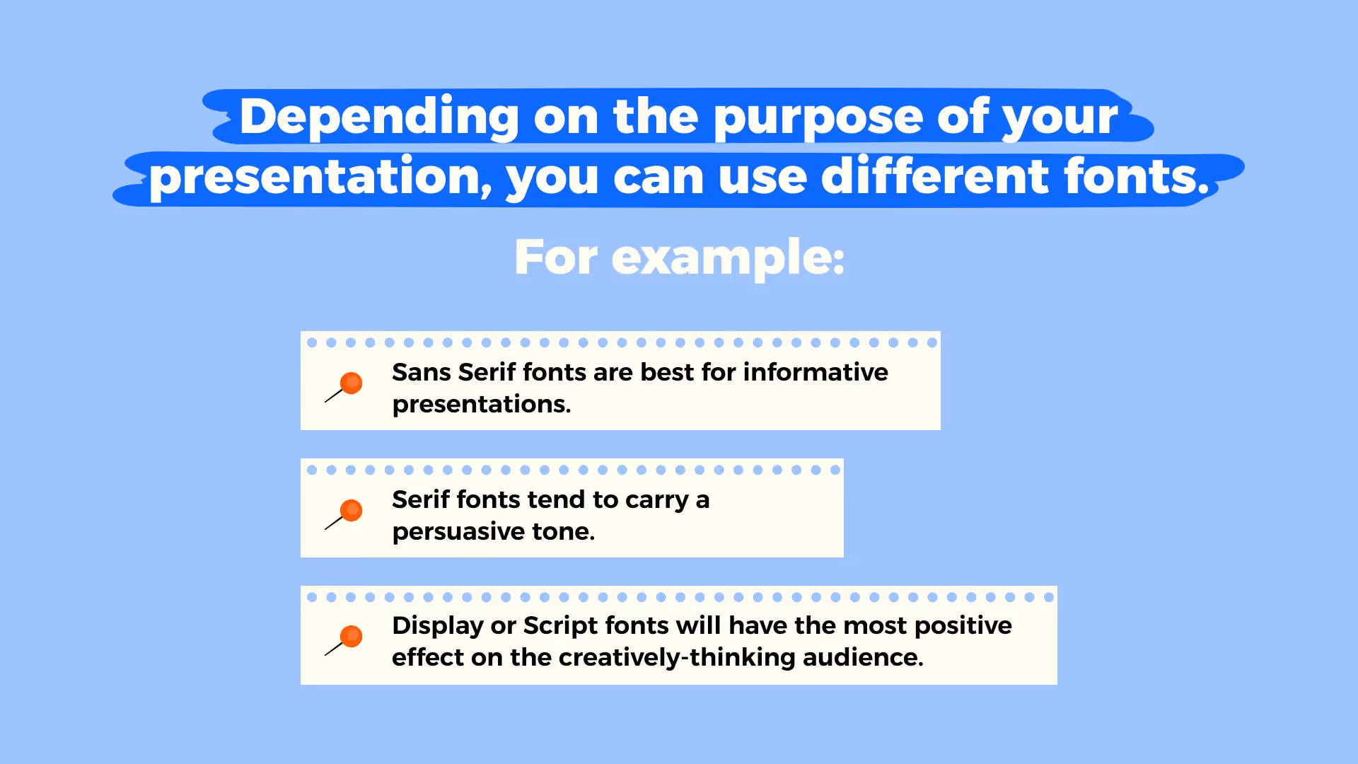
Serif fonts including Times New Roman and Garamond maintain a traditional formal trustworthy appearance which makes them practically the most suitable for academic and professional contexts.The modern sans serif fonts Arial, Helvetica and Calibri are more contemporary and are easier to read on screens, making them a strong choice for digital presentations. Depending on the goal of your presentation, you may also use display or script fonts in small amounts to add some creativity, but the core of your deck should rely on fonts that ensure clarity and consistency.
Key considerations for choosing the best font for presentations include:
- Readability across formats (slides, PDFs, screens, print)
- Credibility and tone that match the audience and context
- Visual consistency with your brand identity
- Adaptability for highlighting key messages without distracting from content
Font Readability and Accessibility
Readable fonts make it much more easier for audiences to follow your slides, while accessibility standards ensure that every viewer, including people with visual impairments, can clearly understand your message.Selecting the best font for presentations requires finding a combination of clearness and basic design elements and sufficient contrast to enhance audience understanding.
The first priority when designing slides for inspiration and conversion should be to ensure readability. The digital screen requires Arial or Inter fonts for clear readability but Lora or Merriweather serif fonts create a formal and reliable impression in printed or investor-ready materials. The selection of the best font for pitch decks by founders determines how investors perceive their presentation of clarity and professionalism. The use of overly ornate fonts should be avoided because they decrease readability and draw attention away from the message. Accessibility is equally important. The combination of increased line spacing with strong text-background contrast and visual alternative text makes presentations accessible to everyone.
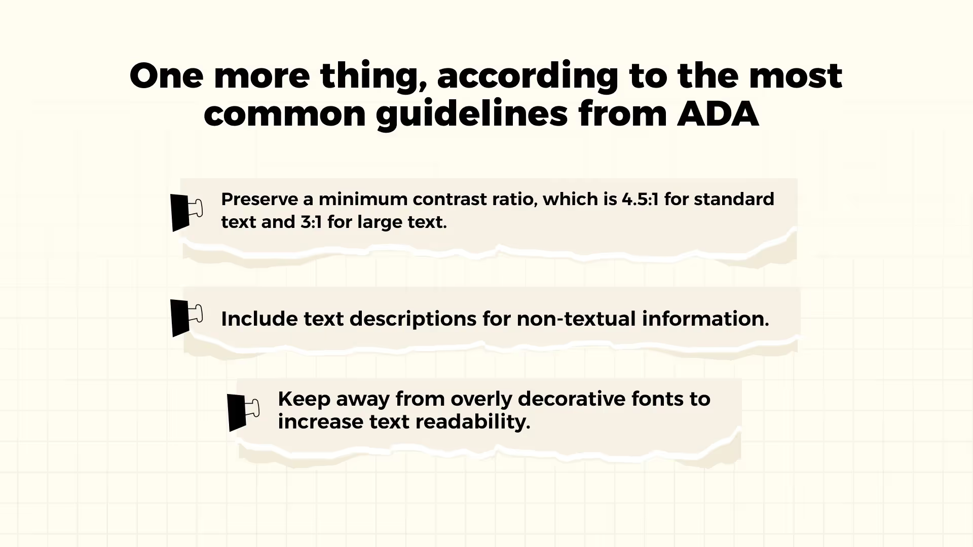
The ADA (Americans with Disabilities Act) guidelines recommend the following:
- The minimum contrast ratio should be 4.5:1 for standard text and 3:1 for large text
- Include text descriptions for non-textual information
- Keep away from overly decorative fonts to increase text readability
These guidelines help you create a stronger message while showing professional design and careful thought. For deeper insights into crafting materials with impact, check out our guide on How To Create a Perfect Pitch Deck — Step‑by‑Step Guide.
Pairing Fonts Effectively
The selection of fonts for pairing requires designers to choose typefaces which harmonize to establish balance and hierarchy and maintain consistency in their presentation. A strong pairing helps highlight the most important points while keeping the overall look professional and easy to follow. The best font to use for presentations depends on choosing multiple typefaces which work together to enhance both clarity and tone.
The most widely used method involves using serif fonts for titles alongside sans serif fonts for body text. The combination of Playfair Display with Inter produces a contemporary sophisticated design while Poppins paired with Roboto Flex creates a versatile clean appearance suitable for both digital and print applications. The goal is to create contrast without conflict because fonts need to be different enough to guide attention yet share enough similarities to maintain unity. Your deck should contain only two or three fonts because this helps to keep the presentation clear and easy to follow. Good font pairing is also an essential part of storytelling in a pitch deck, since it helps highlight the narrative structure and keep the audience focused on key points.
Do’s and Don’ts
Clear rules on font use help presenters avoid common mistakes.By following simple do’s and don’ts, you make sure that your typography enhances the presentation instead of distracting from it.The selection of the best fonts for pitch decks design should prioritize both consistency and readability above all else.
Do’s
- The text becomes more interesting and easier to understand when different font styles are used
- Keep a consistent hierarchy across all slides
- Use no more than two or three different fonts in your deck to maintain balance and clarity
Don’ts
- The combination of fonts that are too similar should be avoided because it creates confusion and reduces hierarchy
- Avoid overly decorative fonts that make the text hard to read
- Do not use inconsistent font sizes or weights across slides
Ignoring these rules often leads to cluttered slides and weak delivery. Many presentation design mistakes come from inconsistent typography, so keeping font choices disciplined is a simple way to improve presentation quality.

Top 10 Best Fonts for Presentations in 2025
Choosing the right font can shape the way your presentation is understood and remembered. In 2025, the best options combine timeless clarity with modern adaptability, ensuring that slides look professional across both live and digital formats.The following ten fonts represent the best fonts for PowerPoint presentations because they offer excellent readability and versatility while making the right impact.
1. Helvetica
Why it works: Helvetica is one of the most widely recognized fonts in the world.The slide design features clean lines and balanced proportions which create a professional and polished appearance.
The template works best for corporate decks and investor presentations and any situation that requires authority and reliability.
2. Arial
Why it works: The font Arial works well because it is easy to read and most devices have it installed which makes it a great choice for cross-platform use. The tool works well with any presentation style because it remains neutral.
The best time to use this font is for digital presentations that need to be shared online because it provides complete font substitution protection.
3. Inter
Why it works: The design of Inter works well for digital spaces because it provides clear text display across various screen dimensions. The text layout and typography exist to provide the best possible reading experience on modern display screens.
The presentation format is suitable for startup pitch decks and SaaS product demos and online meetings when the audience views slides on laptops or mobile devices.
4. Poppins
Why it works: Poppins has a geometric, modern style that feels both approachable and bold.Its rounded shapes add a contemporary look without sacrificing readability.
The tool functions best for creative industries and branding pitches and marketing presentations that require equal emphasis on design and content aesthetics.
5. Roboto Flex
Why it works: Roboto Flex is an evolution of the classic Roboto, offering more flexibility in weight and width.The tool adjusts to various design requirements which results in slides that maintain a consistent and contemporary appearance.
The use of this font is suitable for decks that require different levels of heading and subheading and body text without needing to change the font style.
6. Lato
Why it works: The design reaches a perfect equilibrium between friendly and professional elements. Its humanist shapes make text more approachable while still maintaining credibility.
The presentation template works best for internal company presentations and HR updates and team communication decks that require both clarity and warmth in their content.
7. Calibri
Why it works: The font works because Calibri has been the default font in Microsoft Office since its inception and users continue to trust it. The design provides a clear appearance which makes presentations easily recognizable to most viewers.
The best time to use this format is for fast business reports and status updates and when you need a safe universally recognized choice.
8. Futura
Why it works: Futura is a geometric sans serif with a modernist heritage.The slides appear both powerful and design-oriented because of their distinct and unambiguous forms.
The tool functions effectively for both creative presentations and keynote speeches and for industries like design or architecture where visual impact is important.
9. Playfair Display
Why it works: Playfair Display is a serif font that brings elegance and sophistication to headings and titles.It creates strong contrast when paired with a sans serif body font.
The appropriate use of this template includes investor decks and luxury branding pitches and presentations that require authority and refinement.
10. Merriweather
Why it works: The design of Merriweather enables digital readability through traditional serif typography. Its slightly condensed style allows more content to fit on slides without losing clarity.
Use this template for research presentations and academic talks and thought-leadership decks that require both detailed information and easy reading.
Best Fonts for Different Presentation Types
Each presentation serves a different objective so fonts which succeed in one situation may not work in another. A sales pitch requires boldness to capture attention yet an academic talk demands clear structured content. The choice of good presentation fonts according to presentation type helps your slides match both the message and the target audience.
The most effective fonts for investor decks are professional and highly legible options including Helvetica, Inter and Merriweather because they establish credibility while maintaining focus on numbers and key messages. The presentation style of creative or marketing content should use Poppins or Futura fonts to convey energetic and original ideas. The internal updates and training sessions will be more approachable with Lato or Calibri which balance friendliness and readability. Your font selection should match your presentation objective to create a stronger overall effect and better message reception.
How to choose fonts by presentation type:
- Start with the audience: consider whether you are speaking to investors, colleagues, or customers and choose fonts that match their expectations.
- Match the tone of the content: professional decks benefit from formal and clean fonts, while creative pitches can use more expressive typography.
- Test readability in context: always preview your slides in the format you will present (screen, projector, PDF) to ensure fonts stay clear and accessible.
Common Font Mistakes to Avoid in Presentations
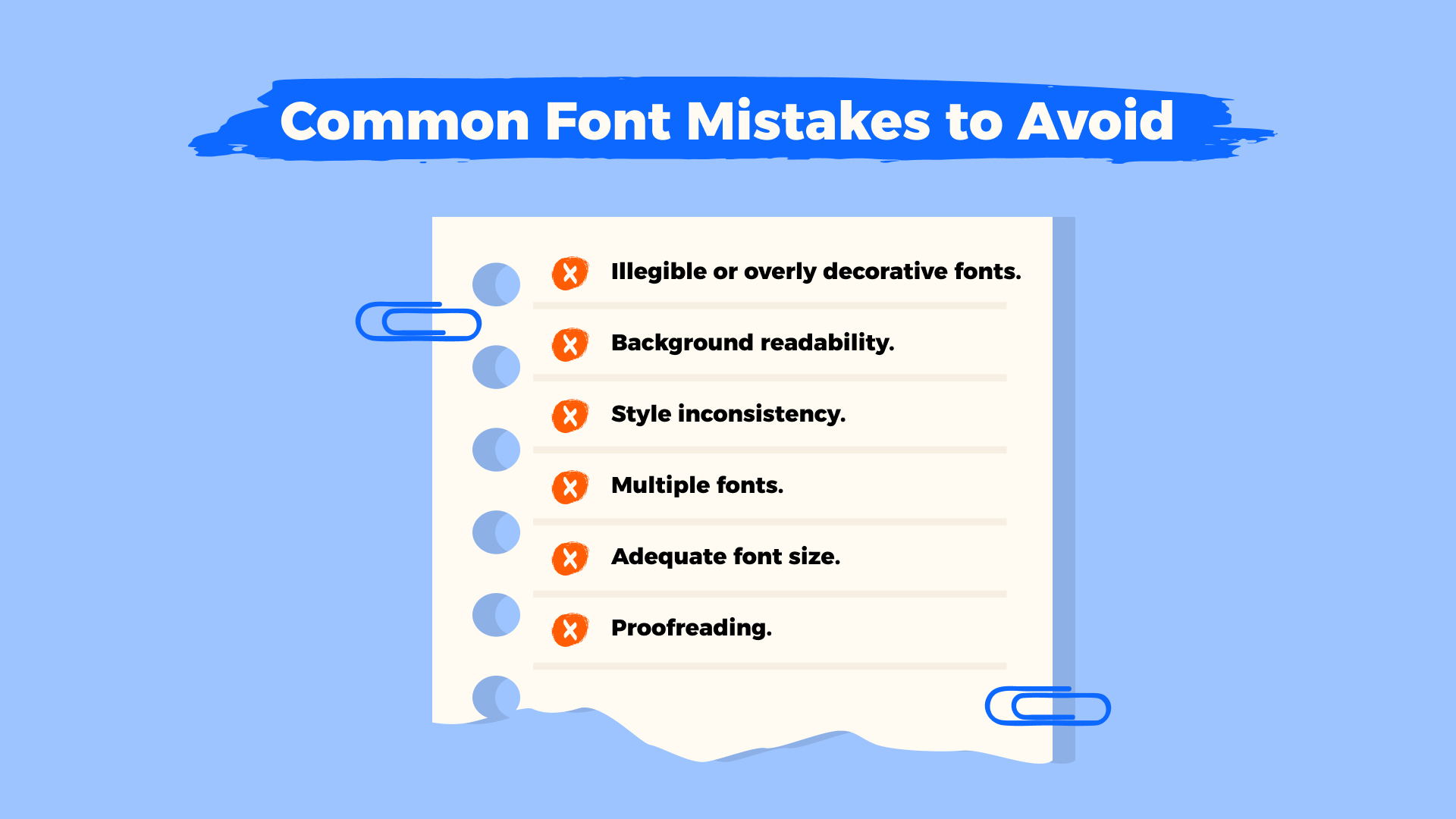
A design that is strong will lose its impact if basic font rules are not followed. Most presentation errors result from small typography choices which disrupt both readability and flow rather than from weak content. When working with presentation fonts, here are the pitfalls to avoid:
- Overly decorative fonts: keep them for titles only, and never use them for main text.
- Poor contrast with background: test fonts on your slides to make sure they stay readable in both dark and light settings.
- Inconsistent style: limit yourself to a clear hierarchy — for example, one font for headings and another for body text.
- Too many fonts: stick to 2–3 per presentation to avoid a cluttered look.
- Font size mistakes: avoid text that’s either too small to read or oversized and overwhelming.
Always review your slides for typos and spacing errors before presenting.
Tips for Pairing Fonts Effectively
The way you combine fonts sets the tone for your entire presentation.The presentation of multiple inconsistent fonts results in visual disorder which interferes with audience attention to the core message. A consistent font system, on the other hand, creates a polished and professional impression.
To set up effective font pairs:
- Open your presentation software (PowerPoint or Google Slides).
- Go to View and select Slide Master.
- Choose a font pair from the Fonts menu or create your own custom combination.
- Close Master View to apply changes across all slides.
By keeping your fonts consistent, you not only improve readability but also strengthen your brand identity and reinforce trust in your presentation.
Creative Use of Presentation Fonts
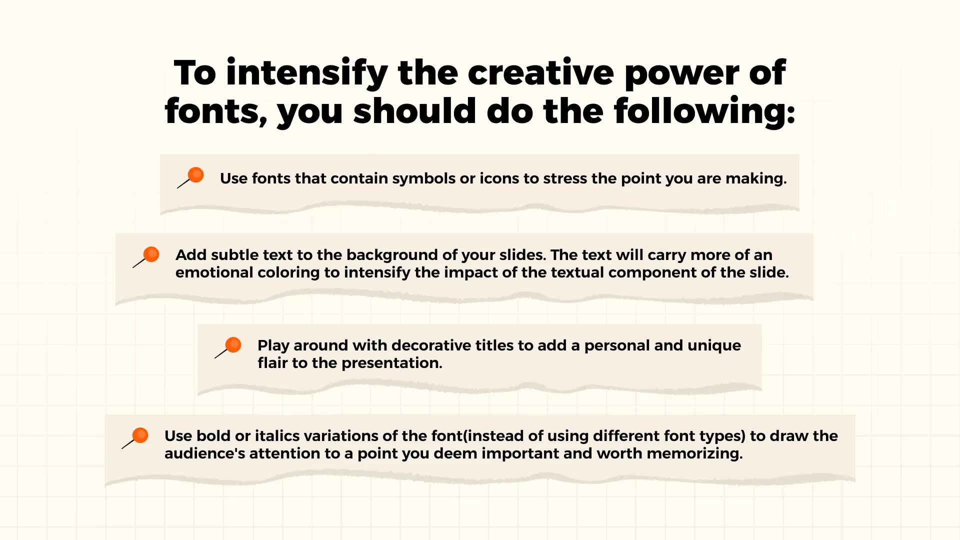
Fonts are not just about making words readable. When used with intention, they can bring out emotions, highlight key points, and help your slides stick in people’s minds.
A few simple ideas to try:
- Choose fonts that include built-in icons or symbols to draw attention where it matters.
- Play with gentle textures or background shades behind text to add a bit of mood.
- Give your slides character by using decorative fonts for headings.
- Rely on bold or italic styles to naturally guide the audience’s eye to the most important thoughts.
The trick is to keep things balanced. Creativity should make your message clearer, not distract from it.
Optimizing Fonts for Different Presentation Formats
The right font depends on the context of your presentation. A keynote in a large hall requires a different approach than a team meeting or an online webinar. Choosing from the best fonts for professional presentations helps ensure your slides stay clear and impactful in any setting.
Key things to consider:
- Screen size. Serif fonts tend to work well on large screens, while sans serif fonts are often better suited for smaller or mobile displays.
- Resolution. Avoid thin or highly detailed fonts if the display resolution is low, as these can appear blurry.
- Presentation format. Online presentations benefit from web-safe fonts that display consistently across devices, while in-person presentations allow for more flexibility.
Always test your presentation in the environment where it will be shown to make sure your text is easy to read from any seat or screen.
Recommended Font Resources
When choosing fonts for presentations, there are plenty of reliable sources. Some are completely free, others are paid, and many offer both options. For anyone searching for professional fonts for presentations, these five trusted websites are a great place to start:
- Google fonts – a large free library that works well for both personal and commercial projects.
- Adobe Fonts – included with Creative Cloud, offering a wide selection of professional typefaces.
- Envato Elements – a paid subscription platform with premium fonts and design assets.
- Font Squirrel – a free collection of hand-picked, high-quality fonts.
- Fonts.com – a paid marketplace with thousands of professional font families.
Before downloading, always check the license terms:
- Some fonts are free only for personal use and require a license for commercial projects.
- Others may need attribution or come with usage restrictions.
- Verifying these details ensures your presentation is both visually effective and legally safe.
Examples: How Fonts Transform a Slide
Well-chosen fonts can completely reshape how a presentation is perceived. Let’s look at two well-known brands that adjusted their font strategy and why it mattered. Choosing the best font for presentation slides is not only about aesthetics but also about consistency, branding, and audience trust.
Netflix
In early investor presentations, Netflix often showed font inconsistencies that risked confusing the audience. Today, the company uses a custom-designed font that is consistent, recognizable, and professional.
Netflix’s design lead, Noah Nathan, explains: “With the global nature of Netflix’s business, font licensing can get quite expensive. Developing this typeface created an ownable and unique element for the brand’s aesthetic.”
Airbnb
Airbnb faced a similar challenge. Early presentations mixed multiple fonts that didn’t align with one another, weakening the modern appeal of the brand. The company now uses a clean, Cereal font family that reflects its identity and ensures clarity.
As Creative Lead Derek Chan says: “As designers, we can choose when words serve the visual or when words are the visual. At Airbnb, we use type to both blend in and stand out — to keep the focus on the community and to make big statements.”
Conclusion: How to Choose the Best Font for Your Next Presentation
There is no single “perfect” font for every presentation.The best choice depends on your message, audience, and brand identity. The most important factor is that your font choice enables easy reading while maintaining uniformity between slides and aligns with the overall message of your content.
A well-chosen font from the best presentation fonts can do more than make slides look polished. It improves comprehension, strengthens audience engagement, and helps your presentation feel memorable and professional.The success of your story depends on using fonts which are both clear and accessible while maintaining visual alignment with your narrative.
When in doubt, test a few options and focus on clarity over complexity. The right typeface will not only enhance your design but also build trust and connection with your audience.
For more practical insights, explore our guides on how to make an outline for a presentation and presentation end slides.
Talk to a presentation design expert now!
Let's Talk
FAQ
1. What is the best font for a presentation?
There isn’t a single “best” font that works for everyone.The best option depends on your presentation approach and the audience you are addressing. The safe font choices include Helvetica, Arial and Calibri because they are clean and highly readable. You can add more personality to your design by using branded or custom fonts but always keep them professional and easy to read on any screen size. To find good fonts for presentations you should look for fonts that are both readable and match the style of your content.
2. What is the best font size for presentations?
The body text should be written in a font size between 18–24 points to make it easy for the audience at the back to read. The titles and headers need to be larger than 32 pt to establish a clear hierarchy. The fundamental principle states that when the person who stands furthest from you cannot read your slides the font size becomes too small. The best powerpoint fonts will lose their impact if they are displayed too small to be legible when choosing sizes.
3. How many fonts should I use in a presentation?
The ideal number is two fonts, one for headings and one for body text.Using more can make your slides look inconsistent and distracting. The selection of appropriate fonts from the best presentation fonts maintains your deck professional while achieving balance and readability.

Read more

.png)




.avif)

.avif)
.avif)


