
Color Blind-Friendly Presentations: The Ultimate Guide to Color Blind Accessible Presentations
Discover how to revolutionize your slides with our expert guide on creating presentations that speak to everyone, including those with color blindness. From color-safe palettes to design principles, transform your slides into models of inclusivity.
Author: Tanya Slyvkin, CEO & Founder, Whitepage Studio

Did you know that around 300 million people around the globe are color-blind? Upon first thought, you may doubt how these stats are relevant when you are working on a killer pitch deck design. However, the moment you realize that most present-day presentations rely heavily on their visual components, the understanding becomes overwhelming.
If you ignore your PowerPoint presentation's accessibility, you may discard as many as 10% of the audience before you even start. Considering the importance of the question, Whitepage experts decided to compile a guide that will help you create presentations that are as inclusive as possible. Today, we will talk about the core of color blindness as a disability and its impact on presentations. Our professionals will share effective tips on how to enhance PowerPoint accessibility along with a few tools that come of use along the way.
Ready to spread a genuinely universal message?
Understanding Color Blindness
You can only make necessary accommodations for color blindness if you know precisely what it is. People who are color blind, or in other words are affected by color vision deficiency(CVD), can't distinguish between specific colors. In rare cases – people perceive the world through black-and-white palettes.
As many as 1 in 12 men and 1 in 200 women suffer from the condition, and these stats make it all the most critical to attune your presentation's accessibility to their needs.
There are three main types of color blindness:
- Deuteranopia
- Protanopia
- Tritanopia
People with deuteranopia can't tell between red and green colors. Protanopes are less susceptible to red hues, which may alter their perception of green and red colors. Lastly, tritanopes can differentiate between yellow and blue tones.
To help you better understand how people with different types of color blindness perceive colors around, we'll visualize these conditions:

The Impact of Color Blindness on Presentations
There's a list of obvious accessibility points, and most designers consider them while working on their presentations. However, when you decide on a suitable presentation font size or device-friendly format, the issue of problematic color combinations is often underestimated.
You must approach the problem on a deeper level to understand its importance. To ease your research, our experts shared a few examples of how certain colors can become challenges, decreasing the overall impact of your presentation.
Example 1
Imagine that you use red and green colors to stress negative and positive features. People with deuteranopia who struggle to differentiate between these colors may not be able to perceive the presented information correctly. This will lead to confusion and misunderstanding.
Example 2
Some presentation design services use red hues in text to emphasize its importance, and there's nothing wrong with the approach. However, if you know that there will be people with protanopia in the audience, you may want to reconsider the color palette. Protanopic members of the audience won't be able to notice the vital aspects of the presentation stressed in red, which may result in misinterpretation and general inability to comprehend the information.
Example 3
It is a common practice to use contrasting colors to define the opposites. Blue-to-yellow contrast may seem like a fitting pair. Still, people who suffer from tritanopia won't be able to perceive these differentiators, so some parts of the presentation may remain unclear.
Color-blind friendly presentations will notify the audience that you care about inclusivity. Moreover, they will ensure the clarity of the presentation, which will lead to a more positive reaction. Not to mention, such well-thought-out presentations speak of high professionalism, reliability, and good reputation.
Principles of Accessible Presentation Design for Color Blindness
.avif)
As you move on with your accessible presentation checklist, you must embrace the main principles of accessibility. These principles are critical for effective communication. They are the following:
- High contrast – make the background and the text contrast to ensure that subtle colors don't mislead color-blind people.
- Texture – use different textures for separate elements of the slides so that the audience can perceive the main message correctly.
- Color combinations – some color combos are more challenging to people affected by CVD. It is best to reconsider red-green and yellow-blue color pairs, if possible.
One of the perks of the modern era is that you can submerge yourself into any situation or condition with a suitable simulator at hand. These days, some tools simulate how individuals with color blindness can see. You can use tools like Colorblindpal, Coblis, or Stark to test whether you've chosen good presentation colors.
Tips for Creating Color-Blind-Friendly Presentations
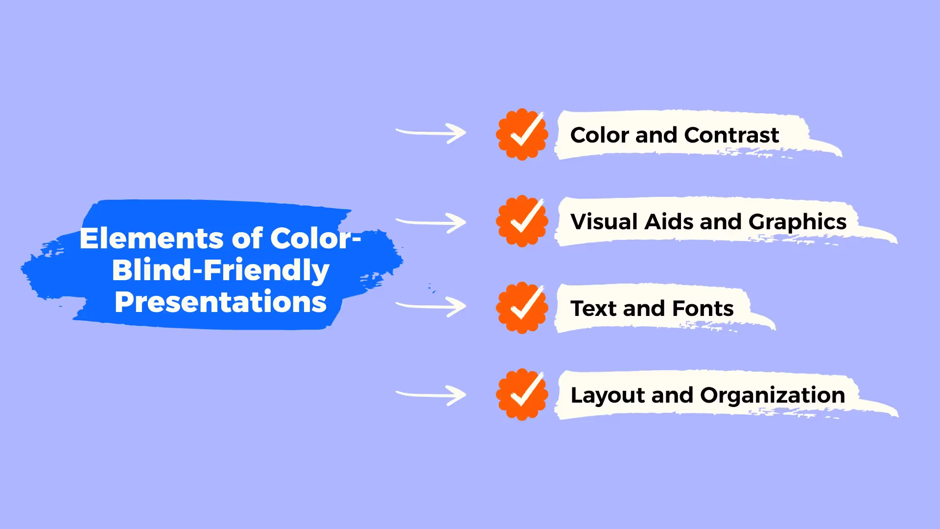
Just as you learn how to write an outline for a presentation that leaves an impact, you can learn how to design accessible presentations that don't lose their primary effect on the audience but rather intensify it through a well-thought inclusivity approach. There are a few practical tips that will help you succeed with the task effortlessly.
Color and Contrast
The best colors for color-blind presentations are usually the opposites. If the black-and-white combo pops in your head – you are thinking in the right direction. The high contrast between these colors improves readability and information perception.
Another quite reliable pair would be blue and yellow. Most color-blind people can distinguish those colors, but there are exceptions – tritanopes, yet they are not as common as individuals affected by deuteranopia. This leads us to red and green color pairs, which should be avoided at all costs if you want to create an accessible presentation.
When you decide on a suitable color pair, you must test if they are contrasting enough. Effective contrast ensures proper visual accessibility of the presentation. Whitepage experts stress the importance of contrast ratios. You can use tools like WebAIM's Contrast Checker to figure out the best contrast ratio.
Use of Text and Fonts
After you are through with picking the best colors for color-blind presentations, there's a lot of work ahead. Another critical alteration to brood upon is the proper alignment of presentation text and fonts.
First things first, you should vote in favor of larger fonts. Going lower than 18-point font size for body text will decrease its readability, even for those individuals who don't struggle with CVD.
The same goes for the font style. More elaborate styles will enhance the visual appeal of the presentation, but they are most likely to decrease the clarity of the message. That is why we want to draw your attention to sans-serif fonts, such as Arial or Calibri, to improve text readability and the impact it will have on the audience.
Lastly, you may want to increase the spacing a tad so that the text does not pile up.
IMPORTANT!
Don't use overly bright text on a vibrant background. The intensity of colors will provoke discomfort and lower viewer concentration.
Visual Aids and Graphics
Very often, we rely on the power of color to deliver a meaningful message. However, colors aren't the only weapon in the arsenal. You can refer to the different textures, patterns, or labels when designing an accessible and impactful color-blind graphics presentation.
These visual guidelines will point you in the right direction:
- Use universal icons. Well-known and recognizable icons are already packed with a pre-defined meaning that will add to the primary message of your presentation.
- Implement clear labels. Descriptive labels will promote user understanding even if they can't decode the color palette.
- Tune in with the contrasting. Elements that stand out because of stark contrast will allow the audience to discern listed visual elements.
- Use patterns and textures. You can make the most of different textures when you can't apply colors to outline some elements of the presentation. For instance, you can use dashed and solid lines to represent various types of information.
.avif)
Layout and OrganizationOne more critical piece of the color blindness PowerPoint presentation puzzle would be its structure. The way you organize your content will either enhance the user's perception of the provided information or decrease it.First of all, an effective presentation is usually laid out in a hierarchical order. Such a structure ensures that the viewers can make out the main points and tune in with the importance of each part of the presentation.Secondly, we suggest that you stick to a logical presentation flow. What does it mean? You shouldn't jump from one point to another, dragging the audience along and dispersing its attention instead of accumulating it. A logical flow means that you feed the viewers a critical piece of information bit by bit, allowing them to digest it.Lastly, such visual cues as lists, bullet points, or icons will help you provide crucial information logically and clearly without the need to refer to different colors that may compromise presentation accessibility.
How do you outline critical points without the use of colors?
- Use different text sizes and weights
- Use whitespaces
- Use bold and italicized or underlined text
.avif)
Tools and Software for Accessible Presentations.
You can't fully understand the way people affected by CVD perceive information, especially when it comes to visuals. That's why you should consider using different tools and applications that can help you succeed with the task effectively. Whitepage professionals have outlined a bunch of handy options to refer to:
- Contrast Checker – an online color-blind presentation checker that helps you to see the contrast between the text of the presentations and the background. You can upload an image from the presentation and then test the foreground and background color from the detected palette and see how it works with the text.
- Color Blind Vision Simulator – an online color blind test for presentations that allows you to see different slides of the presentation the way people with different types of color blindness would see them. All it takes is to upload the picture and choose a type of CVD from the list above to visualize the condition.
- Microsoft Office Accessibility Checker – a feature available in PowerPoint, Excel, and Microsoft Word. All it takes is to click the "Check Accessibility" button for the tool to highlight potential issues in your presentation.
Case Studies and Examples.
Let's analyze a few different examples of presentations that have been successfully adapted for color-blind audiences to ensure that making your presentation more accessible is worth the fuss.
Example 1: Business pitch deck.
The original presentation included a lot of red and green hues used to stress vital aspects of the project. Moreover, all the critical details were color-coded, and almost no contrast was used.
After
A team of expert designers used a high-contrast color palette to make information more accessible for color-blind individuals. They switched from color-coded details to bold fonts and added textured elements to outline different data points.
Example 2: Product launch deck.
Like many similar presentations, this one relied heavily on the combination of colors to stress the appeal of the new product. While ending the presentation with impact, the designers implemented a CTA button that was based on color distinction. The deck featured no contrasting elements and visual cues to assist people affected with color blindness in deciphering critical parts of the presentation.
After
A team of expert designers worked on the redesign of the presentation. It fixed the primary accessibility concern by switching to a color-blind-friendly palette and tuning the contrast up. Apart from that, they increased font size and style to improve readability and comprehension. Lastly, all the critical buttons, including the CTA one, were redesigned into distinctive shapes and spiced with clear labels.
Conclusion
People are different, and we must accept the facts and address them with understanding and respect. Accessible presentations for color-blind people not only ensure that the project has a desired impact on the audience but also speak of your thoughtfulness, professionalism, and care for inclusivity.It takes more than to choose the best colors for a color blindness-oriented presentation. You may need to refer to visual alternatives and different presentation structures, and you may even need to spend some time testing your project. However, in the long run, you will present your readiness to contribute to building a professional community that does not exclude people based on their accessibility needs!Check out our fresh guides on what is a slide deck presentation, handout ideas for presentations and how to speak eloquently to become a true expert in the field!
What It’s Like To Work With Us
reviews


867 BOYLSTON ST
BOSTON, MA 02116


