





























.avif)

.avif)
.avif)


























Get a guide to creating pitch decks presentation



.png)
.avif)
If you are wondering how many slides a 15-minute presentation should contain, use 10–15 as a starting range. Use fewer when slides are data-heavy, the conversation is interactive, or Q&A is included in the 15 minutes. Use more only when the slides are visually light and move quickly.
If you are asking how many slides a 15-minute presentation needs, start with 10–15 slides. That range is practical for many business, educational, and conference presentations because it leaves enough time to explain each important idea without turning the deck into a rapid-fire sequence.
Use 10–15 slides as an initial planning range. The final count depends on content density, presentation format, speaking pace, and whether the 15-minute slot also includes questions, a live demo, video, or discussion. A dense financial chart may need two minutes, while a full-screen visual may need only 20 seconds. Both can belong in the same presentation.
The most reliable way to plan a short presentation is to allocate the time first, build the narrative second, and count the slides last. This guide shows how to do that, including a slide-by-slide outline, timing ranges for different slide types, design guidance, and a rehearsal workflow.
At Whitepage, we have spent more than 12 years developing presentation strategies and designing decks for founders, executives, and business teams. In our experience, the slide count usually becomes clear only after the message, audience, and available speaking time have been defined.
Start with a working range of 10–15 slides. Then adjust it according to what each slide asks the audience to process and how much of the 15-minute slot is reserved for interaction.
A 10–15-slide deck gives you an average of roughly one to one and a half minutes per content slide once quick title, transition, and closing screens are taken into account. That is enough time for the audience to read a headline, understand a chart or visual, and listen to the speaker without constant slide changes competing for attention.
For a straightforward business presentation, 12–14 slides is often a comfortable working draft. Rehearsal will show whether slides should be removed, combined, or split. Let the story determine the final count: nine strong slides are better than a padded ten, while sixteen lightweight slides can be reasonable when a visual sequence needs to move quickly.
Fifteen minutes is useful because it gives a speaker enough time to develop one focused argument while still forcing clear prioritization. TED uses a comparable benchmark, recommending talks of 18 minutes or less, although many focused talks run for only 3–9 minutes.
That benchmark should not be treated as a universal attention-span limit. A review by Wilson and Korn found little support for the common claim that attention consistently declines after 10–15 minutes; audience focus also depends on the speaker, subject, motivation, visual clarity, and level of interaction.
A 15-minute format works well for a focused pitch, conference talk, project update, or executive briefing. It is less suitable when the session requires technical training, several complex decisions, an extended live demonstration, or substantial discussion.
Slide count is only a proxy for pace. Two decks can both contain 12 slides and require completely different delivery times. One may consist of simple images and short conclusions; the other may contain a market model, product architecture, comparison matrix, and financial chart. The audience needs more processing time for the second deck even though the number of slides is identical.
This is why slide count alone cannot answer how long a presentation should be. If you are exploring how to make a presentation longer, add useful explanation, evidence, interaction, or examples rather than padding the deck with extra slides. Start from what the audience needs to understand, decide, or remember.
One slide per minute is a useful planning heuristic because it gives the presenter a quick first estimate: 15 minutes suggests about 15 slides. It is easy to remember and often produces a manageable first draft. Treat it as an estimate and give each slide the time its content requires.
The rule works best when slides have similar complexity and the talk follows a steady rhythm. A project update, internal business presentation, or straightforward educational talk may move through a series of comparably weighted points. In that setting, averaging around one slide per minute can produce a natural pace.
Even then, think in averages. A title slide may take 10 seconds. A transition may take 20. A key result or chart may stay on screen for 90 seconds. The overall presentation can still average about one slide per minute without any individual slide following that timing exactly.
Use fewer slides when the audience needs time to interpret information, when the speaker is expected to explain nuance, or when discussion is part of the session. Use more slides when each screen is visually simple and supports a fast sequence: product screenshots, before-and-after examples, image-led storytelling, or short transitions between sections.
A useful comparison is Guy Kawasaki’s 10/20/30 Rule of PowerPoint: ten slides, twenty minutes, and no font smaller than thirty points. Kawasaki originally framed it for pitching to venture capitalists, not as a law for every presentation. Its enduring value is the constraint: prioritize the most important points instead of filling every available minute.
These ranges are planning recommendations, not fixed rules. The same presentation type can move outside them if the content, audience, or event format calls for a different pace.
The right slide count emerges from the presentation you are building. Before deciding whether the deck should contain 10, 12, or 15 slides, review the following constraints.
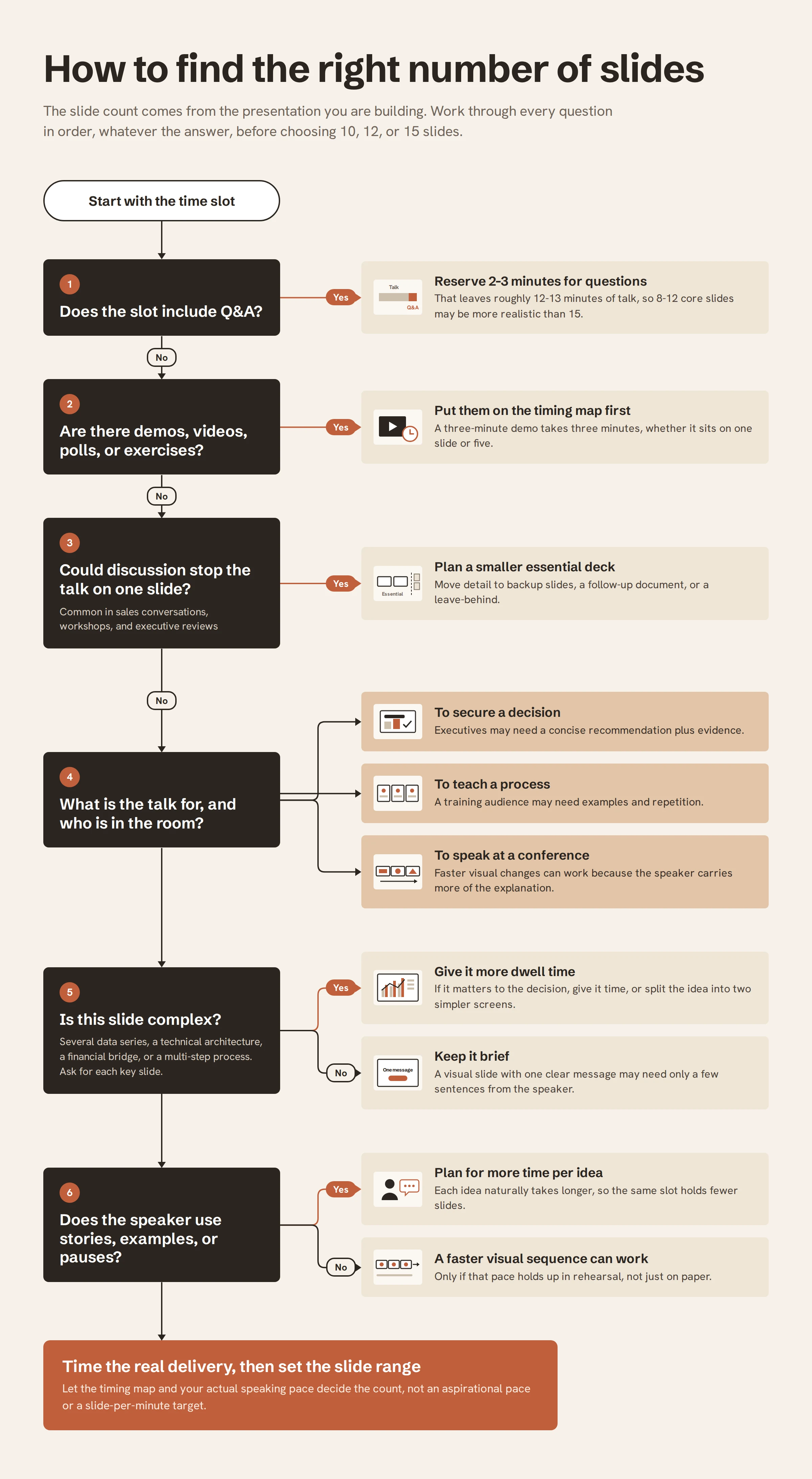
Complex slides need more dwell time. A chart with several data series, a technical architecture, a financial bridge, or a multi-step process asks the audience to interpret relationships, not just read a headline. If the slide matters to the decision, give it time rather than shrinking the explanation to fit an arbitrary slide-per-minute target.
The opposite is also true. A visual slide with one clear message may only need a few sentences from the speaker. Splitting a dense idea into two simple screens can increase the slide count while making the presentation easier to follow.
A presentation built to secure a decision needs a different rhythm from one built to teach a process. Executives may need a concise recommendation plus evidence. A training audience may need examples and repetition. A conference audience may accept faster visual changes because the speaker carries more of the explanation.
Build this logic before the slides. If the narrative still feels uncertain, clarify what a presentation outline is meant to do in this talk: the opening promise, the few ideas the audience must understand, and the conclusion you want them to leave with.
A speaker who uses stories, examples, or pauses naturally spends longer on each idea. A speaker delivering a highly visual sequence may move faster. Do not design the deck for an aspirational speaking pace that disappears under pressure. Time your real delivery and let that pace inform the slide count.
If the 15-minute slot includes Q&A, you do not have 15 minutes of presentation time. Reserving two or three minutes for questions reduces the scripted talk to roughly 12–13 minutes. In that case, 8–12 core slides may be more realistic than 15.
Interaction during the talk is even less predictable. A sales conversation, workshop, or executive review can stop on one slide for several minutes. When that is likely, plan a smaller essential deck and place detail in backup slides or a follow-up document.
A separate leave-behind can carry the detail that does not belong in the live talk. Our handout ideas for presentations can help you separate live presentation content from post-meeting reference material.
A three-minute demo consumes three minutes whether it is represented by one slide or five. The same applies to embedded video, audience polls, exercises, or planned discussion. Put these elements on the timing map before calculating the slide range. Otherwise, a deck that looks reasonable on paper can become impossible to deliver.
After more than 12 years of presentation strategy and design work, we use the following checks before finalizing a short deck. If several answers are no, revise the narrative or timing before investing time in polished slide design.
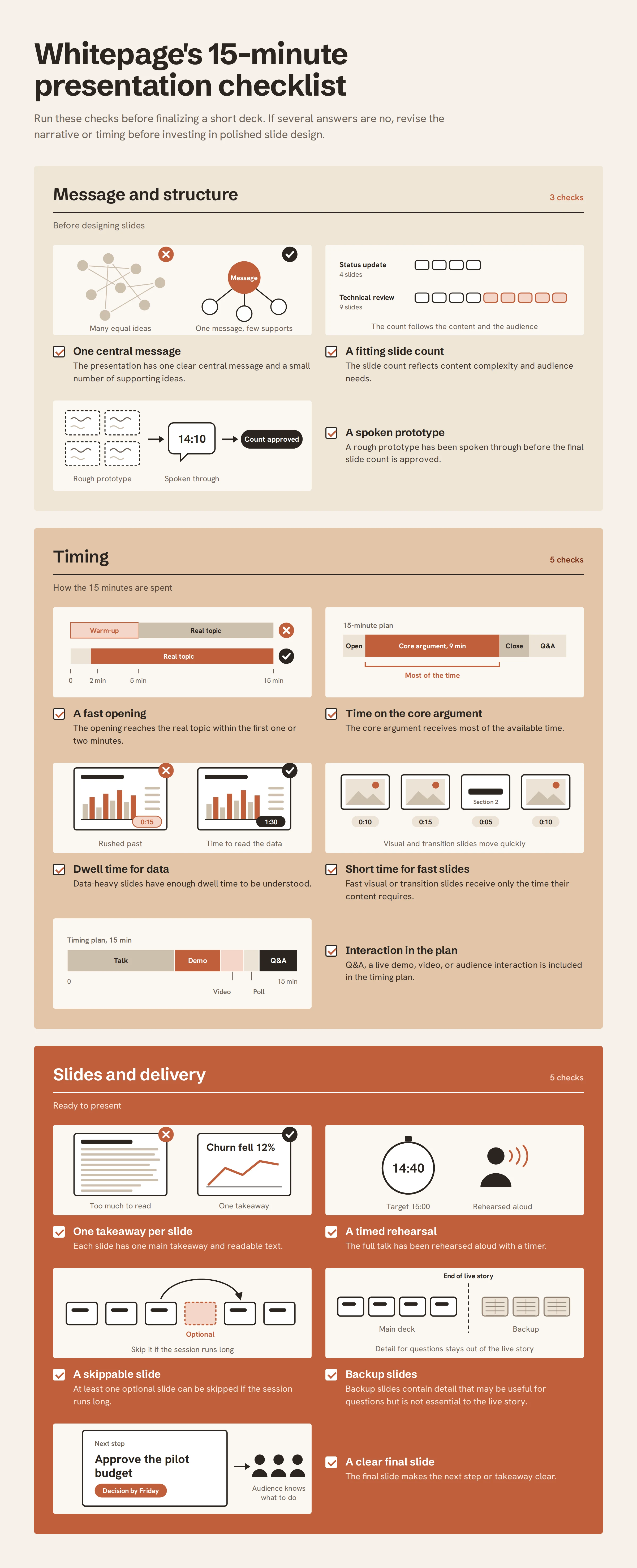
A strong 15-minute presentation usually has enough time for a complete argument, but not for multiple competing storylines. Build around one main message and a small number of supporting points. The allocation below works as a practical starting framework. These are adjustable ranges, not values to add at their maximum; your final timing map must still total 15 minutes.
Use the first one or two slides to establish the topic, why it matters, and what the audience should listen for. Keep context to the minimum needed to understand the argument, then give most of the available time to two to four core ideas supported by evidence or examples.
Bring the story back to one conclusion and make the next step clear. If Q&A is included in the 15-minute slot, reserve that time before assigning slides; if questions are separate, retain a small buffer for transitions or technical delays.
If the close still ends with a generic “Thank you,” our guide to the final slide in a presentation explains how to land the message and make the next step clear.
Do not force the deck to contain every range above. A concise executive pitch might finish at slide 10. A visual talk might use all 15 slides with several fast transitions. The outline is useful because it assigns jobs to the slides, not because the slide numbers themselves are mandatory.
If you want to know how many minutes per slide in a presentation are appropriate, start with the type of information on the slide. The audience does not process every screen at the same speed.
Allow more time for a chart, financial model, technical diagram, or comparison that requires interpretation. The slide should have one clear takeaway, but the audience may still need time to locate the evidence and connect it to your explanation. If a data-heavy slide takes longer than two minutes, consider whether the visual can be simplified or broken into a sequence.
This range works for a typical business slide with one headline, a small number of supporting points, and a focused visual. It gives the speaker enough room to explain the idea without encouraging unnecessary detail. Many 10–15-slide presentations will spend most of their time in this range.
A section divider, full-screen image, customer quote, or simple before-and-after visual may only need a short comment. These slides are why “presentation slides per minute” can be a misleading metric: a fast transition slide and a two-minute chart can coexist in the same well-paced deck.
A short time limit increases the need for visual clarity. When a slide is hard to decode, the audience spends part of the available time reading or searching instead of following the argument.
A slide can contain several supporting elements, but they should all serve one conclusion. If the audience needs to understand two unrelated claims, split them. This can increase the slide count while reducing cognitive competition and making the spoken narrative easier to follow.
Do not use the 15-minute limit as a reason to shrink text or pack paragraphs into the deck. Edit the content instead. Use a clear hierarchy, short supporting copy, and a font size for presentation that remains readable in the actual room or screen-sharing environment.
Every chart should make the speaker’s point easier to see. Highlight the relevant comparison, remove secondary data that does not affect the conclusion, and use annotation where it reduces searching. Decorative visuals are useful only when they reinforce the message or help establish rhythm.
Consistency reduces the amount of visual relearning from slide to slide. Keep typography, color logic, spacing, and chart conventions stable so the audience can focus on the changing information. Section transitions should also be obvious enough that the audience knows when the argument is moving to a new phase.
For high-stakes decks, professional presentation design services can help align narrative density, visual hierarchy, and pacing instead of treating design as a final cosmetic pass. If the deck is investor-facing, the same principle applies to working with a pitch deck design company that understands both the live presentation and the decision context.
Also test whether critical distinctions still work for people with color vision deficiency. Our guide to color blind friendly presentations explains how to avoid relying on color alone for meaning.
The first draft of the deck cannot confirm whether the slide count is right. Rehearsal reveals where the presentation actually spends time, which ideas cause an overrun, and how well the sequence supports the speaker.
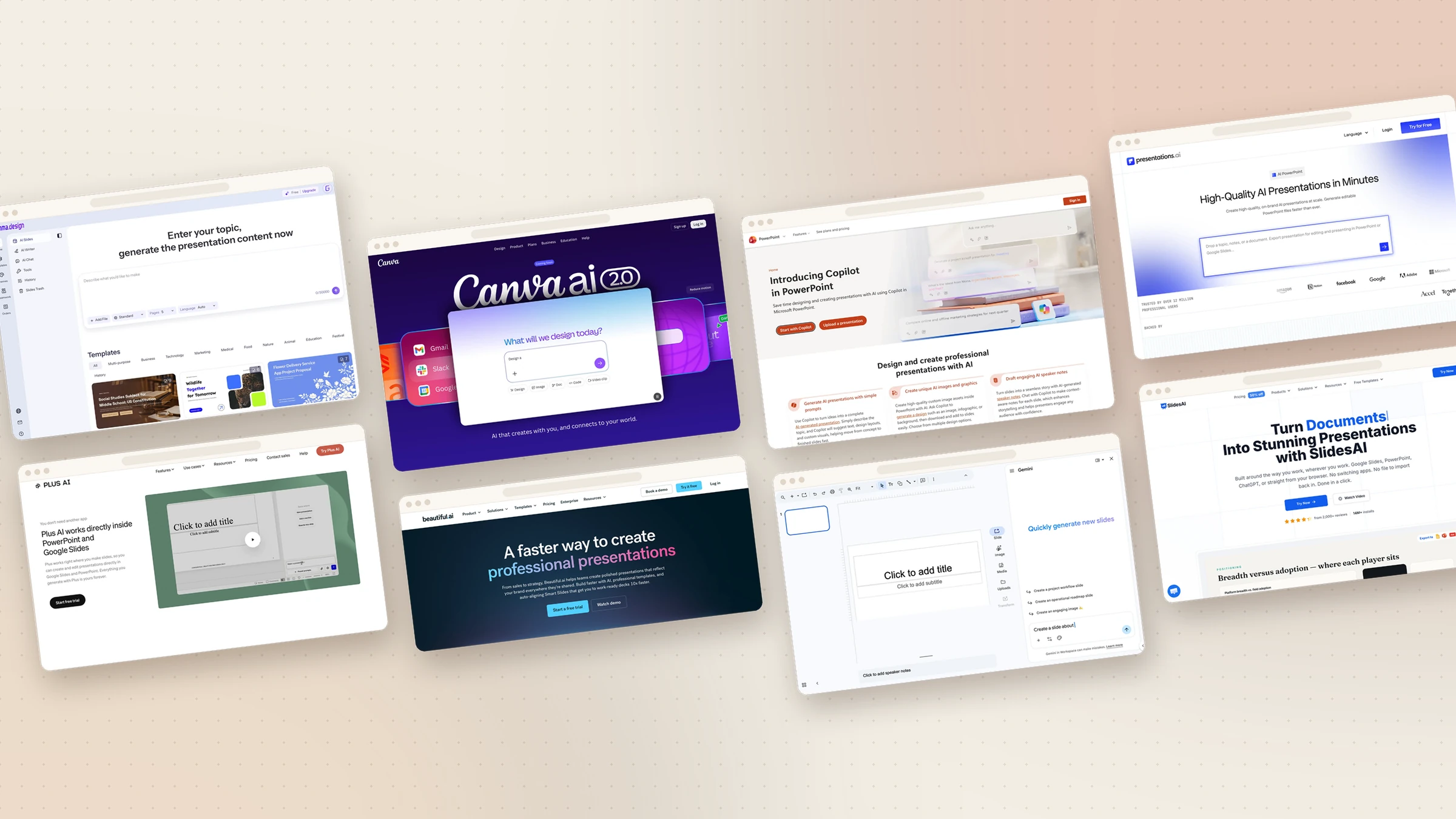
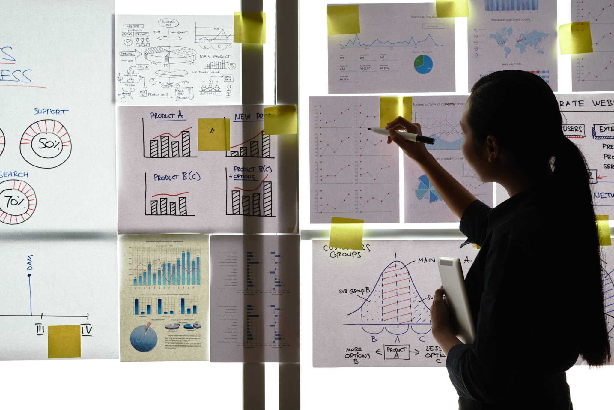
Before designing the full presentation, create a low-fidelity prototype using slide titles, rough sketches, or simple visual placeholders. Talk through the sequence aloud and note where the explanation naturally expands, where transitions feel weak, and which slides can be combined or removed. AI tools can suggest an initial outline or rough slide options, but the presenter still needs to verify the facts, refine the logic, and test the sequence against the actual speaking time. A quick prototype can prevent hours of polishing a deck with the wrong structure.
Assign a target time to each section and note the slides that deserve extra attention. For example: opening 1:30, context 2:00, core 7:30, conclusion 1:30, buffer 2:30. Then check whether the slide sequence matches those priorities. If half the deck belongs to a two-minute context section, the structure is already telling you what to cut.
Present the full deck aloud, using the same screen, notes, and demo flow you expect on the day. PowerPoint includes Rehearse Timings, which records the time spent on individual slides and the total presentation. A simple stopwatch works too; what matters is measuring the real delivery rather than estimating it silently.
If the rehearsal takes 18 minutes, the first response should not be to speak 20% faster. Faster delivery usually reduces emphasis and gives the audience less time to interpret the slides. First remove repeated examples, combine overlapping points, simplify dense visuals, or move supporting detail to backup slides.
Not every slide has to be essential to the live path. Identify one or two slides that can be skipped without breaking the logic if time is lost. Keep technical detail, extra proof, and deeper calculations in backup slides for questions. This creates flexibility without forcing the core narrative to carry every possible answer.
Delivery matters as well. Strong body language in public speaking should support the pacing rather than introduce rushed movement or constant screen-checking.
Most timing problems begin before rehearsal. They come from treating slide count as a target, packing too much into the core story, or leaving no room for normal delivery friction.
A title slide, a transition, a detailed chart, and a closing screen do not require the same amount of time. Giving each slide exactly one minute can rush important evidence while leaving simple visuals on screen for too long. Build the timing map around the role and complexity of each slide.
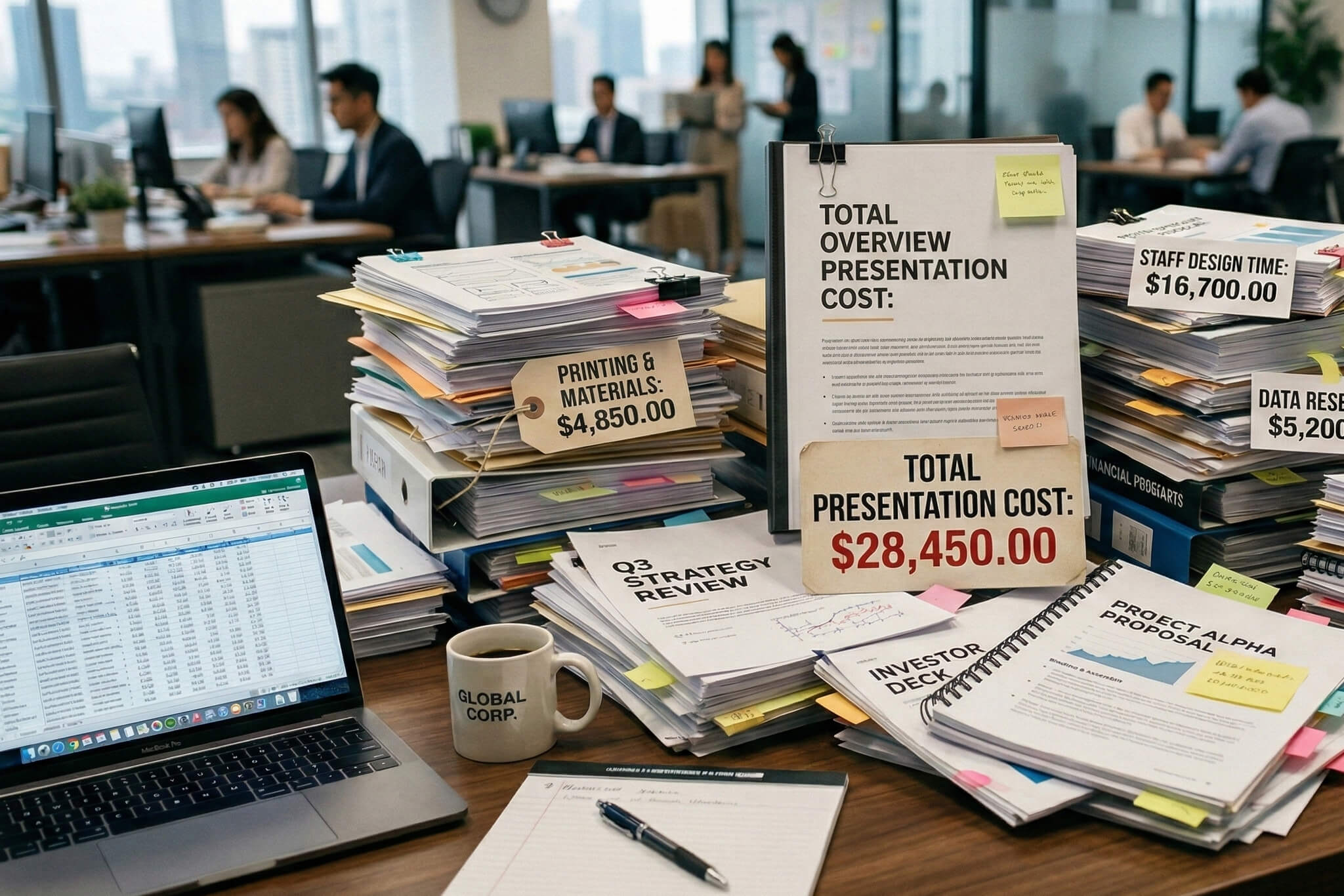
Too much information can appear as too many slides, too much content on each slide, or both. Do not solve an overloaded deck by reading faster. Remove material that does not change the audience’s understanding or decision, and give important slides enough time to work.
A presentation that only fits in rehearsal under ideal conditions is fragile. Leave room for a pause, a slow slide change, an interruption, a question, or a technical delay. The final minutes should feel controlled, not like a race to reach the closing slide.
A strong 15-minute presentation gives every important idea enough time to land. Use 10–15 slides as an initial range, then let the narrative, content density, and rehearsal determine the final number.


Yes. Fifteen slides can work well for a 15-minute presentation when the deck contains a mix of standard content slides and faster visual or transition screens. Do not assume that every slide deserves exactly one minute. If several slides are data-heavy or the session includes discussion, fewer than 15 may be better.
Not automatically, but 20 slides require an average pace of 45 seconds per slide before accounting for pauses, questions, or demos. That can work for a highly visual sequence, but it is usually too fast for 20 dense business slides. If the deck contains substantial charts, explanations, or discussion points, reduce the count.
If Q&A is part of the 15-minute slot, reserve roughly two to three minutes unless the event specifies another format. That leaves about 12–13 minutes for the planned presentation. For interactive sales or executive meetings, questions may happen throughout, so build an even smaller essential deck and keep detail in backup slides.
Use the content as the guide. Data-heavy slides often need around 90–120 seconds, standard content slides around 60–90 seconds, and simple visual or transition slides around 15–30 seconds. These are planning ranges, not performance rules. Rehearsal should determine the final timing.
Yes, they count as slides in the file, but they do not need the same dwell time as a content slide. A title slide may be visible for only a few seconds, a transition slide may simply mark a new section, and a Q&A slide may remain on screen while the conversation continues. This is another reason raw slide count is less useful than a timing map.


867 BOYLSTON ST
BOSTON, MA 02116


