


.avif)

.avif)
.avif)


Get a guide to creating pitch decks presentation


.png)

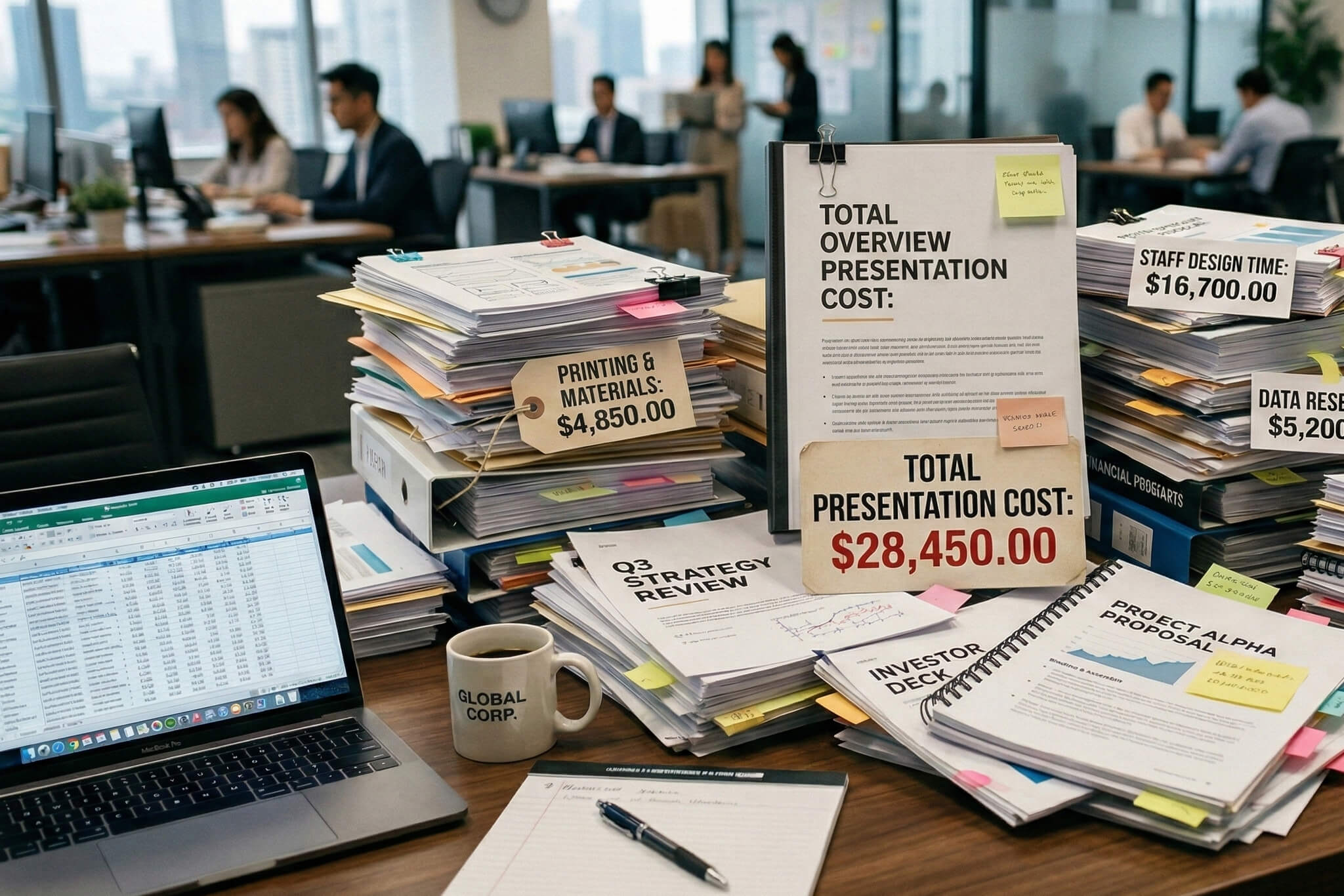
We’ve all suffered through it: death by PowerPoint. A wall of text and a missing storyline – a recipe for glazed-over eyes and lost opportunities. But that doesn’t have to be the case.
A good PowerPoint presentation, however, is a tool designed to inspire action. It’s exciting, it motivates, and it takes you from point A to point B without detours.
Knowing how to make a great PPT presentation is about following a process and finding exact ways to push your viewer’s buttons with invisible hacks. This guide provides 20 proven PowerPoint presentation tips to teach you how to create a PowerPoint presentation step by step.
I would change to PowerPoint instead of the abbreviation to avoid saying this (I'm assuming it's a keyword) twice in the same paragraph.
Before you build a great presentation, you need to know why most go wrong. Here are the three most common reasons presentations fail:
PowerPoint is not a Word document. When a slide is crowded with text, you force your audience to choose: read your slides or listen to you. The result? They'll read ahead and tune you out.
Without a narrative, a presentation is just a collection of disconnected facts. Information without a story is forgettable.
Even the most groundbreaking idea can’t overcome poor design. Clashing colors and misaligned elements distract from your message.
Read more advice on PowerPoint presentations below with our step-by-step guide.
The common mistake presenters make is opening PowerPoint and immediately starting to design slides. Don’t. Spend some time beforehand to build a strategic foundation for your deck.
Answer the fundamental question: What is the goal of this presentation? Every decision that follows flows from this answer. Broadly, every presentation has one of three goals:
A single presentation might have elements of all three, but one purpose must be primary.
Effective PowerPoint presentation tips center on one principle: make it about them, not you. Your audience is the hero of the story.
Before you begin, ask yourself:
Tailor your content to answer all your audience’s questions.
Humans are wired for stories, so compile your facts and data into a journey. Every great PowerPoint presentation has a simple, clear arc:
This structure guides your audience, making it easier to remember your message.
Once you have your story, map it out — physically — to see if the logic holds together. This step can save hours of rework later. You can use:
You should be able to read just the slide headlines and have them tell a complete and logical story.
Your audience's attention is highest at the beginning and the end of your presentation. Don’t waste these moments on trivialities like a generic "Thank You" slide.
We all want to know how to make a good PowerPoint presentation design. Just follow a few fundamental rules that ensure your message is seen and not lost in a sea of visual clutter.
Here are designer-approved tips for slides how presentations:
A slide is a billboard, not a document. Adhere to the "one idea per slide" principle.
A simple test: can someone glance at your slide and understand its main point in three seconds? If not, it’s too complicated.

Guide your font choice by legibility. Creative fonts seem appealing, but they often fail when projected at a distance.
.avif)
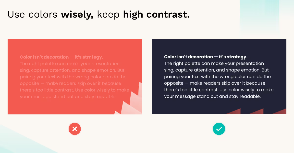
Color’s most important job is to make your content easy to read.
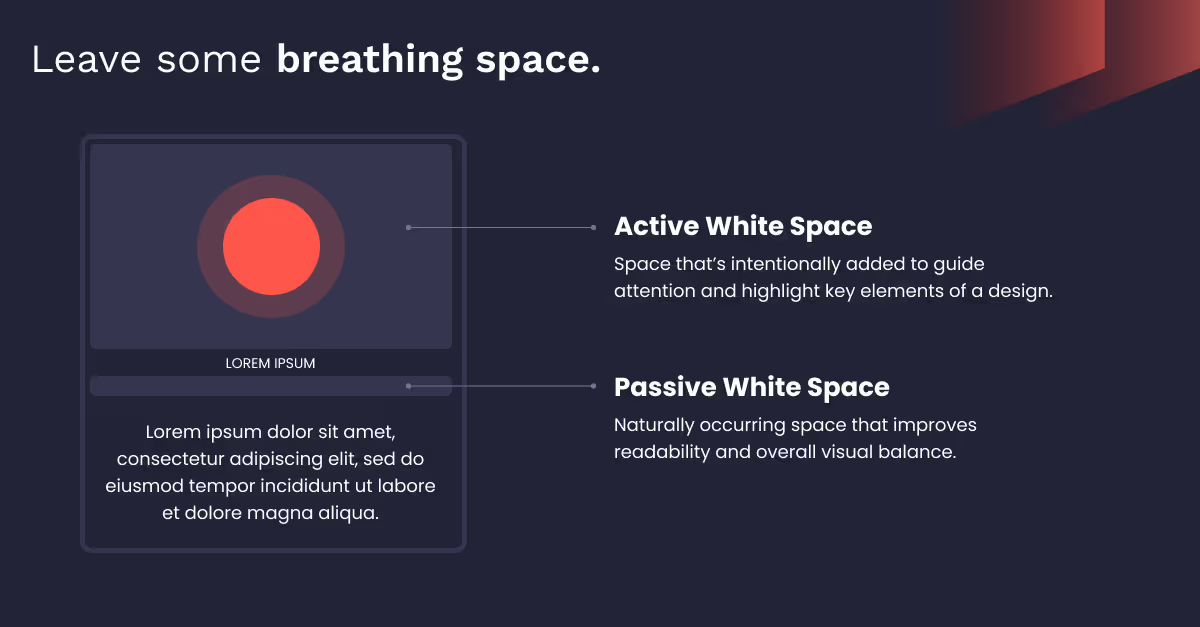
White space (or negative space) is the empty area around the text and visuals on your slide. It’s your friend, since it:
Resist the temptation to fill your slide to the edges. More space creates a confident look.
Centering every element on a slide can become visually monotonous. To create a more dynamic layout, use the rule of thirds, a core principle from photography and art.
Imagine your slide is divided by a 3x3 grid. Instead of placing your main headline or image in the center, put it along one of the grid lines or at one of the four intersection points.
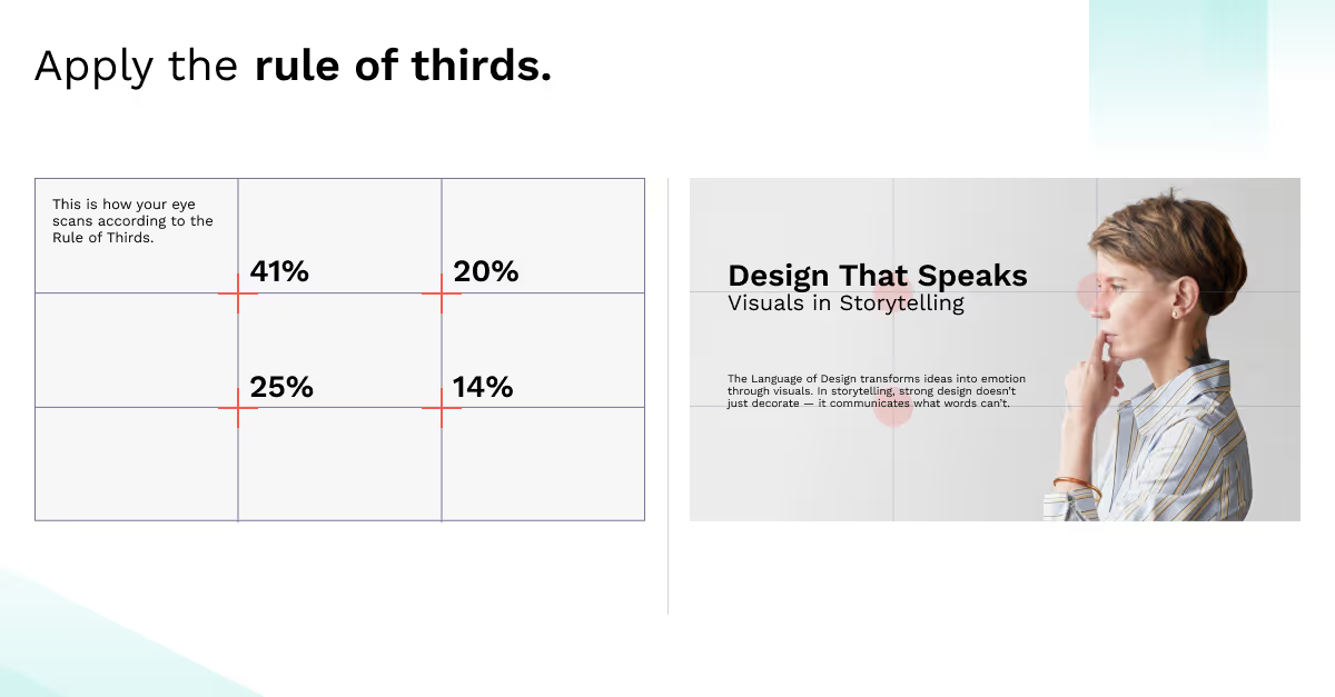
This technique creates a more balanced and interesting composition.
Avoid using text as a crutch and focus on visuals instead to tell your story. Here's how to make better PowerPoint presentations by making your visuals take the lead.
Stop using bullet points. They make you write too much and force your audience to read.
Instead, apply the picture superiority effect: the scientific finding that ideas are better remembered if they are presented as pictures rather than words.
A pixelated image or a cheesy stock photo of a handshake is just bad taste. Your visuals should look good and be relevant.
.avif)
Data is your best argument, but a cluttered chart is just as bad as a wall of text. To make your key message obvious, eliminate any visual elements that don’t add new information.
.avif)
A presentation where every slide looks different makes your work look sloppy. If you’re wondering how to build PowerPoint professionally and consistently, the solution is PowerPoint’s Slide Master feature.
Found under the "View" tab, it’s a master template that controls the formatting for your entire deck. Set your fonts, colors, and logo placement there, and every new slide you create will automatically be consistent.
.avif)
Perfect alignment is a small detail that makes a massive difference. You don't need to do this by eye. PowerPoint has built-in tools:
.avif)
Motion, when used correctly, can help engage your audience. But "correctly" is the operative word.
Make the motion so subtle that the audience feels its effect without noticing it.
A short, well-produced video can be a dynamic and engaging way to break up a presentation and show, rather than just tell.
Keep these best practices in mind:
Inject energy into a presentation by turning it into a two-way dialogue with interactive tools like Slido or Mentimeter.
You can insert interactive slides into your deck to:
Now that you know how to make a great PPT presentation, remember to prepare the technology and rehearse your delivery.
Your laptop screen is not a reliable preview. A check on the actual presentation equipment helps avoid embarrassing technical failures.
Confidence on stage comes from practice. The goal of rehearsal is not to memorize your material, but rather to get comfortable speaking about it conversationally and authoritatively.
A few mistakes can undermine even a great PowerPoint presentation. Acknowledging the threat is the first step to avoiding these slips.
It makes you redundant. Your slides should be visual cues, not a script.
No flying, spinning, or bouncing text has ever driven an investment.
Include less of what you find interesting, more of what the audience needs to know.
Stick to the “5 P’s rule”: — “Proper preparation prevents poor presentation.”
By following the tips above, you'll learn how to make better PowerPoint presentations. Ones that take your audience on a visual journey, transforming questions into action with an engaging and strategically designed experience.
However, applying the principles in practice requires expertise. When you're preparing a presentation where the stakes are high, expert support can be the difference-maker.
At Whitepage.studio, we craft narratives that help secure millions in investments. We partner with businesses to create fundraising pitches, sales decks, and executive presentations that drive results.
Have any questions about presentation design? Contact us, and let's build the slides your vision deserves.
The 10/20/30 rule is a framework: 10 slides, 20 minutes, 30-point font. It ensures brevity, impactfulness, and readability of the deck.
There’s no one “right” number. Focus on the "one idea per slide" principle: it’s always better to have more slides that are simple and clear, than fewer, cluttered and complex ones.
Choose clean, sans-serif fonts. You can’t go wrong with Helvetica, Arial, or Calibri.
The Problem slide is arguably the most important. If you fail to convince an investor that you are solving a massive problem, your solution becomes irrelevant.


867 BOYLSTON ST
BOSTON, MA 02116


