


.avif)

.avif)
.avif)


Get a guide to creating pitch decks presentation


.png)

Great presentation design is all about the effectiveness of your slides, and font size provides clarity and attention control. The correct usage of font sizes is grounded in two core principles.
Presentation expert Nancy Duarte established that your audience should be able to get the main point of a slide in three seconds. Think of a billboard on the highway. If the message isn’t legible, it fails.
The human brain has limited processing power. When a slide is cluttered with small text, our brain works hard to decode the words. This leaves no mental capacity for remembering the speaker’s actual message.
The shortest answer is: the ideal font size for PPT body text is 24 points and up. This ensures legibility for everyone, even in the back row. However, the actual font size depends on the font itself, slide layout, presentation settings, and how much visual hierarchy you build into the design.
General recommendations don’t replace good design judgment – but they give you a safe, proven baseline. When you follow them, you reduce the risk of unreadable slides, distracted audiences, and missed messages, and you create a strong foundation you can adapt to your specific context. Below, you will find the “safe” font size ranges for presentation design of any type.
For any standard presentation font size, use these ranges to ensure clarity and a professional look.
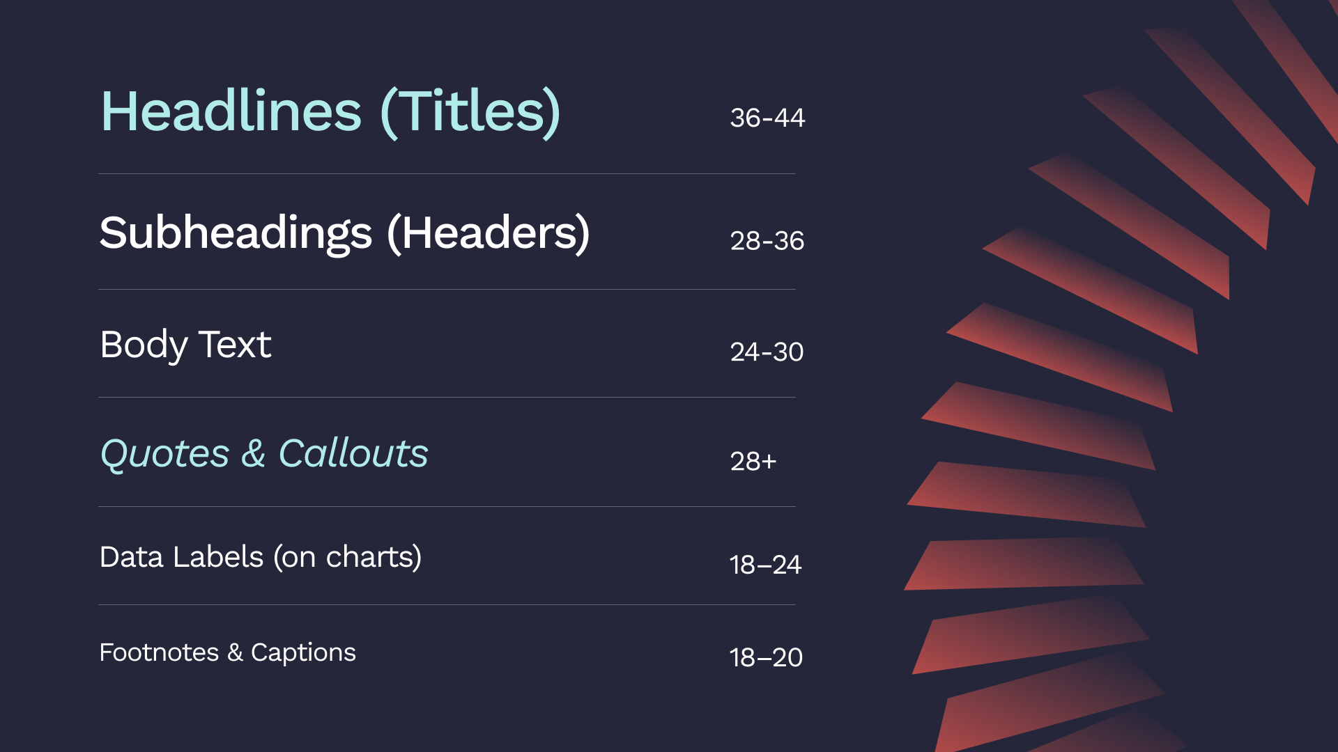
A great presentation uses a visual hierarchy to guide the reader’s eye to the crucial information first. Crafted and proven by top experts, hierarchy sticks to these sizes:
Size: 36–44 pt
This is your slide’s billboard. Its only job is to communicate the core idea of the slide instantly. It must be the largest and most dominant text element.
Size: 28–36 pt
Headers are the signposts of your presentation. They break up content and provide a structure, helping your audience know where they are in your narrative. Headers must be visibly smaller than headlines but larger than body text.
Size: 24–30 pt
This is the standard font size for PowerPoint presentation text. We’ve established that 24 pt is the absolute minimum. A 30 pt font, the size recommended in Guy Kawasaki’s famous 10/20/30 rule, is the gold standard for readability.
Size: 18–20 pt
Source citations, chart labels, and photo captions must be readable but not distracting. Avoid "whisper text" – the tiny 10- or 12-point font that presenters use for disclaimers. If information is important enough to be on the slide, it must be legible.
The right font size depends on the job your presentation needs to do. A keynote in a ballroom has a different goal than a sales deck in a boardroom. Design choices – such as layout, spacing, and visual hierarchy – play a crucial role in how font size works in each case.
Below are specific, practical examples showing how font size should adapt to different presentation contexts and use cases.
This is the default professional setting these days: a small group in a room, and a shared screen. The goal isn’t performance – it’s clarity and alignment. Slides are presented there to support discussion, highlight key points, and keep everyone on the same page.
In this context, font size should prioritize comfortable reading at close distance while maintaining clear hierarchy, so the slide guides the conversation rather than dominating it.
The font sizes above are your blueprint. They balance glanceability with data legibility.
This is the "big stage" model a la TED Talk. Think of a large room, a distant audience, and the presenter in the spotlight.
The slides are a visual backdrop here, not a script. In this case, the ideal font size for PPT is whatever is large enough to be absorbed instantly.
In this case, regardless of the setup, the primary goal is information retention. That makes visual hierarchy critical. Larger, clearly defined headings help learners quickly identify key concepts, while consistent subheadings and readable body text reduce cognitive load and make information easier to process and remember.
When font sizes are used deliberately, slides guide attention, reinforce structure, and support comprehension – allowing the audience to focus on understanding the material rather than struggling to read it.
These "slidedocs" are documents designed for on-screen reading, not live presentations.
The rules of glanceability do not apply here and are replaced by the rules of on-screen reading. This is the example of a context where a font size for PowerPoint presentation text can (and should) be smaller.
Your environment can override all other rules.
For the live presentations, the back-row problem is real. The larger the room and the more distant your audience, the bigger your fonts need to be.
For online events, the challenge is the virtual presentation trap. Your audience isn’t seeing your slide full-screen, but in a small content window, surrounded by chat boxes. 30-point standard font size for PPT is a safer bet here, as it survives the shrink.
These are the simple rules that separate professional slides from amateur ones.
Put your laptop on a table, switch to presentation mode, and stand 6-10 feet away. If you have to squint, your font is too small.
Your main headline should be the same size on every slide. Your body text should be the same size. Your footnotes should be the same size. You get the idea…
Use the Slide Master in PowerPoint to set your sizes, and they'll be correct everywhere.
Older presentation guides might tell you that 16 or 18 points is acceptable. That advice is outdated and fails in the real world. For any live presentation, in-person or virtual, the minimum is 24 points.
Using five different font sizes on one slide creates visual chaos. Use no more than three distinct sizes on a single slide: a title, a subtitle, and body text.
The font you choose is as important as its size. A complex font can be unreadable even at 30 points.
Fonts like Helvetica and Calibri were designed for on-screen clarity. Their clean lines are easy to read from a distance.
Serif fonts (like Times New Roman) are for print. Using them in a presentation looks dated and makes your text harder to read.
To ensure your presentation looks the same on every computer, use "bulletproof" system fonts like Arial or Roboto.
To choose the right typeface, see our ultimate guide for using fonts in decks.
Theory is one thing. Seeing the difference is another. Here are two examples of the font size use in context.
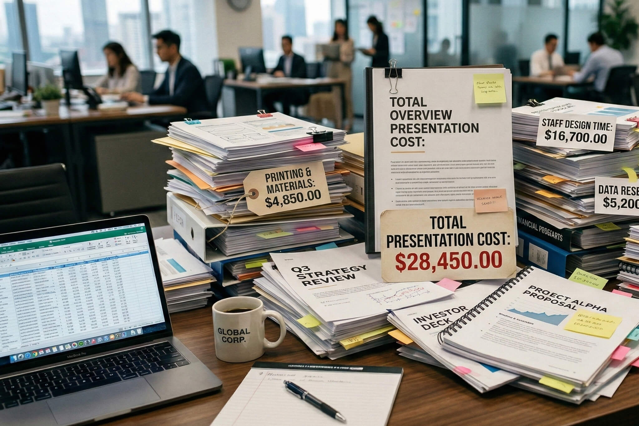
As font size decreases, cognitive load increases: the audience spends energy deciphering text rather than processing the idea. The result is a wall of text that competes with the presenter instead of supporting them.
As a result, a slide above is crammed with bullet points in a tiny 12-pt and the font fails the “glance test”, forcing the audience to read instead of listen. Small font sizes demand focused, line-by-line reading, which slows comprehension and pulls attention away from the speaker.
The same idea is presented with a clear 40-pt headline, supporting headers in 28 pt, and body text in 24 pt. Font size creates a visual hierarchy that tells the audience what matters most and in what order to read the slide. The eye lands on the headline first, grasps the core message in seconds, and only then moves to supporting details if needed.
As a result, the slide passes the “glance test,” is instantly understandable, and keeps the audience’s attention on the speaker – not the text
Here are two real-world tests to ensure your slides are readable.
1. The 6-Foot Test
This simulates a real viewing distance. Put your laptop in presentation mode, place it on a desk, and take two large steps back (about 6 feet).
Can you read every word on the slide easily? If you have to lean in or squint, your font is too small.
2. The Squint Test
This tests your visual hierarchy. Look at your slide and squint your eyes until the text blurs into simple blocks.
Your headline should pop as the dominant element. Your body text should recede. If a logo or an image is more prominent than your main message, your hierarchy should be fixed.
When in doubt, use these rules. They work every time.
Getting these details right takes expertise. This is especially important when a critical deal or funding round is on the line.
At Whitepage.studio, we help founders and businesses to turn their ideas into powerful visual stories. We ensure every detail, from the narrative structure to the presentation font size, works to persuade and inspire action.
If you need a professional presentation design that commands attention and gets results, we can help.


For any live presentation where you are speaking, the body text must be a minimum of 24 points. The standard font size for PPT in virtual (Zoom/Teams) presentations should be 30 points. For a document or "leave-behind" designed to be read on a personal screen, you can use smaller, more text-friendly sizes like 14-20 points.
One. The best practice is to choose one robust font family (like Roboto) and create hierarchy using its different weights (e.g., Black for headlines, Regular for body text).
Yes. The standard font size for PPT in a virtual setting should be 30 points.
All axis labels, legends, and data labels must be a minimum of 18 points, with 20-24 points being ideal.
Clear, simple, sans-serif fonts like Arial and Helvetica and especially Verdana are always the best choice.


867 BOYLSTON ST
BOSTON, MA 02116


