


.avif)

.avif)
.avif)


Get a guide to creating pitch decks presentation


.png)

Picture this: you’ve spent months building a product you believe in. Now you’re standing before investors, buyers, or strategic partners with one shot to prove your vision isn’t just compelling – it’s inevitable. Your presentation doesn’t just introduce a product; it shapes whether stakeholders believe in your ability to execute.
Consider the Dyson Zone (2022), which remains one of the most discussed product launches in recent years. Dyson’s first wearable technology combined high-fidelity audio with personal air purification – defying every headphone market convention. Tech journalists created millions in earned media coverage without traditional advertising because Dyson positioned it as a scientific breakthrough, not a fashion accessory. As for Dyson itself, it moved their brand into the "Luxury Wearable" space and proved they weren't just a "vacuum company" but a brand that could apply airflow and filtration technology to entirely new categories.
Source: Dyson Youtube Channel
That’s what great product launch presentations accomplish. They don’t just inform – they reframe how stakeholders understand both the problem and your unique position to solve it. Whether you’re launching to secure funding, acquire enterprise customers, or build partnership momentum, your presentation becomes the lens through which every subsequent interaction is filtered. In this guide, you'll learn the secrets of effective product launch presentation: the essential structure, narrative architecture, and stakeholder psychology that defined the final look of your deck.
A product launch presentation is an external-facing narrative designed to create belief, demonstrate market fit, and trigger specific action – whether investment, direct purchase, or partnership. What distinguishes it from other business presentations is versatile adaptability: the same product requires fundamentally different narratives depending on audience, industry context, and strategic goals.
For instance, for investors, the launch presentation emphasizes execution velocity and market opportunity. For partnership prospects, it highlights complementary value and mutual customer benefit. For customers, it focuses on pain-point solutions and demos. For internal teams, it aligns on rollout plans. All demand concise storytelling and engaging visuals.
The trap many founders fall into: trying to deliver everything at once. This approach risks overwhelming audiences with excessive information or overloading internal teams with constant slide edits. At the same time, the audience thinks differently: short-form video and visual storytelling (like that used in Apple or Dyson keynotes) currently deliver the highest ROI for product awareness (Hubspot). From a professional designer's perspective, most founders misunderstand what visual design does in a launch presentation. It's not decoration – it's cognitive architecture.
Here's what actually makes a product launch presentation successful:
- Stakeholder fit;
- Clear structure;
- Visual language.
Le's dive into each aspect of product launch presentation.
Different stakeholders evaluate your product launch presentation differently. While the essence of your product doesn't change, each stakeholder groups is seeking for a different information product launch assets:
Depending on target audience, product launch presentations take different forms depending on your audience and objective. Recognizing these distinctions helps you match format to strategic intent.
This is a high-production, high-stakes event meant to inspire the general public, media, and loyal fans. Format: live-streamed stage event or high-end pre-recorded video. Visual style: extremely minimal slides with large images, one-word headlines, and cinematic videos. The speaker is the focal point.
Elon Musk’s Model 3 launch is the perfect modern study in The Keynote format. It uses high-production drama to turn a commodity (a car) into an object of obsession. He saves the $35,000 price tag for the very end, causing the crowd to erupt, followed immediately by the "Pre-order now" call to action.
Key components:
- The Big Reveal (a dramatic moment where the product is physically shown for the first time);
- The Live Demo (showing the product working in real-time – the riskier it looks, the more impressive it is);
- Price and Availability (saved for the very end to maximize the “I want it“ feeling before revealing the cost).
When launching a product to secure funding or report to a board, the focus shifts from cool factor to market viability. Format: a slide deck delivered in a boardroom or via private Zoom call. Visual style: data-heavy, with graphs, charts, and competitive matrices more important than cinematic B-roll.
AirBnB is a "gold standard" used in business schools to teach the Investor Pitch. It is the antithesis of a flashy keynote; it is built to prove that a weird idea (sleeping on a stranger's floor) is a viable business.
Key components:
- Market Opportunity (proving there are enough people who will actually buy this),
- The Business Model (exactly how the product will make money)
- The Roadmap (what happens after launch and how the product evolves over the next 18 months).
This is used for internal teams or potential B2B clients who need to know how to actually use or sell the product. Format: interactive workshops, webinars, or lunch-and-learns. Visual style: feature-focused with lists of specifications, how-to screenshots, and comparison tables.
Slack is the master of The Practical Style. When they launch new features (like "Canvas" or "Huddles"), they don't just do a keynote; they release deeply practical, "how-to" focused sessions for B2B admins.
Key components:
- The Value Proposition (a clear elevator pitch for sales teams to memorize);
- Objection Handling (a section dedicated to answering common customer doubts or comparing against specific competitors);
- Case Studies/Testimonials (social proof from beta testers or early adopters).
Regardless of format, most successful launches follow this storyboard: The Hook (identifying the current, broken way people are doing things), The Reveal (introducing the product as the hero), The 3 Pillars (highlighting the three most important features), The Proof (a demo, video, or customer testimonial), The Differentiator (a “Why Us?“ slide showing why competitors fail where you succeed), The Logistics (price, launch date, and where to buy), and The Call to Action (pre-order now, sign up for the beta, or download the app).
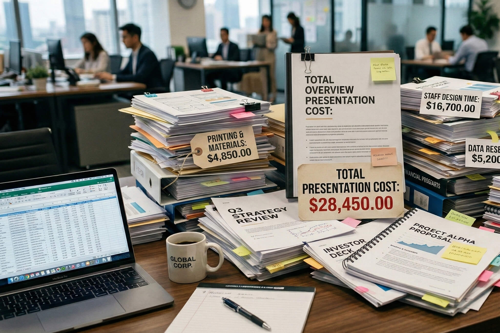
However, in the high-stakes arena of product marketing, a launch is more than an announcement—it’s a performance. Whether you are a seed-stage startup or a Fortune 500 incumbent, the difference between a market "thud" and a viral "boom" often comes down to narrative structure. According to Harvard Business School, approximately 95% of new products fail, and many of those failures aren't due to poor engineering, but poor storytelling.
To break into the successful 5%, savvy leaders utilize a "Battle-Tested Storyboard" that transforms a product pitch into a movement.
Every great launch begins by identifying the "villain": the inefficient, expensive, or broken way customers currently operate. By highlighting the friction in the status quo, you create an immediate emotional connection. For instance, when Salesforce launched, their hook wasn't "great software"; it was the "End of Software," attacking the bloat and cost of traditional on-premise installations.
Once the pain is felt, enter The Reveal. This is the "Hero" moment where your product is positioned as the definitive solution. However, avoid the "feature creep" trap. Data suggests that consumers lose focus after three main points. Use The 3 Pillars to categorize your value proposition into digestible buckets—typically speed, cost-efficiency, and user experience.
In a B2B environment, The Proof is your most valuable currency. A study by Nielsen found that 92% of consumers trust earned media and testimonials more than any other form of advertising. Whether it’s a high-fidelity demo or a testimonial from a Beta partner (e.g., "Company X reduced churn by 20% in 30 days"), social proof bridges the gap between a promise and a reality.
Market saturation is a reality. The Differentiator is where you draw a line in the sand. This isn't just about being better; it’s about being different.
Precision kills hesitation. The Logistics must provide a frictionless path to purchase: clear pricing, a definitive launch date, and accessible channels. Finally, The CTA converts the excitement you’ve built into measurable data. High-performing CTAs often use "scarcity" or "exclusivity"—think of the early days of Gmail or Clubhouse, where "request an invite" created a psychological "fear of missing out" (FOMO) that fueled exponential growth.
From a professional designer’s perspective, most founders misunderstand what visual design does in a launch presentation. It’s not decoration – it’s cognitive architecture. Here’s what actually drives conversion:
Investors and customers make snap judgments about credibility based on visual hierarchy. If they can’t identify the most important element on a slide within 3 seconds, your design outline has failed. Use size, color contrast, and white space to create unmistakable focal points. A common mistake: treating all text equally, creating walls of uniform content that demand cognitive effort to parse.
The 2026 aesthetic shift reflects stakeholder psychology: minimalism now signals generic SaaS sameness. Dynamic maximalism – bold typography, vibrant color contrast, purposeful animation – cuts through the noise in hybrid presentation environments where attention is fragmented. This doesn’t mean cluttered; it means confident. Use dark backgrounds with high-contrast text for remote viewing. Ensure type is readable at 14-point minimum for accessibility.
If you're creating an investor pitch or a sales deck, modern B2B buyers or investors expect software-style self-serve clarity. Hiding pricing in your launch deck signals complexity or uncertainty. The new standard: show entry-level pricing, explain expansion economics, and include a unit economics snapshot showing LTV exceeds 3x CAC with payback under 12 months. Transparency builds credibility; vagueness creates friction.
These design principles separate professional presentations from amateur attempts:
Use dark backgrounds (navy, charcoal, true black) with high-contrast text for hybrid presentations. Light backgrounds wash out on screens and projectors (be mindful for color blind presentations as well). Your primary brand color should appear in strategic moments – CTAs, key metrics, founder highlights – not everywhere. Limit your palette to 3-4 colors maximum. Ensure text meets WCAG AA contrast standards (4.5:1 minimum) for accessibility and remote viewing clarity.
Establish clear font hierarchy: headlines at 36-48pt, body text at 18-24pt minimum. Anything smaller is invisible in conference rooms or on Zoom. Use one typeface family with weight variation (light, regular, bold) rather than mixing fonts. Sans-serif fonts (Inter, Helvetica, Arial) work better than serifs for presentations. Never use more than three text sizes per slide.
Empty space isn’t wasted space – it’s emphasis. The less you put on a slide, the more important each element becomes. Aim for 40-50% white space on most slides. If a slide feels crowded, split it into two slides. Investors and buyers interpret generous white space as confidence; cramped slides signal desperation to justify yourself.
Charts should tell a story at a glance. Remove gridlines, legends, and excessive labels. Highlight the key data point in your brand color; gray out supporting context. Never use 3D charts or pie charts with more than 3 segments. For growth metrics, show trajectory with minimal axis notation. The insight should be obvious within 3 seconds.
Use animation sparingly to reveal information progressively, not to entertain. Builds (sequential reveals) work for complex diagrams. Transitions between slides should be instant or simple fades – anything else distracts. Screen-recorded product demos beat animated mockups because they show real functionality. Keep any embedded video under 20 seconds unless it’s a core demo.
The physical or virtual environment where you present fundamentally affects design decisions. For in-person boardroom settings, prioritize readability from 10+ feet away with minimum 24pt body text and high-contrast color schemes. Conference room projectors often wash out colors, so test your deck on the actual equipment beforehand.
For virtual presentations via Zoom or Teams, dark backgrounds with white or light text reduce eye strain and improve visibility across various screen qualities. Assume attendees are viewing on laptop screens, not large monitors – what looks spacious on your 27-inch display may feel cramped on a 13-inch MacBook.
Hybrid settings demand the most rigorous design standards: your presentation must work equally well projected in a conference room and viewed remotely on mobile devices. This means maximum contrast ratios, generous font sizes, and avoiding intricate details that disappear when compressed for video streaming.
• Traction metrics appear in first 5 slides (if you're working on an investor pitch deck structure)
• Problem statement includes quantified impact, not generic pain
• Product demo is visual (screenshot or video), not text description
• Pricing is transparent with example scenarios if complex
• Unit economics included if fundraising (LTV, CAC, payback period)
• Competitive positioning based on customer feedback, not assumptions
• Call-to-action is specific and actionable, not vague
• Text is readable at 18pt minimum for body, 36pt+ for headlines
• Color contrast meets accessibility standards (4.5:1 minimum)
• Each slide passes the 3-second hierarchy test
• No more than 3-4 colors used throughout the deck
• Charts are labeled clearly with key insights highlighted
• No generic stock photos or overused template elements
• Deck tested on both Mac and Windows if presenting remotely
• Videos embedded properly and compressed for smooth playback
• PDF version prepared for sharing (with clickable links maintained)
• Presenter notes included for key talking points on complex slides
• Backup plan ready if screen-sharing or projection fails
The brutal truth: most product launch presentations fail not because founders lack vision, but because they confuse presentation structure with strategy. Templates provide slide order; they don’t create narrative architecture. Generic designs signal generic thinking. And leading with features instead of validated outcomes creates skepticism before you reach your ask.
The 2026 reality demands more: investors want traction proof early, customers want pricing transparency, and all stakeholders evaluate visual credibility as a proxy for execution capability. If your presentation doesn’t reflect professional storytelling grounded in real metrics, you’re not just losing attention – you’re actively undermining belief in your ability to execute.
This is where specialized presentation design creates measurable impact. The difference between a founder using a template and working with a professional studio isn’t aesthetics – it’s strategic narrative architecture that ties every slide to stakeholder psychology and conversion mechanics.
Whitepage Studio specializes in validation-first product launch presentations for founders who’ve outgrown templates. We don’t just design presentation slides – we architect narratives that connect traction to belief, proving your business works before explaining how it scales. We work with founders at the intersection of validated traction and significant growth inflection – typically Series A fundraising, enterprise market entry, or strategic partnership launches where presentation quality directly affects business outcomes.


Aim for 12-15 slides for investor or partner presentations, maximum 20 for comprehensive customer launches. The presentation should take 15-20 minutes to deliver, leaving time for discussion. Remember: attention spans are shorter in 2026’s hybrid environment. If you can’t make your case in 15 slides, you have a narrative problem, not a slide count problem.
Yes, fundamentally. Pitch decks are due-diligence documents optimized for investor scrutiny – they emphasize unit economics, market mechanics, and financial projections. Launch decks are market-making narratives designed to create belief and trigger action across multiple stakeholder types. Your investor deck might have detailed CAC/LTV analysis across six slides; your launch deck shows unit economics in one slide as proof of sustainability, not the centerpiece.
Absolutely. Pricing transparency is now a trust signal, not a liability. Modern B2B buyers expect self-serve clarity. If your pricing is usage-based or varies by company size, show example scenarios with actual numbers. The only exception: true enterprise deals where pricing is genuinely custom based on complex integrations. Even then, show starting ranges to establish anchors.


867 BOYLSTON ST
BOSTON, MA 02116


