


.avif)

.avif)
.avif)


Get a guide to creating pitch decks presentation


.png)

So, you’re sitting down to craft an amazing corporate presentation, but the screen is blank. Where do you even start? With a little help. Those new to corporate presentations and seasoned pitch deck-builders can benefit from learning all there is to know about corporate presentation design or a quick knowledge top-up.
Your goal is to get it right. And that starts with an effective presentation design that ticks all your audience’s boxes, whether you’re presenting a business plan or the year-end results.
That effective structure combines:
With this guide, you don’t have to worry about feeling overwhelmed. We’ll break down what corporate presentation design actually means and how to effectively apply it. The end result? A corporate presentation that’s sure to achieve your goals.
Now, the essential question is, why does corporate presentation design matter in the first place? This isn’t solely about making things look good, although that is a byproduct. Instead, it boils down to structure. The focus throughout should always be on clarity and consistency.
The ultimate goal of your presentation – your intent – matters, too. For example, something you create for a marketing presentation with the aim of sharing strategies and goals with teams wouldn’t work well as a pitch deck, where your core idea and its potential are the center of attention.
Corporate presentations don’t all fit into a single box. Everything from visuals and detail to structure will vary. At the end of the day, your intent should determine your overall business approach. This use case breakdown will help:
Clarity is absolutely key. When it isn’t a priority, confusion and lack of message retention are almost unavoidable. Here’s how to do a clarity check using the 5-second rule:
Tip: Most corporate audiences scan for meaning on slides rather than reading your PowerPoint line by line, so always keep this in mind.
To create an effective design, you don’t need to be a professional graphic designer or marketer. All you need is a small set of fundamentals that focus on fast understanding, credibility, and decision-making. And these “basics” apply to presentation types across the board.
Never put your PowerPoint presentation together slide by slide. First, you need a plan, which you can think of like a storyboard.
The beginning of the story establishes context and the main purpose. The middle dives deep into the core message by using things like evidence, data, or rationale. The end, as you probably guessed, reinforces key takeaways and defines next steps.
Think back to some of the corporate presentations you’ve attended. Without realizing it, you probably remember the ones that followed a simple principle: one idea = one slide. They didn’t overcomplicate things with too many competing ideas. It’s better to have a few extra slides than to clutter them up.
The 5/5/5 rule is a bit misleading – it’s more of a guideline. To maintain clarity, aim for a max of:
Think of corporate presentations as an extension of your brand. A consistent design signals credibility and professionalism without much effort.
Having different slide visuals is jarring. This distraction will pull viewers away from your message. Don’t pick elements at random. Align your logo usage, color scheme, template, and fonts with your brand guidelines. Haven’t set those yet? It’s time to do it now.
Plus, using a standard layout across multiple presentation aids enhances information retention. The audience knows what to expect and is more able to take in the actual material being presented. This is especially true when you’re presenting multiple times to the same clients or stakeholders.
In reality, standardization should apply across all presenting situations, not just one. This is where you need consistent PowerPoint or Google Slides formatting:
It’s hard to achieve a polished and professional look without incorporating the principles of enough white space and intentional visual hierarchy. Both guide the audience’s eye.
When you have adequate white space between points, you don’t run the risk of slides feeling too crowded or overwhelming.
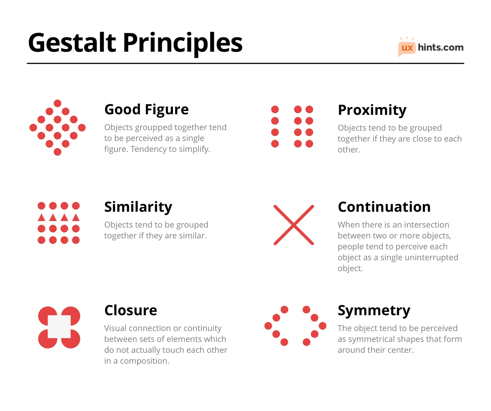
Visual hierarchy, part of the Gestalt psychology principles, explains why viewers instantly understand certain slides, whereas others cause a struggle or confusion. Without even thinking about it, your audience will organize visual information into meaningful patterns. Definitely don’t assume they will process elements one by one. Use this principle as leverage to guide viewers with:
If you’ve ever squinted at a PowerPoint slide in a boardroom, asked someone to “zoom in,” or watched an executive stop listening because a chart was unreadable, you’ve seen what happens when the visuals break down. Here’s your checklist to avoid this kind of breakdown:
While a business plan presentation template will look different than one for a meeting between teams, the above essential elements are valuable.
Don’t think of building corporate slide templates as cheating. They actually provide a practical foundation for building consistent, professional corporate presentations at scale.
You’ll benefit from reduced production time and know your brand guidelines are covered. That way, you can focus on the content and presenting and prevent decision overload from making multiple low-level decisions at once.
Including the following slide types ensures the presentation template supports executive, reporting, proposal, and sales contexts without the need for reformatting.
Do: Minimize any changes to approved brand elements, like fonts, colors, and logo placement.
Don’t: Alter core layout structures unless the slide template needs change across the board.
Result: Corporate presentations are visually aligned while allowing teams to evolve content responsibly over time.
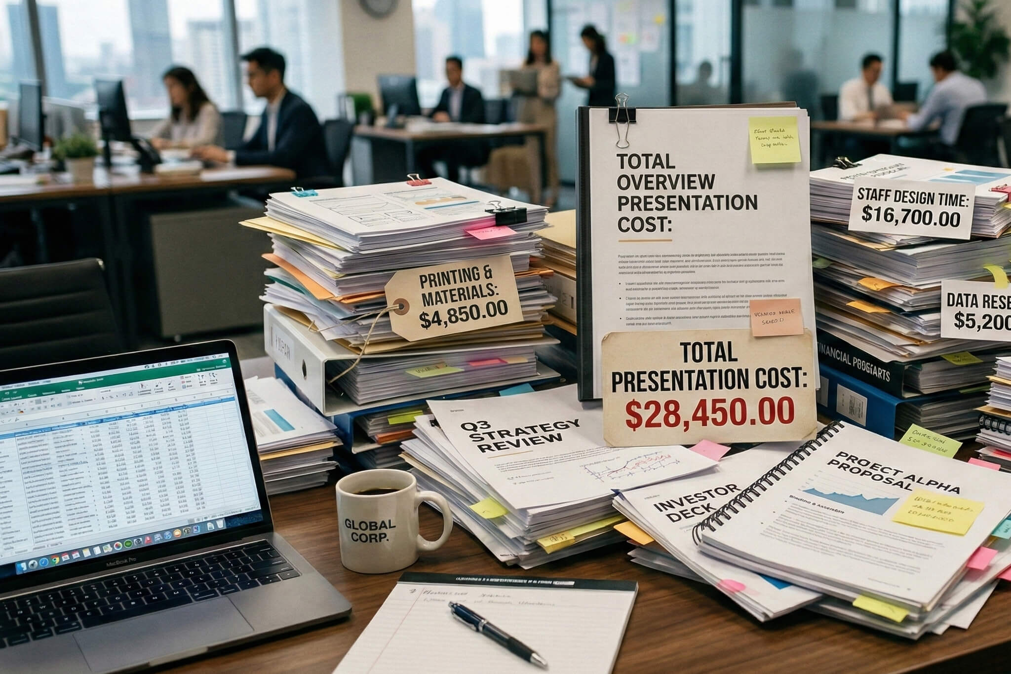
Of course, word choice is important, but it’s not the be-all end-all. Your facts, which help to communicate the core message, need attention as well. Take care in how everything is selected, framed, and displayed. Your priorities? Facts that support understanding, provide proof, and guide decision-making.
Company executives are busy people. Your data should be presented in a way that communicates meaning with a glance (or two). The chart title must be descriptive and results-oriented. For example:
Basically, if the title only describes the chart, it’s not doing its job. A good title states the insight the audience, whether it’s clients or employees, should take away.
Getting the information across is crucial, but doing it with loads of dense tables, large spreadsheets, and confusing information-heavy charts is a mistake.
The reality is that you can’t present everything. Drill down into what matters and simply summarize it. Highlight only what’s most relevant. Leave the rest to an appendix or follow-up email.
Set realistic expectations for your presentation environment. Likely, you won’t have perfect lighting or even the audience in a single location. It’s best to prepare for a hybrid situation, where your corporate presentation design works well in boardrooms, over video calls, and on laptops or mobile screens.
First, you need a good contrast between the text and the background:
Then, you need to ensure the font sizes keep the slides accessible to everyone:

Alt text is another important consideration. Slides that convey ideas and meaning, often charts, images, or icons, benefit from alt text to increase accessibility. It becomes accessible to screen readers and assistive technologies. Keep any alt concise and descriptive. It just needs to describe the purpose of the visual, not the decorative details.
Hybrid-first design means assuming slides will be viewed in less-than-ideal conditions. In boardrooms, slides must be readable from a distance. On video calls, for content to be useful, it has to stay clear when compressed, resized, or viewed on smaller screens. On laptops, tablets, or phones, dense layouts and small text can quickly become unusable. Your priorities should be:
Tip: Don’t place critical information near slide edges where it may be cropped during screen sharing.
Let’s be clear – not every corporate presentation design needs to include these elements. They’re only useful when they complement the presentation's purpose.
Stuck on how to initiate a productive discussion with your audience? That’s when polls, Q&A prompts, or live inputs are useful. In addition to discussion, these elements can also get more audience buy-in to the goal or provide specific company feedback.
Try to limit these interactive components to workshops, internal meetings, or strategic thinking sessions where participation is expected. Leave them out in executive or decision-focused corporate presentations. Discussion can quickly interrupt your flow and dilute your message. Keep interactions simple, strictly timed, and clearly tied to the presentation objective.
Modern animation can help guide attention when used with restraint. Focus on simple transitions, progressive reveals, or emphasis animations. Used selectively, these can highlight key points and control pacing. Don’t go too far, either. Too many (or broad) animations can have an amateurish feel.
Sometimes a corporate presentation is just about information or training with no material consequences. But modern professional design services are more likely to benefit:
Why? High-stakes corporate presentations are more likely to have a high-quality bar and require both precision and a compelling narrative – especially compared to your everyday slides for company meetings.
Need help deciding? In general, templates optimize speed, custom design solves specific company problems, and professional services reduce risk when the stakes are high.
It’s risky to assume that your current team (or even teams) can handle the presentation without considering their available time and ability to maintain quality while tackling complex data or ideas. When you don’t call in the professionals, your presentation may not have the same impact it could, may require constant time-consuming re-work, or may flout your brand guidelines.
At Whitepage, we’re experts in presentation design. Together, we can craft something high-impact and memorable to get the job done – whatever it is.
A full-service presentation design company like Whitepage can help you with all types of projects, from pitch decks to sales presentations. Our assistance can involve:
Book a call with us and let’s talk about corporate presentations that get results.


867 BOYLSTON ST
BOSTON, MA 02116


