






























.avif)

.avif)
.avif)



























Get a guide to creating pitch decks presentation


.png)

These four healthcare pitch deck examples are a teardown, not a template. Use them to figure out which template choices are even worth making for your stage and sub-vertical - the recurring structure is observable across funded decks, but each deck solved the same problems differently.
Healthcare is one of the most-funded technology verticals right now - U.S. digital health alone took in $14.2 billion in 2025 (Rock Health). Healthcare and biotech decks have been a meaningful share of Whitepage Studio's work over twelve years.
U.S. digital health startups raised $14.2 billion in 2025, up 35% from $10.5 billion in 2024, according to Rock Health. That recovery looks encouraging on the surface, but the distribution tells a more specific story: nearly 40% of that capital landed in mega-rounds, and 42% of total funding went to companies working on healthcare workflow and operational tools — clinical documentation, revenue cycle management, care coordination infrastructure.
What this means for your deck: the investor reading the pitch is not waiting to be convinced healthcare is investable. They are waiting to see whether you understand the system well enough to solve a specific piece of it - and whether the deck has already answered the questions they are holding before they ask. That is the bar a generic startup template was never built to clear. (More on that further down, in the pitch deck design methodology section.)
Two pieces of distribution data tell the rest of the story. Nearly 40% of 2025 capital landed in mega-rounds, and 42% of total funding went to healthcare workflow and operational tools - clinical documentation, revenue cycle management, care coordination infrastructure (Rock Health). Medtech tracked another $6.8 billion in venture funding in H1 2025 alone (J.P. Morgan Q2 2025).
So the climate is favorable. The bar to clear it is not.
Flo's Series C deck is the cleanest example in this teardown of a Series C deck doing one job structurally: making the investment thesis obvious before the investor finishes scanning the first three slides.
At Series C the cover slide carries a number, not a tagline. Flo's "1 out of 4 women in the U.S. uses Flo" is the deck; every later slide elaborates that claim. The cover answers the first question a Series C lead is holding before the second slide loads: is this category big enough to deploy $200M into.

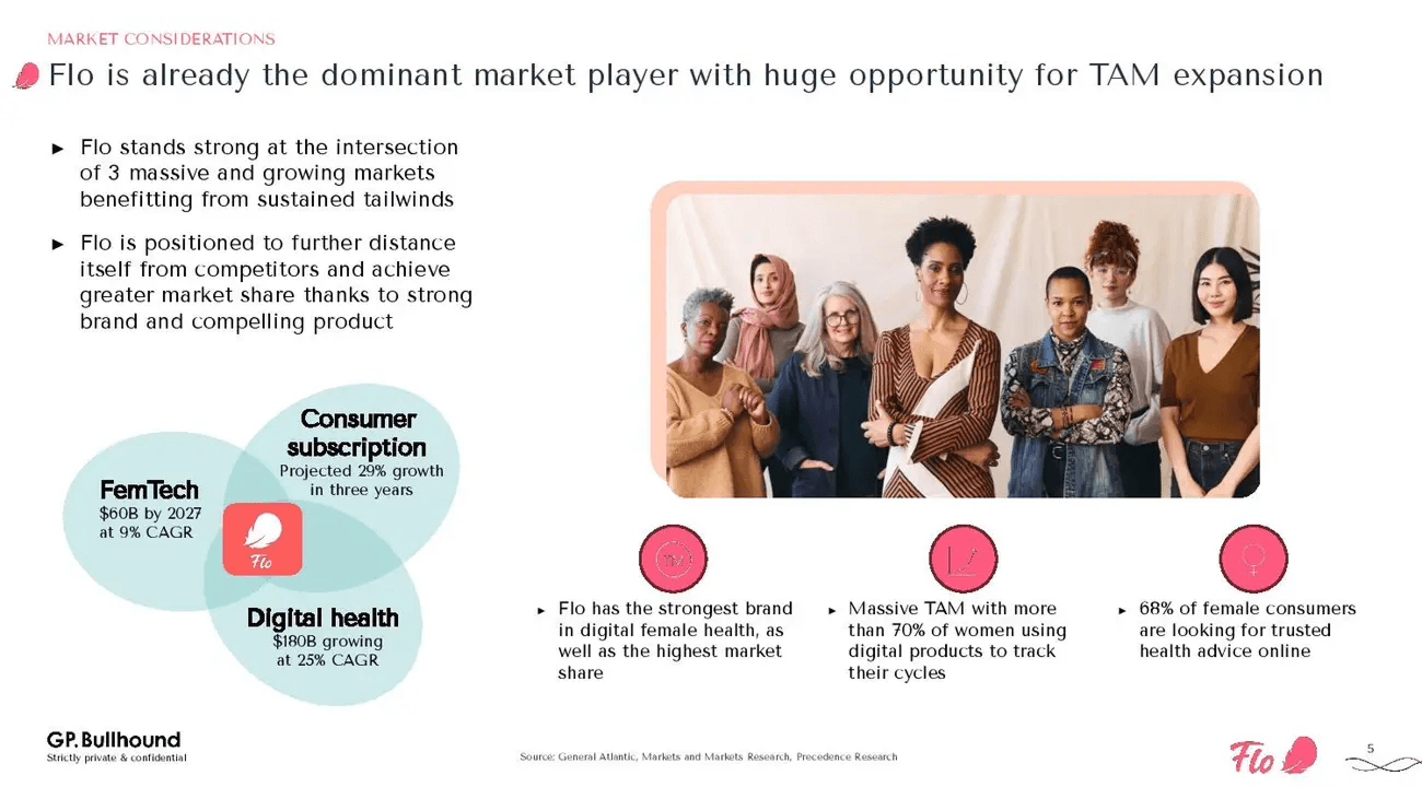
The market slide presents Flo at the intersection of three converging markets, which makes the defensibility argument visible at the overlap without ever labeling it "moat." The slide is doing two jobs at once: market sizing and defensibility.
Flo's defensibility lives in the overlap between three growing categories no single competitor occupies simultaneously. Addresses: is the defensibility durable.
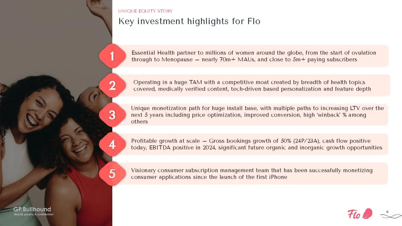
The five-category investment argument becomes a hierarchy when each category gets its own line, bold-led, in this order:
The order is itself the argument. Reordering scale-to-team would change how the slide reads entirely. Addresses: is the economic argument made, or do I have to assemble it from scattered slides.
At Series C, the deck's job is not to introduce the company - it is to make the investment thesis obvious.
The funding climate Rock Health described earlier - mega-rounds concentrating capital, workflow-tools commanding 42% of dollars - explains why the Flo deck reads the way it does. The investor pool funding Series C in 2025 is fewer, larger, and more concerned with the economic argument than the narrative arc. The Flo deck reflects that pool back at itself.
Flo's deck makes the thesis obvious. A pre-seed deck has to build the thesis from scratch, with none of those signals available. The next teardown shows what that looks like.
The Series C versus pre-seed contrast is the organizing idea here. The Flo deck makes the thesis obvious; the Jimini deck has to build the thesis with thin traction and no clinical readout yet. Every structural choice in the Jimini deck is shaped by that constraint.
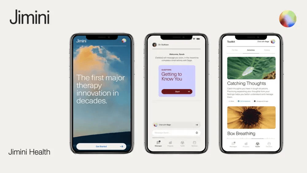
The Jimini cover frames the deck for an investor who has not yet heard the company name. Mental health AI, pre-seed, clinical-first product narrative.
The Jimini problem slide is a research chart showing therapy outcomes have not materially improved in decades. Not a market size number. A clinical-stagnation argument, sourced from published research. The framing tells investors the problem is not simply underserved distribution. It is broken at the product level. Harder problem. More defensible one to own.
The product section uses two consecutive slides to build a clinical proof-of-concept narrative without clinical data.
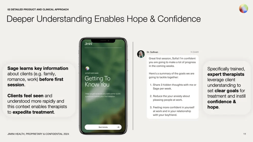
"Deeper Understanding Enables Hope and Confidence" shows how the AI gathers client context before the first therapy session, allowing therapists to set goals faster and with more precision.
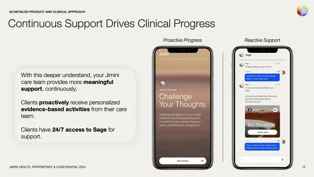
"Continuous Support Drives Clinical Progress" shows the proactive and reactive care model - 24/7 AI access between sessions, alongside provider-led activities.
Read together, the two product slides read like a clinical protocol rather than a consumer-app product spec. That is the move.
The appendix devoted to published science is the most unusual structural choice in the Jimini deck. Four academic studies. Methodology notes. Evidence design.
At pre-seed, an evidence appendix is rarely included. Including it signals to a clinically literate investor that the founders read the literature, not just the market reports. At Series A, where clinical evidence is expected, a long appendix is table stakes. At pre-seed, it lands as discipline.
Founder clinical background does specific trust work in mental health that it does not do in workflow tools or AI infrastructure. Category trust is fragile in mental health - patients and clinicians are choosing whether to put their care relationship inside the product. A founder credentialed in psychiatry, psychology, or clinical research carries a load-bearing trust signal that design polish cannot replace.
When traction is limited, clinical framing and research depth can carry the credibility weight.
a16z's Julie Yoo has noted that seed-stage healthcare investors look for founders with "highly opinionated answers" on why previous approaches failed. The Jimini opening - therapy outcomes flat for decades, evidence appended - is exactly that argument, embedded structurally before the product is introduced. Pre-seed clinical framing can carry weight. It does not guarantee a raise.

The single strongest insight in this article lives in the Hopscotch deck: the payer-wall move. The section weights accordingly.
The Hopscotch problem slide opens with four public-data stats:
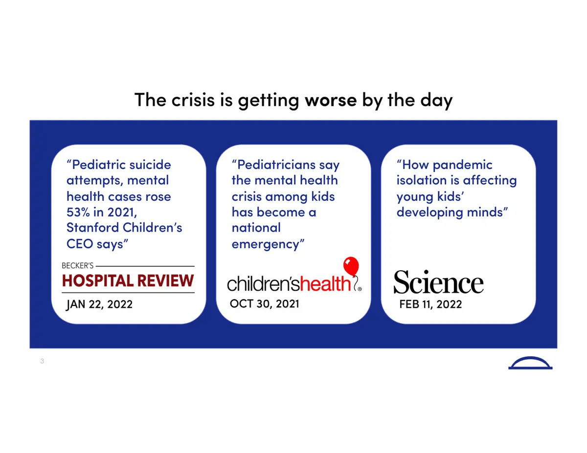
This is followed immediately by a press-coverage slide aggregating headlines from Hospital Review, Children's Health Defense, and Science magazine, titled "The crisis is getting worse by the day." Before Hopscotch introduces itself, the investor has already seen two full slides of external, named evidence. The two-slide problem-proof structure is the Hopscotch deck's signature.
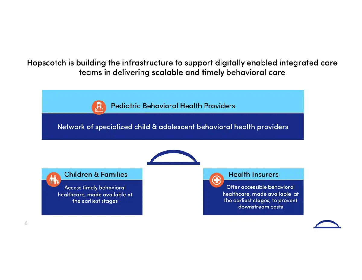
The insight slide delivers the deck's thesis: the answer to the pediatric behavioral health crisis is not more providers. It is better tools that improve the quality of care across the entire family.
The quality-versus-capacity reframe is a defensibility move. Capacity is solved with money - hire more clinicians, expand locations. Quality is solved with product, which is harder to copy and slower to commoditize. Investors price those two stories very differently, and the insight slide is doing the pricing work for them.
The reimbursement slide near the end of the Hopscotch deck completes the answer the insight slide started. The insight slide tells the investor what Hopscotch does for the family. The reimbursement slide tells the investor who is already paying for it.
It shows the logos of eight payers - Aetna, United, Cigna, BlueCross, Oscar, Magellan, Highmark, Empire - negotiated before the Series A round. No explanatory text. No market sizing. Just the logos.
It answers the payment objection before the investor asks it, and it signals operational progress that changes how the rest of the deck reads. In pediatric behavioral health, the reimbursement slide is the company.
External validation does more credibility work than product slides at the seed stage.
One distinction worth naming, because the article risks letting pediatric and adult mental health blur together. Pediatric is a different sub-vertical, not a smaller version of the same one - heavier Medicaid mix on the payer side, a different VC cohort underwriting family-centered care, and clinical-evidence requirements that do not transfer from adult-mental-health deck patterns. A founder with an adult mental health deck in hand should not assume the Hopscotch moves port over without translation.
If a payer wall is achievable before Series A, building it early shifts how the rest of the deck reads. A payer wall exists only because the deals exist; it cannot be invented for a slide.
The key takeaway: external validation does more credibility work than product slides at the seed stage.
A note before this section, because the category description matters for how the rest reads. Crosby Health is an AI infrastructure play for healthcare administrative and clinical-decision workflows, with appeals and revenue recapture as the initial commercial wedge. The ApolloLLM benchmark sitting at the center of the deck is a clinical-grade medical-reasoning benchmark - not a billing benchmark. Founders reading this with their own AI-health deck in hand will notice the difference.
The cover frames the Crosby deck through public-record evidence the investor already recognizes: mainstream news headlines on lawsuits alleging that major insurers used AI to deny medically necessary claims. No explanation. No context slide. The problem is in the public record, and the investor is assumed to know it.

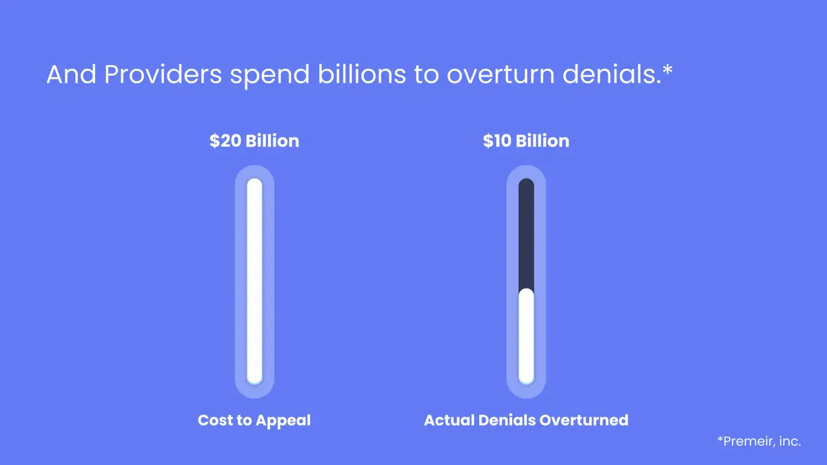
The TAM slide reframes the market as recoverable loss rather than greenfield bet. Providers spend $20 billion appealing denials; only $10 billion is overturned. The $10 billion gap is the market. This is not an abstract TAM/SAM/SOM exercise. It is a recapture opportunity, sized in dollars already being spent and lost.
The clinical LLM benchmark slide is one of the more distinctive technical credibility approaches in recent pre-seed health tech decks. ApolloLLM scores 91.8% on the MedQA Medical Exam Benchmark. Med-PaLM 2 sits at 86.5%. The average medical student lands at 60%.
At pre-seed, a third-party benchmark substitutes for the clinical pilot that does not yet exist. The benchmark is verifiable today - any investor can rerun MedQA. A pilot would take months and would not yet be true. Picking the credibility signal that survives diligence is itself a structural decision.
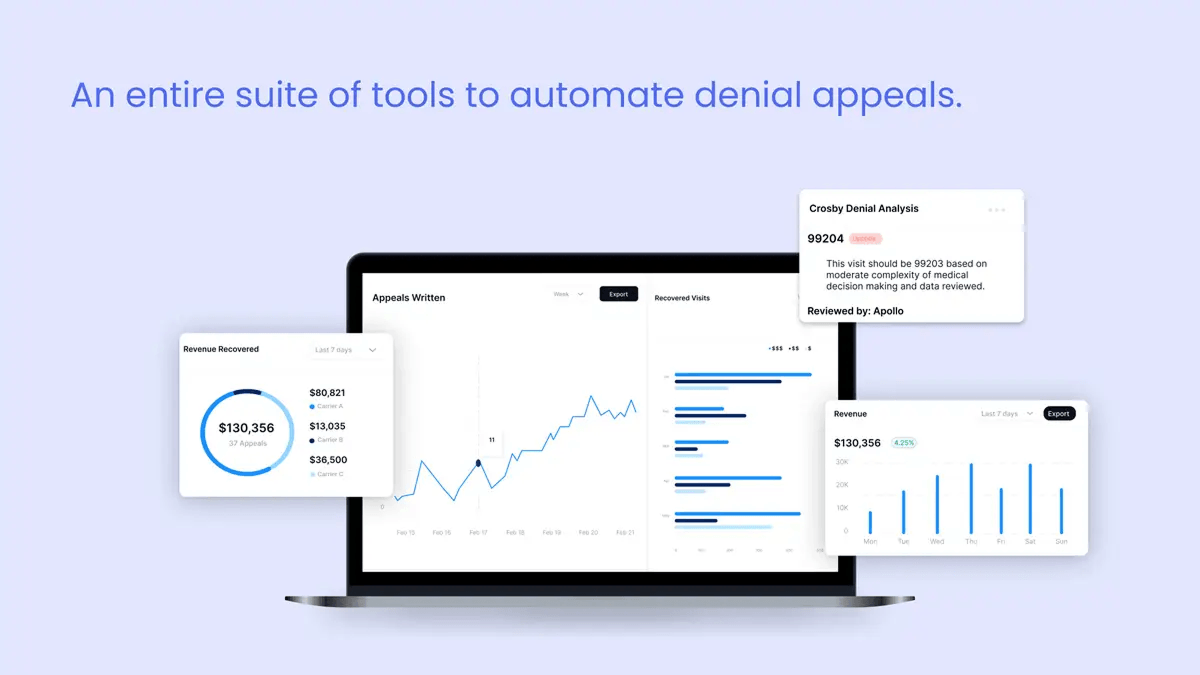
The dashboard slide grounds the technical argument with a screenshot: $130,356 in revenue recovered across 37 appeals in seven days. Concrete, specific, not projected. At pre-seed, that kind of early proof lands differently than a revenue growth curve.
Benchmarks and early revenue screenshots replace traction slides.
For founders building outside the healthcare lane, the same benchmark-over-traction logic shows up across pre-seed AI decks generally - see our AI startup pitch deck structure breakdown for the cross-vertical version.
Crosby's two structural moves - benchmark over pilot, recapture over greenfield - port well to other AI-infrastructure decks (revenue cycle, prior auth, scheduling, claims). The same two moves do not port cleanly to AI-clinical decks, where pilot data and the FDA pathway carry weight a benchmark alone cannot replace. The lane matters. This is the pre-seed version of the same pattern Abridge ($250M Series D) and Suki ($70M Series D) demonstrate at scale.
Four healthcare pitch deck examples. Four stages. Five structural moves show up in each.
The fundraising ask carries more weight when it follows that sequence.
Founders searching "healthcare pitch deck examples" want to know how the decks were designed, not only what they argued. Healthcare decks have a recognizable visual discipline that separates them from generic SaaS decks - and that discipline affects how a clinically literate investor reads the page.
Conservative type. Generous spacing. Clinical neutrality in color. Display fonts and exotic weights read as undercooked to healthcare investors, who associate type discipline with operational maturity. None of the four decks uses more than three brand colors plus a neutral. The Hopscotch deck reads warmer; the Crosby deck reads cooler. Both stay inside the same restrained range. A deck that opens with neon gradients and three display fonts gets read as a consumer product in a category that does not reward consumer aesthetics from investors who price clinical credibility before brand polish.
Benchmark slides, payer walls, and TAM slides each have a different data budget. The Crosby benchmark slide fits one row of comparison: three numbers, three labels, one verdict. The Hopscotch payer wall is one logo grid - no annotations, no parentheticals, no asterisks pointing at footnotes. The Flo market view is three intersecting circles. One structural idea per slide. If a slide needs two diagrams, it is two slides.
All four decks reuse a small set of graphic elements - colored callouts, single-icon headers, a consistent data-viz style. The discipline reads as professionalism. The alternative reads as unfinished. The cover slides across the four decks, lined up at the same scale, show what this looks like in practice: four different design languages, but each one committed to its own choices from page one to page fifteen. That commitment is the design read.
Stock medical photography (the stethoscope on a laptop). Overused medical-blue palettes. Dense clinical text dumps with no visual hierarchy. Doctor-shaking-hands stock photography on the cover. Generic DNA helix renders behind the team slide. A healthcare investor will read any of these as a signal that the founder has not yet thought about what the deck is doing, and the investor will start reading defensively two slides in.
Slides that need three paragraphs of supporting text usually have a narrative problem, not a design problem. Before adding visual complexity, the better question is what the one thing this slide is arguing. If the answer needs more than a sentence, the design work has not started yet. A clinically literate investor will spot a slide that has not been edited inside ten seconds, and the rest of the deck reads through that filter.
The founders who come to us building healthcare decks are almost always the most technically fluent people we work with. The challenge is rarely knowledge. It is translation - taking what you understand at depth and making it legible to someone who has twenty minutes and a portfolio of forty companies. The four decks above solved that translation problem in very different ways, depending on what they had available at their stage. What they shared was a willingness to show the hard thinking had already been done.
Healthcare and biotech decks have been a meaningful share of Whitepage Studio's work over twelve years, and the patterns above are the part of that work that keeps surfacing. Use the four teardowns as a reading frame for your own deck, not as a template to copy from.
Before reusing a generic template, pull your reimbursement logic and your stage-matched credibility signal forward. If the deck cannot make both visible on a single slide each, the deck is not ready.
Book a complimentary consultation - we'll review the slide structure behind your current healthcare deck.


The recurring spine in funded healthcare decks is problem with external evidence, insight, product and workflow fit, validation or evidence plan, regulatory pathway where applicable, reimbursement logic, stage-matched traction, financials, use of funds, and team. The order is observable across funded decks but is not a template - the four teardowns above show four different orderings that each performed for their stage and sub-vertical. Healthcare decks often run 12-15 slides because clinical evidence, regulatory pathway, and reimbursement each earn their own page.
Different investor cohort, different evidence type, different cover staging. Biotech decks read by Flagship, Polaris, or Third Rock anchor on platform and mechanism, with clinical milestones as the primary credibility signal. Digital health decks read by General Catalyst Health Assurance, a16z Bio + Health, or Oak HC/FT anchor on traction and retention, with deployment metrics as the credibility signal. Biotech covers tend to lead with mechanism or asset; digital health covers with penetration or category-leadership. The Flo and Hopscotch teardowns above are digital-health examples of that staging in practice.
The Cover slide does one of three jobs: state a defining number (Flo's "1 in 4 women"), surface external-evidence urgency (Hopscotch's pediatric crisis stats), or signal credibility (Crosby's lawsuit headlines). Clinical data on the cover works at pre-seed when it is the strongest signal the company has - Jimini's therapy-stagnation chart is the example - and rarely lands at later stages. The least effective move at any stage is a cover with only company name and tagline.
Different metric type (clinical milestones versus ARR and cohort retention), different evidence depth (peer-reviewed publications versus growth curves), different team composition (clinical advisors required), and a regulatory-pathway slide with no SaaS analog. Series A is where the divergence is sharpest: a Series A SaaS deck leans on growth curves; a Series A biotech deck leans on Phase I-readiness and IND timeline. For the SaaS side specifically, see our SaaS pitch deck design breakdown.
A three-legged stool: clinical credentials (advisory or in-house), operator experience (commercial, payer, reimbursement), and technical depth. A team with deep clinical knowledge but no operator experience reads as product risk. Strong engineering with no clinical advisors raises adoption risk. At pre-seed, two of three with the third in advisory works; at Series B and beyond, gaps read louder. The founder-credibility point in the Jimini teardown above is the version of this for fragile-trust categories like mental health.


867 BOYLSTON ST
BOSTON, MA 02116


