


.avif)
.avif)
.avif)


Get a guide to creating pitch decks presentation


.png)

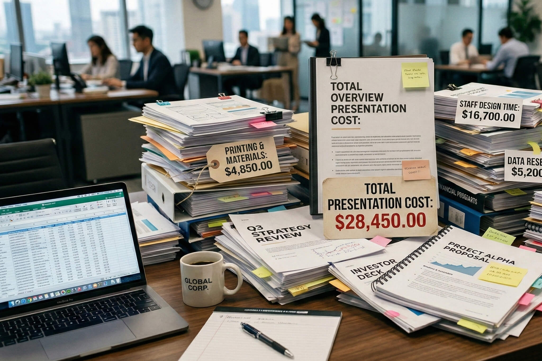
A founder we worked with last year walked into her first call with us carrying a 35-slide deck. Her CFO had done 15 rounds of edits. The content was thorough: financials, product roadmaps, org charts, appendix slides for every possible question. And investors kept passing after slide eight.
She's not unusual. Nearly every founder we talk to at Whitepage asks the same opening question: how many slides should my pitch deck actually be?
The short answer is 10 to 15 slides.
But the more useful answer is about why that number works, and why most decks blow past it.
The most reliable data we have comes from tracking how investors actually behave when they open a deck, not what they say in interviews.
Storydoc's 2026 report, based on over a million presentation sessions, found that decks with exactly 10 slides had the highest completion rate at 32%. That might sound low until you consider the average across all lengths: just 22%. Separate research from Qubit Capital found that decks in the 11–20 slide range were 43% more likely to close funding than shorter or longer alternatives.
So where does that leave you? For most seed round pitch decks and Series A pitch decks, the sweet spot is 10 to 15 slides. Here's how that shifts by stage:
There's a useful concept from IdeaProof's research called the "Magic Slide 4" rule: 82% of investors who make it to slide four will finish the entire deck. But 31% bounce immediately within ten seconds. Your first three slides are doing almost all the qualifying work.

That means frontloading matters more than total count. We've seen founders obsess over whether they should have 12 or 14 slides while their first three slides were walls of text about company history. The problem and solution slides up front do far more heavy lifting than most founders realize.
This depends on whether you're presenting live or sending the deck ahead, and most founders need to do both.
For live pitches, aim for 15–18 minutes of presentation inside a 30-minute meeting. That leaves 12–15 minutes for questions, which is where the real conversation happens. Guy Kawasaki's original 10/20/30 rule: 10 slides, 20 minutes, 30-point font, still holds up well for the in-room context, according to Kruze Consulting's analysis. The 20-minute cap forces discipline.
For emailed decks (which is how most first interactions happen now), the math changes. Investors are reading asynchronously, usually scanning, often on their phones. Storydoc found that 32% of pitch decks are now opened on mobile, where reading time averages 3:27, compared to 4:51 on desktop.
The broader trend is attention compression. Average review time across all formats has dropped to somewhere between 2:14 and 3:44 minutes, depending on the study and the year. KnowYourSocial's analysis found that financials and team slides together consume 46% of total reading time, nearly half the attention budget spent on just two slides.
That's important. If investors are spending two and a half minutes on your deck and half of that goes to team and financials, every other slide is sharing roughly 75 seconds. Be direct. A paragraph of strong visual storytelling will always outperform three paragraphs of text.
One founder on a recent call described the problem perfectly: "It's just super wordy. This is all wordy. It's kind of all about us, us, us, us. Like I don't really think any company particularly cares about our revenue growth per year." She was right.
The pitch duration question isn't really about minutes; it's about earning every second of attention you're given.
After working on over 1,000 decks across pre-seed through Series D, and studying the frameworks from YC, Sequoia, and a16z, here's the pitch deck structure we recommend for most investor decks:
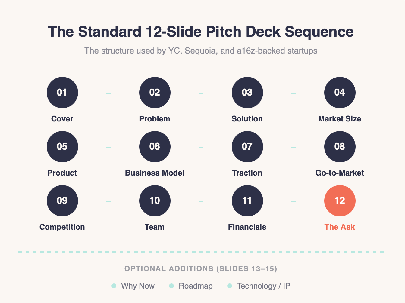
1. Cover / Title: Company name, one-line tagline, your name and contact info. Nothing else.
2. Problem: The pain point you're solving, grounded in one strong statistic or a specific customer scenario. This is where investors decide if the rest is worth reading. We've written extensively about crafting this slide.
3. Solution: What you've built and how it addresses the problem. One clear statement, two or three supporting points. Not a feature list.
4. Market size: TAM, SAM, and SOM — but focus on SOM, the slice you can realistically capture in the next 2–3 years. Investors see inflated TAM numbers constantly. Our market size slide guide covers this in depth.
5. Product: Screenshots, a brief demo flow, or a clear visual of how the product works. Show, don't describe.
6. Business model: How you make money. "$99 per seat per month" beats "SaaS model" every time. Specificity signals that you've thought through unit economics.
7. Traction: MRR charts, cohort retention, customer logos. This slide has become far more important in the last two years. Investors want evidence, not promises of future growth.
8. Go-to-market: Your acquisition strategy. How do customers find you today, and how will that scale?
9. Competition: Competitive landscape and your differentiation. Avoid the 2x2 matrix if you can; it's overused and rarely convincing. Show what you do that others can't.
10. Team: Founders, key hires, relevant experience. Remember: this slide gets 43% of total reading time. Don't bury it.
11. Financials: Revenue projections, key metrics, burn rate. Here's our deep dive on financial projections for pitch decks.
12. The Ask: How much you're raising, what it funds, and the expected milestones it unlocks.
Optional additions (slides 13–15 if your story needs them): a "Why Now" slide explaining market timing, a product roadmap, or a technology/IP slide if you have defensible underlying technology.
Every successful deck we've seen includes six non-negotiable slides: Problem, Solution, Market, Business Model, Team, and Traction. Everything else is context and supporting evidence. When in doubt about a slide, ask: does this help an investor understand why they should fund us right now? If the answer is maybe, cut it.
At Whitepage, when we restructure a deck, the first thing we do is map the founder's existing content to this sequence, then remove anything that doesn't serve the narrative. Usually, that means cutting 30–40% of the original slides. The story gets sharper every time. If you're working through this process and want a second set of eyes, our pitch deck consulting team does this daily.
Guy Kawasaki's framework — 10 slides, 20 minutes, 30-point minimum font — dates back to his time at Apple and has become gospel in startup circles.
In 2026, it's best understood as a floor, not a ceiling.
The 20-minute time limit still holds. Eighteen minutes of content with twelve minutes of Q&A is the sweet spot for in-person pitches. The 30-point font rule is arguably more relevant than ever: it forces you to cut text, which is the single biggest design problem we see in DIY decks. And the 10-slide minimum works for live pitch contexts.
Where it's evolved: modern fundraising relies heavily on emailed decks that investors read alone. In that async context, 10 slides often isn't enough. You need the traction data, the financial depth, and the competitive positioning that might come out in live Q&A but won't appear if there's no conversation. Twelve to fifteen slides is the updated standard for send-ahead decks.
The spirit of the rule, ruthless brevity, one idea per slide, respect the audience's time, is more important now than the specific numbers.
In twelve years of building decks with founders, I've watched the same pattern repeat hundreds of times. A smart founder builds a deck by adding everything they know about their business. Every metric, every feature, every market nuance. The logic feels sound: more information means better-informed investors.
But investors don't read decks the way founders build them.
One client told us: "We have too much information and don't know what to cut." Another described their deck as "disjointed" — individual slides were fine, but the overall flow didn't build toward anything. We hear "looks like a hot mess" more often than you'd think from sophisticated, funded companies.
The root cause is usually one of three things:
The "us, us, us" trap. Founders default to talking about themselves: their journey, their technology, their revenue growth. But investors are evaluating whether your business solves a problem worth funding. The deck should be organized around the investor's decision-making process, not your org chart.
No structural framework. Without a clear slide sequence to follow, founders add slides every time someone internally asks "shouldn't we mention X?" After a few months, the deck is 25 slides long and no one can explain why.
DIY iteration fatigue. We've had clients show up with decks that went through 15 rounds of internal edits and still didn't feel right. At a certain point, more iterations without a fresh narrative perspective just rearrange the same problems.
The fix isn't complicated: start from the story you need to tell, map each slide to one beat in that story, and cut everything else. It's just hard to do when you're the founder who knows all the details and thinks they all matter. They probably do, just not in this deck.
Looking at the decks that launched iconic companies puts the "how many slides" question in perspective.
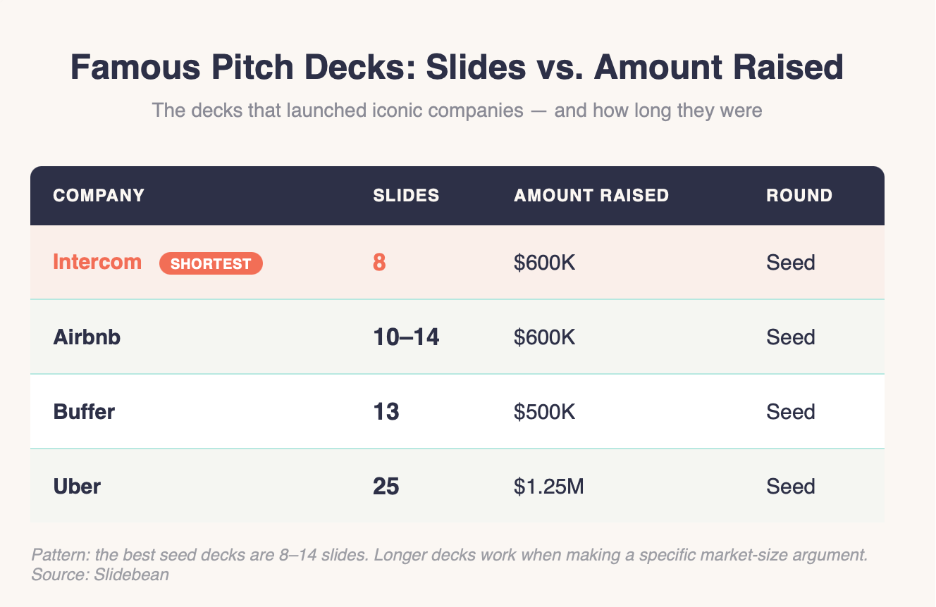
The pattern: the best seed decks are short (8–14 slides). Longer decks appear at later stages or when the company needs to make a complex market argument. What none of these decks did was pad. Every slide existed because the story needed it there.
The founder with the 35-slide deck I mentioned at the top? We restructured her pitch to 13 slides. Same company, same product, same market. We didn't lose information — we reorganized it around the investor's decision process instead of the company's internal knowledge base. She closed her round within two months.
The question "how many slides in a pitch deck?" matters because it's a proxy for a deeper question: have you figured out the simplest, most compelling version of your story? The data says 10–15 slides. The real work is deciding what earns a place in those slides and what doesn't.
If your deck is sitting at 20+ slides and you can't figure out what to cut, or if you've been through multiple iterations and it still doesn't land; that's a normal place to be. It's also the exact problem we solve every day. Talk to our team and we'll help you find the 12-slide version of your 30-slide story.


A seed-stage pitch deck should contain 10 to 12 slides. At this stage, investors are evaluating the team, the problem, and early signs of traction, not detailed financial models. Focus on the six essential slides (problem, solution, market, business model, team, traction) and add only what's needed to tell a complete story. Decks in this range achieve the highest completion rates from investors reviewing them.
Series A pitch decks typically run 15 to 18 slides. Investors at this stage expect deeper evidence: cohort analysis, detailed unit economics, competitive positioning, and a clear go-to-market strategy. The additional slides give you room to present this data without cramming. Beyond 18 slides, investor engagement drops significantly according to recent research.
The team slide consistently receives the most attention from investors: roughly 43% of total reading time according to tracking data. Financials come second. But the problem slide is arguably the most critical for keeping investors engaged, because 31% of investors bounce within ten seconds. If the problem doesn't grab attention immediately, they'll never reach your team slide.
AI tools like ChatGPT and Gamma can generate a structural starting point quickly, but they produce generic decks that lack the narrative strategy investors respond to. The output tends to be "wordy" and self-focused: exactly the problems founders already struggle with. AI handles layout and formatting reasonably well, but the strategic decisions — what to include, what to cut, how to sequence the story — still require experienced human judgment.
Most VCs and accelerators, including YC, Sequoia, and a16z, recommend a similar core sequence: Cover, Problem, Solution, Market Size, Product, Business Model, Traction, Go-to-Market, Competition, Team, Financials, and The Ask. The order can shift slightly depending on what's strongest in your story (a high-traction company might move traction earlier), but the fundamental structure has remained consistent across fundraising stages for the last decade.


867 BOYLSTON ST
BOSTON, MA 02116


