


.avif)

.avif)
.avif)


Get a guide to creating pitch decks presentation


.png)

“I work really late, really long days, I don't have time. And after all of that work to put it together, my deck looks like a hot mess" – Startup Founder
This is a pattern we see constantly at Whitepage Studio. The ideas are there. The data exists. But the visual storytelling presentation – the actual mechanism that turns information into a decision – is missing entirely.
Visual storytelling in a presentation is the practice of using design, structure, imagery, and data visualization to guide your audience through a narrative arc — from problem to solution to action. Think of it less as decoration and more as the architecture of how your argument unfolds visually.
Why does it matter? Because a University of Minnesota and 3M study found that presentations using visual aids are 43% more persuasive than unaided presentations. That number isn't about aesthetics. It's about how the human brain processes information — visuals are absorbed faster, retained longer, and trusted more than text alone.
We've seen this play out across more than a thousand projects. A founder tells us their deck "has all the information investors need." And technically, they're right. The problem is that information dumped onto slides without visual narrative structure doesn't land. One client described their own deck as "a hot mess." Another said their slides were "not professional enough" and "disjointed." They had the substance. What they lacked was a visual storytelling presentation that made the substance feel as strong as it was.
The distinction matters because most people confuse visual storytelling with visual design. Design is how a slide looks. Visual storytelling is how a presentation thinks — how it sequences information, controls attention, builds tension, and resolves with a clear ask. You can have gorgeous slides that tell no story. And you can have a simple, clean deck that moves a room to write a check.
Here's something most founders don't realize: investors don't read your deck. They filter it.
Research from DecktoVC (2026) breaks down how VCs actually process pitch decks into a three-pass system. Pass one takes about 30 seconds — a scan of your title slide, problem statement, and traction. This pass determines whether your deck even fits their investment thesis. Pass two adds another 60 seconds for solution, market size, and team. Only if you survive both filters does the investor commit to a full 5-to-10-minute read.
The uncomfortable finding: over 70% of decks never make it past that first 30-second scan.
The window keeps shrinking, too. Seed-stage decks now average just 1 minute and 56 seconds of total viewing time, according to PitchBuilder data. And Magistral Consulting (2025) reports that 65% of investors form their funding decision based on the first three slides alone.
This is where visual storytelling in business presentations becomes a survival skill, not a nice-to-have. When a founder tells us their slides are "too wordy" or that they're struggling because their deck is "a lot about the product, features… not what investors want to hear," they're describing the exact failure mode the data confirms. Investors aren't reading every word. They're scanning for visual cues that signal clarity, credibility, and fit — in seconds.
What does that mean practically? Your opening three slides need to do three things visually: establish the problem in a way that resonates emotionally, present your solution with immediate clarity, and give one proof point that earns the next 60 seconds. Not through more text. Through visual narrative structure — hierarchy, pacing, whitespace, and one clear idea per slide.
If your team is evaluating whether to invest in professional presentation design or keep iterating internally, this is the calculus worth considering. The cost of a weak visual narrative isn't a design problem — it's a lost meeting, a passed deal, a board that doesn't align.
Let's move from the "why" to the "how." After working on over a thousand decks for startups and enterprises, we've found that the most effective visual storytelling presentation techniques share a common foundation: they reduce cognitive load while increasing emotional resonance.
The cognitive fluency principle. A Princeton University psychology study found that information which is easier to process is judged more favorably — and perceived as more truthful. This isn't a design insight. It's a decision-making insight. When your slides are visually clean and your information flows intuitively, you're not just making things "look nice." You're reducing the subconscious perception of risk in your audience's mind. That's why cluttered, text-heavy decks underperform even when the underlying business is strong.
We hear this from founders all the time. "How do you bring all that together?" one client asked us during a discovery call. Another described their challenge as an inability to "translate technical complexity into simple visuals." These aren't design problems — they're thinking problems that manifest visually.
Problem-Solution-Impact sequencing. Qubit Capital (2025) identifies this as the structural backbone of high-performing pitch decks. You state the problem so the audience feels its weight. You present your solution as the direct answer — not as a feature list, but as a resolution to tension. Then you demonstrate impact through traction, market validation, or future potential. Each transition should be visually distinct: different layout, different visual emphasis, clear progression.
The Duarte Method. Nancy Duarte, in a 2024 conversation with Guy Kawasaki, described her framework as a Venn diagram with empathy at the center and three circles extending from it: story, visuals, and delivery. The structural technique she's known for — oscillating between "what is" and "what could be" — creates narrative tension that keeps an audience leaning forward. This isn't about slides. It's about the emotional rhythm of your argument.
The 6-6 discipline. Maximum six bullets per slide, maximum six words per bullet. It sounds almost too simple, but Qubit Capital's analysis of funded decks consistently shows that this constraint forces the kind of clarity investors reward. When you can't hide behind paragraphs of text, every word has to earn its place. And every visual has to carry meaning — not fill space.
One pattern we notice across visual storytelling presentation techniques that fail: the wrong fonts, inconsistent typography, and clashing visual hierarchies that signal carelessness before a single word is read. Visual storytelling starts with the foundational design choices that either build trust or quietly erode it.
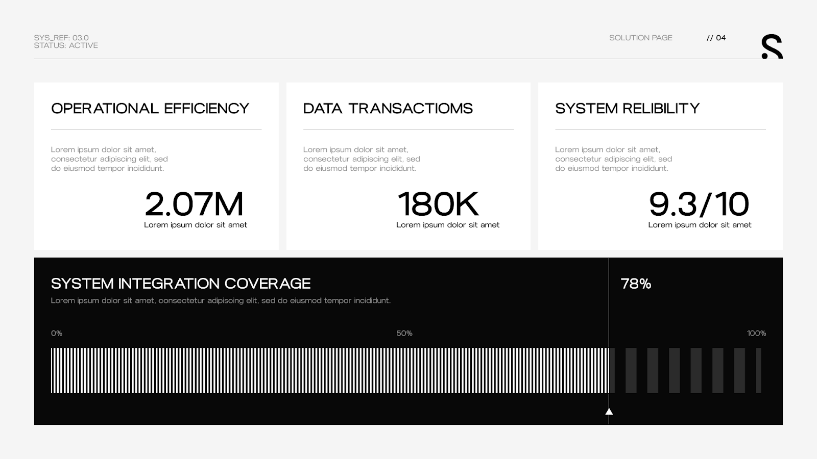
Data-heavy slides are where most presentations fall apart. Founders and executives know they need numbers to build credibility — but the difference between data that persuades and data that overwhelms is entirely visual.
The science is clear. People remember 65% of what they see and hear combined, compared to just 10% of what they hear alone. When you present a revenue chart alongside a spoken narrative about growth trajectory, your audience retains six times more than if you'd simply read the numbers aloud. Visual storytelling in data means designing your charts, graphs, and metrics so they tell a story — not just display information.
A 2024 study published on arXiv found that visualization design has a significant and measurable relationship with users' trust perception. The researchers identified five trust dimensions: credibility, clarity, reliability, familiarity, and confidence. Poorly designed data visuals don't just confuse — they actively reduce trust in the underlying information.
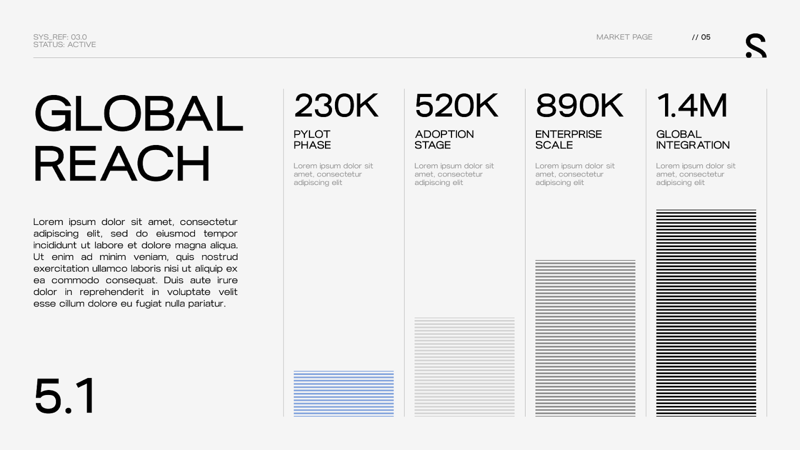
This matters enormously for pitch decks, where financial projections, market sizing (TAM/SAM/SOM), and traction slides are often the make-or-break moments. We've seen decks where the traction data was genuinely impressive — but presented as a dense table that investors skimmed past in seconds. Same data, redesigned as a clean growth curve with annotated milestones, and suddenly investors are asking questions about it. The information didn't change. The visual storytelling did.
Lucid's research on data storytelling for board presentations (2025) reinforces this: visual data narratives simplify decision-making, boost engagement, and enhance retention compared to raw numbers. For enterprise teams presenting to boards and executive committees, this is the difference between a slide that generates a decision and one that generates a follow-up meeting.
Here's our working principle at Whitepage: every data slide should answer one question visually. Not three. Not five. One. What's our growth rate? How big is the market? Where does the money go? If someone can't glance at your data slide and answer the question in under five seconds, the visual storytelling in data isn't working yet.
If you want to see how this comes together in practice — our Berklee project is a good example of complex institutional data translated into a clear, compelling visual narrative. It's the kind of transformation that happens when strategy and design work together from the first slide.
Theory is useful. Examples are better. Here are four companies whose visual storytelling presentation examples demonstrate specific, replicable principles.
Airbnb's original pitch deck is studied for good reason. It wasn't a design showpiece — it was clean, minimal, and focused. Every slide had a single job, and the visual narrative moved logically from problem to solution to market opportunity without overloading any frame. What's less discussed is the lesson from Airbnb's early struggles: they were initially using amateur listing photos, and conversions were flat. When the team flew to New York and reshot listings with professional photography, conversions jumped. The visual quality of how they presented their product directly affected business outcomes. That insight echoes across every presentation: visual storytelling isn't separate from the business. It is the business, at the moment of decision.

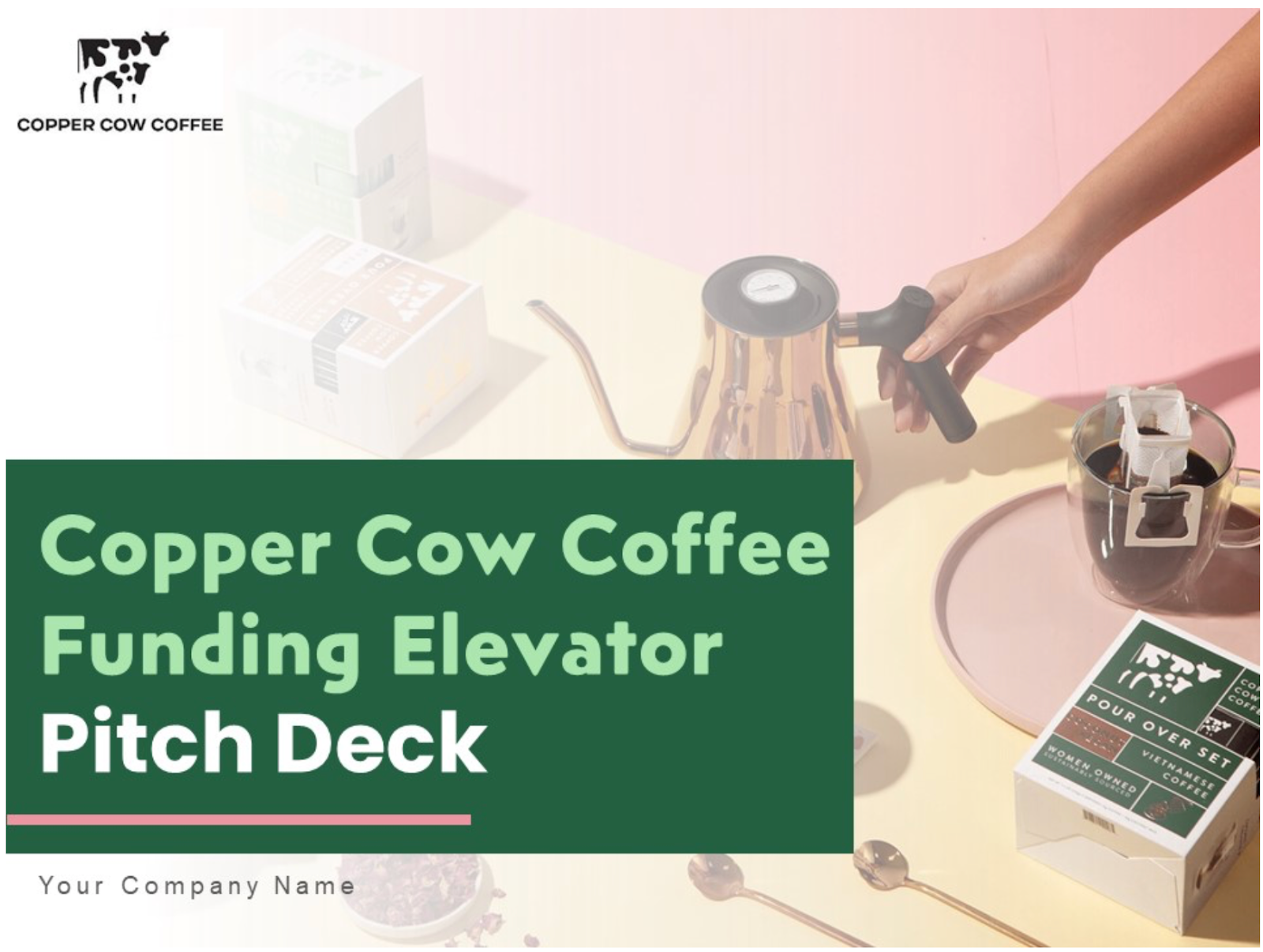
Copper Cow Coffee used a sensory-driven visual narrative to raise $2 million in seed funding and later $8.5 million after 300% year-over-year revenue growth. The opening slide delivered what he called a "sensory teaser" — brand palette, tantalizing product photography, Michelin credibility stamp, and a one-line hook. It sparked emotional appetite and logical curiosity simultaneously. This is visual storytelling in business presentations at its most effective: the first slide doesn't explain — it invites.
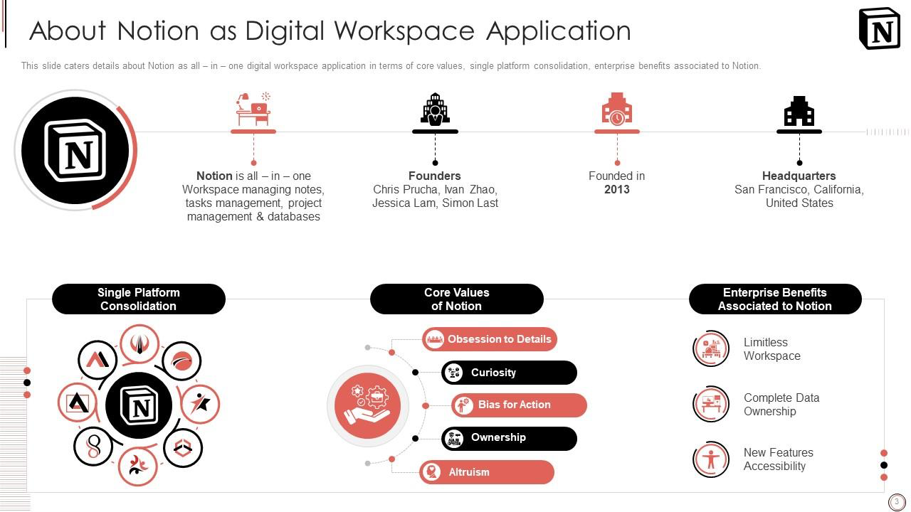
Notion avoided the trap of pitching a grand vision. Notion focused on a specific, measurable problem: knowledge workers waste 20% of their time switching between tools. That precision made the visual presentation immediately relatable — investors nodded because they'd experienced it. The lesson for visual storytelling presentation examples: specificity beats ambition. A concrete problem presented clearly will always outperform a vague promise presented beautifully.
Visual storytelling in presentations isn't a nice-to-have anymore. With investor attention dropping 24% in three years and 70% of decks dying in the first 30 seconds, the gap between a good idea and a funded idea is increasingly a narrative design problem.
That's exactly the problem Whitepage Studio was built to solve. Over 12 years and 1,000+ projects, we've helped startups and enterprises turn complex, high-stakes information into visual narratives that land — from seed-stage pitch decks to enterprise board presentations and everything in between. Our clients have collectively raised over $1.5B, and the pattern is consistent: same product, same data, same market — but a clearer visual story changes the outcome.
What makes our approach different is that we don't start with design. We start with your argument. Content strategy, narrative structure, and audience mapping come first. Design amplifies a clear story — it never substitutes for one. That combination of strategic thinking and presentation design is what most agencies, freelancers, and AI tools can't replicate, because they optimize for how slides look rather than how presentations think.
If your team is preparing for a fundraise, a board presentation, or a high-stakes sales meeting and you're not sure your visual narrative is doing the work it should — let's talk.


Slide design focuses on aesthetics — fonts, colors, layout, consistency. Visual storytelling is the strategic layer above design: how information is sequenced, what's emphasized and what's minimized, how tension and resolution are built across a deck. You can have well-designed slides that tell no story. Effective visual storytelling in a presentation means every visual choice serves the argument. If you're choosing between hiring an agency or a freelance designer, understanding this distinction helps clarify what you actually need.
The three patterns we see most frequently: overloading slides with text and data instead of leading with one idea per frame; using visuals that decorate rather than communicate (stock photos, clip art, generic icons); and failing to adapt the visual narrative for different audiences. A pitch deck for investors, a sales deck for enterprise buyers, and a board presentation each require different visual storytelling strategies — even when the underlying data is the same.
Absolutely — and they need to more than most. Data-heavy presentations fail when numbers are presented as evidence without a narrative frame. Visual storytelling in data means each chart answers one clear question, annotations guide the viewer's eye to the key takeaway, and the progression from slide to slide builds a cumulative argument. Research shows that well-designed data visualizations increase both trust and comprehension compared to raw tables and text.
Most high-performing pitch decks land between 10 and 15 slides. The constraint isn't arbitrary — it reflects the reality that investors spend under 2.5 minutes on an average deck review. Each slide should earn its place by advancing the narrative. If a slide doesn't change what the audience thinks or feels, it shouldn't be there. For a deeper look at how successful founders structure their decks, these 30 funded pitch deck examples are worth studying.
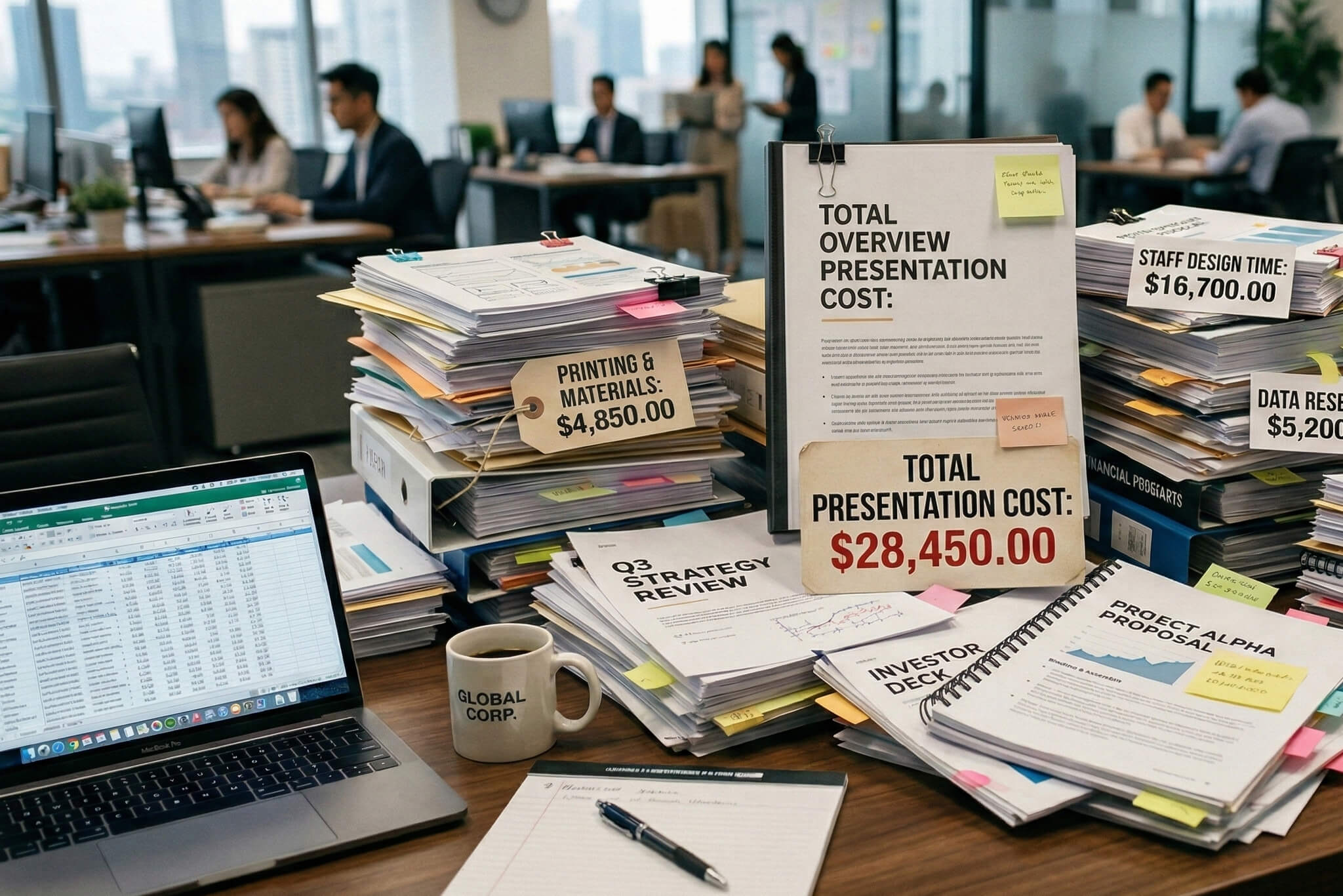
The decision usually comes down to stakes and capacity. As one startup founder told us, "I work really late, really long days, don't have time" — and that's the reality for most founders trying to handle deck design alongside everything else. If the presentation directly affects a funding round, a major partnership, or a board-level decision — and your team doesn't have dedicated presentation expertise — the risk of an underperforming deck outweighs the cost of professional help. We see this particularly with technical founders who understand their product deeply but struggle to translate that complexity into a visual narrative investors can absorb in minutes. Here's a practical breakdown of what professional presentation design costs to help frame the decision.


867 BOYLSTON ST
BOSTON, MA 02116


