


.avif)

.avif)
.avif)


Get a guide to creating pitch decks presentation


.png)

Two minutes and twenty-four seconds. That's how long the average investor spends on your pitch deck before deciding whether to take a meeting, according to DocSend's latest data. Let that sink in for a moment.
Now layer in the math: a typical VC reviews somewhere between 1,500 and 2,500 decks a year and funds maybe ten of them. If you're building your first pre-seed pitch deck right now, you're not competing against other founders in your space. You're competing against the other 2,489 decks in that pile.
We've worked on over 4,000 pitch decks at Whitepage — across pre-seed through IPO — and the pattern is consistent: the decks that land meetings aren't the ones with the flashiest design or the most slides. They're the ones where every slide earns its place in a sequence that builds trust. Here's what that actually looks like at pre-seed, with real examples.
TL;DR
A pre-seed pitch deck is the document you build before you have much to show. No revenue charts. Maybe no product yet. You're raising your first outside capital — typically $250K to $2M based on 2025 Carta data — to validate an idea, build a prototype, or run early experiments.
That's a fundamentally different conversation than a seed round. And your deck needs to reflect that difference.
At pre-seed, investors are buying into three things: the severity of the problem you've identified, the elegance of your proposed solution, and your credibility as the person to pull it off. At seed — where rounds typically run $1M to $5M — investors want to see that the market responded. Retention curves. Unit economics. Proof that something is working.
Here's how the two stages break down:
The mistake we see most often is founders building a seed-stage deck for a pre-seed raise. They fill slides with CAC/LTV ratios they've extrapolated from three customers, or five-year revenue projections that no one believes. One founder told us their deck was "a lot about the product, features… not what investors want to hear." That's the gap. At pre-seed, manufactured precision doesn't build confidence. It kills it.
If you're still working through your overall deck narrative, our guide on how to write a pitch deck covers the foundational structure.
Successful pre-seed decks that raised over $2B collectively in 2024–2025 averaged 10 to 14 slides. Not 25. Not 8. That range gives you enough room to build a narrative without losing your reader in the first ninety seconds.
The YC-influenced structure that we've seen work consistently at pre-seed follows this sequence — and sequence is the operative word here. Each slide should make the next one feel inevitable.
1. Title slide. One sharp sentence that captures what your company does. If this sentence disappeared, would your company disappear with it? That's your test.
2. Problem. A specific, felt pain point. Not a market trend — a moment. The best problem slides describe a scene a real person is stuck in right now.
3. Solution. How your product removes that pain. Keep it concrete: before/after, not a feature list.
4. Why now. What changed recently — regulation, technology, behavior shift — that makes this possible and urgent today? This slide is where most pre-seed decks fall short. Investors need to understand the timing.
5. Product. One flow. A demo screenshot, a prototype walkthrough, a before/after. Not a feature tour.
6. Traction. Whatever signal proves someone outside your team cares. Waitlist numbers, LOIs, a paying pilot, design partners. At pre-seed, light signals are fine — but you need something.
7. Market size. TAM, SAM, SOM — grounded in logic, not optimistic googling. We break this down in detail in our market size slide guide.
8. Competition. Why existing alternatives stall. Not a feature-comparison matrix — a clear explanation of what current solutions miss.
9. Business model. How you make money. One slide. Simple.
10. The ask. Round size, use of funds, and what this capital unlocks. Investors want to know that your ask matches realistic milestones for the next 12–18 months.
The critical thing about this sequence: it builds trust in order. Problem before solution. Why now before product. Traction before ask. When founders rearrange these slides randomly or front-load their product features, the narrative breaks — and with it, the investor's attention.
One more thing about financials at pre-seed: you should have a model, but it belongs in your data room, not spread across your deck. Your pitch deck needs one summary slide at most — key assumptions, burn rate, and what the raise gets you to. Investors know your five-year projection is speculative. What they're testing is whether you've thought through the next 18 months with operational discipline.
If you'd rather have a team handle the structure and narrative for you, that's what our pitch deck design service was built for — we start with content and strategy before we touch a single slide.
Studying templates is useful. Studying decks that actually closed rounds is better. Here are six pre-seed raises from 2024 across different industries and approaches — and what each one got right.
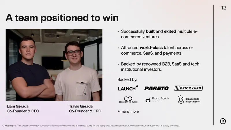
Krepling's deck, created by a 23-year old founder, leaned hard on founder insight. The company works in developer productivity – a crowded space – and the deck didn't try to out-feature competitors. Instead, it opened with a specific frustration developers face that existing tools don't address, then showed how the founder's own experience building developer tools shaped a different approach.
What worked: The deck made founder-market fit the centerpiece. Rather than listing credentials, it demonstrated why this specific founder sees something others miss. That's exactly what pre-seed investors are underwriting.
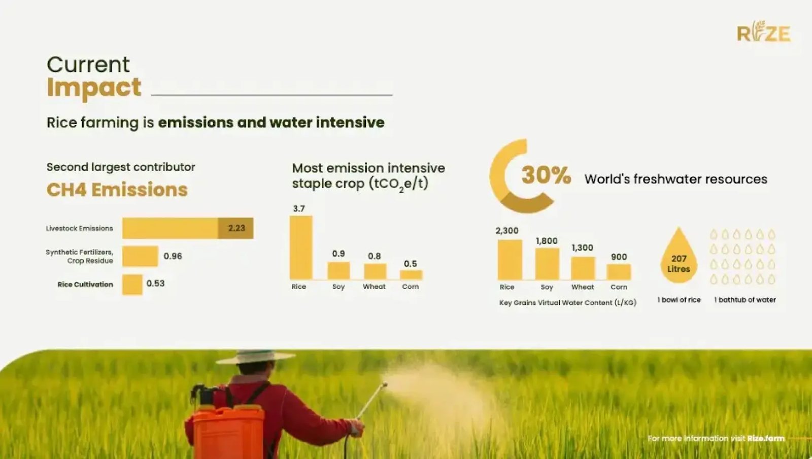
Rize is decarbonizing rice cultivation – a niche that requires convincing investors the problem is both massive and solvable. Their deck built a "why us" narrative grounded in the founding team's research background. The problem slide was backed by specific data on rice farming's carbon footprint, and the solution connected directly to published academic work the founders had done.
What worked: The "why us" slide didn't read like a resume. It read like evidence. The founders' research was the product's credibility, and the deck made that connection explicit rather than hoping investors would figure it out.
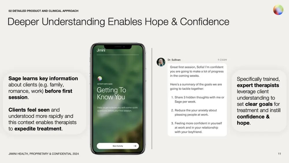
Jimini Health raised one of the largest pre-seed rounds we've seen: $8M for an AI-augmented therapy platform. The 22-slide deck did something counterintuitive: the founders told investors they wouldn't be the fastest-growing startup. Instead, they positioned their slow, evidence-based approach as the differentiator in a space littered with safety controversies. The founding team with deep roots in AI biotech from companies like Immunai used their track record to underwrite a careful, clinical rollout.
What worked: The deck turned a potential weakness (deliberate slowness) into a trust signal. In a market where AI chatbot safety was making headlines, Jimini's restraint became the competitive moat. The team slide carried enormous weight — each co-founder's background directly explained why they could navigate this specific problem responsibly.
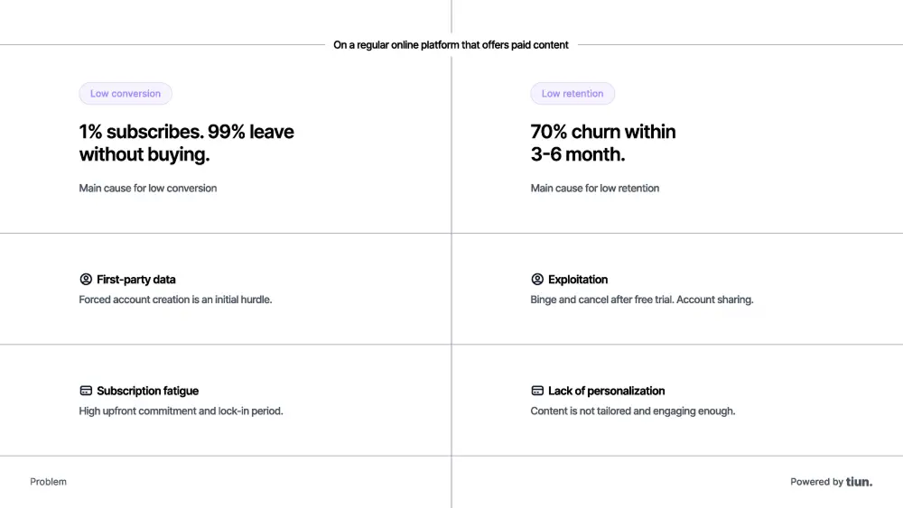
Tiun built a digital wallet to solve subscription fatigue for online media — and did it with just 9 slides. The Zurich-based startup raised $2.5M led by Founderful, and the deck's economy was the point. Every slide had one job: frame the problem (fragmented media payments), show the mechanism (pay-for-what-you-use wallet), and prove the model (transaction-based revenue share with publishers).
What worked: Nine slides. No filler. In a world where founders pad decks to look comprehensive, Tiun stripped everything back to the minimum viable narrative. The brevity itself communicated discipline and clarity of thinking, exactly what pre-seed investors want to see.
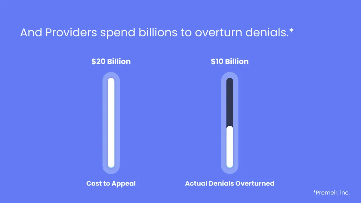
Crosby Health is building a clinical LLM called Apollo to automate insurance claim appeals, which is a $20B+ problem in U.S. healthcare. Their 8-slide deck had one standout move: a product benchmarking slide that showed Apollo outperforming Google's Med-PaLM 2 and the average medical student on clinical reasoning tasks. That single data point did the work of an entire traction section.
What worked: When you don't have revenue, find a different kind of proof. Crosby didn't manufacture traction metrics: they benchmarked their AI against the best in the industry and let the comparison speak for itself. The 8-slide format kept everything tight, and the benchmark became the slide investors remembered.
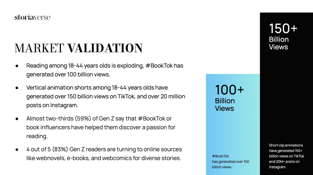
Storiaverse is building a platform for animators and writers, a creator-economy play in a space dominated by video-first platforms. The 16-slide deck leaned into community signals and the creator-first thesis: the problem wasn't that animation tools don't exist, but that animators and writers have no home that treats their craft as a business.
What worked: Storiaverse used its deck to sell a category, not just a product. The pitch positioned the company as building infrastructure for an underserved creator segment — turning what could have been a "niche audience" objection into an untapped-market opportunity. Vision-heavy, but grounded in specific community signals.
The common thread across all six: none of these decks looked like a seed-stage deck squeezed into fewer slides. They embraced the pre-seed constraints like limited data, early product, small team, and built narrative structures that turned those constraints into credibility signals. Jimini turned slowness into trust. Tiun turned brevity into discipline. Crosby turned a benchmark into traction. That's what good pre-seed storytelling looks like.
We hear the pain points in nearly every call. "We've gone back and forth 15 times." "My designer doesn't get it." "Tried to do it ourselves." The frustration is real, and it usually traces back to a handful of structural mistakes:
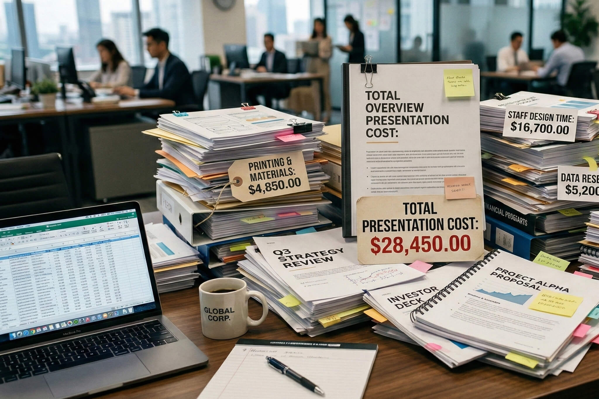
This is the most common and most damaging. Founders Google "pitch deck template," find a structure built for companies with $2M ARR, and try to fill it in with three months of beta data. Complex traction charts and CAC/LTV analysis at pre-seed don't signal sophistication — they signal that you don't understand what stage you're at.
Your product might have twelve features. Your deck should describe one problem so clearly that the solution feels obvious. When a founder told us their deck had "a lot about the product, features… not what investors want to hear," they'd already diagnosed the issue. Pre-seed investors care about the problem's severity and your insight into it — not your sprint backlog.
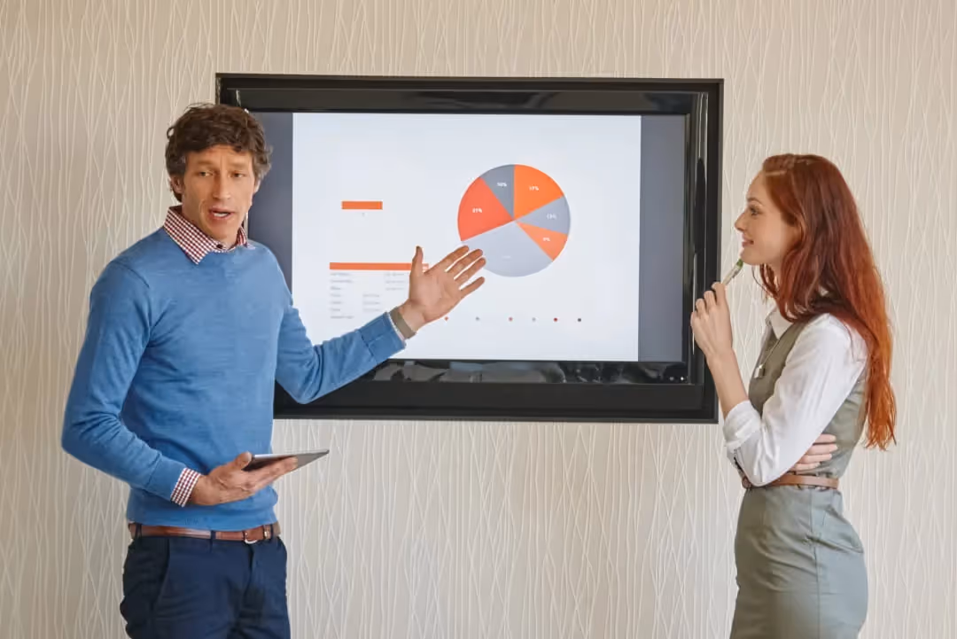
Investors spend two and a half minutes on your entire deck. That's not enough time to read paragraphs. The effective rule of thumb: one idea per slide, minimal text, and visual clarity that lets someone grasp the point in seconds.
At pre-seed, the team slide is arguably the most important slide in your deck. It should feature only the core founding team and highlight concrete evidence of founder-market fit — not list every advisor and their LinkedIn summary. Previous exits, deep domain expertise, a track record that explains why you are the person to solve this problem.
For more data on what drives investor decisions, our breakdown of pitch deck statistics covers the numbers behind what works.
Here's the data point that surprised even us: the first three slides of your deck determine roughly 70% of the investor's decision on whether to keep reading. That means your title, problem, and solution slides are doing almost all the heavy lifting — and if they don't land, the rest of your deck is essentially invisible.
This isn't just about writing. It's about visual execution. A founder we spoke with described the problem perfectly: they wanted someone with a "strategic mindset, not just design mindset." That distinction matters enormously. Sloppy design and cluttered layouts are content problems wearing a visual disguise. When an investor can't parse your slide in three seconds, it's not because they're lazy – it's because your information hierarchy is broken.
Your pre-seed deck is probably the first professional document that represents your company to people who can fund it. It doesn't need to be perfect — but it does need to be clear, honest about where you are, and structured in a way that respects the 2:24 you've been given. If you're at the stage where clarity matters more than speed, and you want a team that starts with your story before opening a design tool, our pitch deck design service is built for exactly that conversation.
We've built decks for founders raising from firms across the country and internationally, and the pattern is the same everywhere: the decks that earn meetings are the ones where narrative, structure, and design work as a single system, not three separate layers bolted together. You can see examples of how we approach this in our portfolio.


Most successful pre-seed decks fall in the 10–14 slide range. YC's recommended structure uses 10 slides, and analysis of over 100 funded decks from 2024–2025 confirms this range as the sweet spot. Going under 8 usually means you've skipped something important. Going over 15 usually means you're including seed-stage content that doesn't belong yet.
You should have a financial model — but it should focus on your key assumptions, unit economics, and cash burn for the next 12–18 months, not a detailed five-year forecast. In the deck itself, one summary slide is enough. The full model goes in your data room. Investors know long-term projections at pre-seed are speculative; they're using your model to test operational discipline, not predict revenue.
Pre-seed decks are story-led. You're selling the problem's severity, your solution's logic, and your team's credibility. Seed decks are data-led — investors expect to see traction metrics like retention, revenue, and unit economics. Pre-seed rounds typically raise $250K–$2M at a $10M–$15M valuation cap, while seed rounds run $1M–$5M at a median $16M pre-money valuation.
Templates can give you a starting structure, but they often create more problems than they solve. The most common mistake is founders filling a template designed for seed or Series A with pre-seed content — which produces slides full of metrics they don't have. If you use a template, make sure it's designed specifically for pre-seed, and customize the narrative and sequence rather than just swapping in your company name.
Team and problem. At pre-seed, the team slide is arguably the most important — investors are betting on founders, not revenue. They want evidence of founder-market fit: why you specifically are the right person to solve this problem. After that, they spend the most time on the problem and solution slides. Data shows that financials, team, and "why now" slides get the longest view times overall.


867 BOYLSTON ST
BOSTON, MA 02116


