


.avif)

.avif)
.avif)


Get a guide to creating pitch decks presentation


.png)

TL;DR
Most businesses don't need a better deck — they need the right type of deck for the audience and decision they're trying to drive. Different presentation types follow fundamentally different logic, and using the wrong one is one of the most common reasons presentations fall flat.
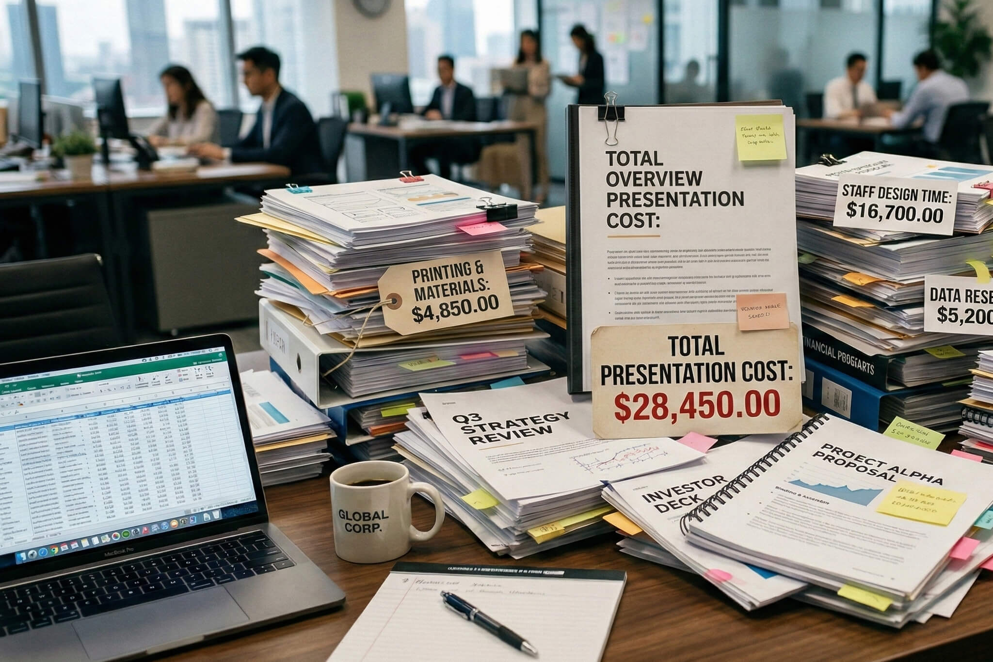
Here's a pattern we see almost every week after twelve years and over a thousand projects: a founder or executive comes to us frustrated. The information in their deck is solid. But it keeps falling flat — in investor meetings, in sales calls, in front of the board. When we dig in, the issue is almost always the same. They built one presentation and are trying to use it everywhere.
SlideUpLift's 2025 research found that roughly 75% of professionals reuse the same slide deck across multiple contexts. On the surface that looks efficient. In practice, it means most teams are sending investor-facing narrative to sales prospects, or bringing a vision story into a boardroom that wants numbers and trade-offs. One client told us directly: "It's a mixture of a sales deck and a pitch deck. I don't know how to separate them."
The fear behind it is real. Founders worry about looking unprofessional or vague. Enterprise leaders don't have time to build five separate decks. And when you don't understand what each type of presentation is supposed to communicate, building one feels hard enough.
But here's the thing: the different types of business presentations aren't just labels. They follow different logic: different structure, different audience expectations, different definitions of success. And once you see that logic, choosing the right one stops being overwhelming.
Across twelve years and more than a thousand projects, we've found that most business presentations fall into five clear categories. Here's the map: then we'll go deeper into what each one actually requires, what audiences expect, and where companies consistently get them wrong.
The question that separates effective presenters from everyone else isn't "how many slides?" — it's "who is in the room, and what decision do I need from them?" Let's break each one down.
Fundraising presentations are the category most people think of when they hear "presentation types." Investor pitch decks, teaser decks, fund and LP decks, real estate investor decks — they all live here.
The job of a fundraising presentation is to earn a second meeting. That's it. Not to answer every due-diligence question. Not to prove you've thought of everything. Just to make a sophisticated investor believe this is worth their next forty-five minutes.
What investors actually expect:
The structural logic is story → market → traction → ask. DocSend's data, summarized by PitchGrade in 2026, shows that 11 to 15-slide decks generate the strongest meeting conversion rates and the longest time spent per slide. Zyner's 2024 analysis of DocSend data puts average investor viewing time at about two minutes and twenty-four seconds per deck. IdeaProof's 2025 research adds that 31% of investors bounce within the first ten seconds.
That means your first three to four slides are the mental anchor that colors everything after. Pitch-design experts in 2025 describe those opening slides — Problem, Solution, Market — as the filter. Get them wrong, and nothing else matters.
The pitfalls we see constantly:
For founders building deep tech or technically complex pitch decks, the discipline of simplifying without dumbing down becomes even more critical.
We worked through a similar structural challenge with a Berklee-affiliated project — here's how that came together.
This is exactly what played out with GoodFinch, an institutional investment firm focused on asset-backed yield across U.S. renewable energy — solar, sustainable home improvement, and EV charging infrastructure. They came to us during a period of market dislocation in clean energy. The opportunity was real and time-sensitive, but the existing materials weren't communicating it at an institutional level. Investors weren't seeing what GoodFinch saw.
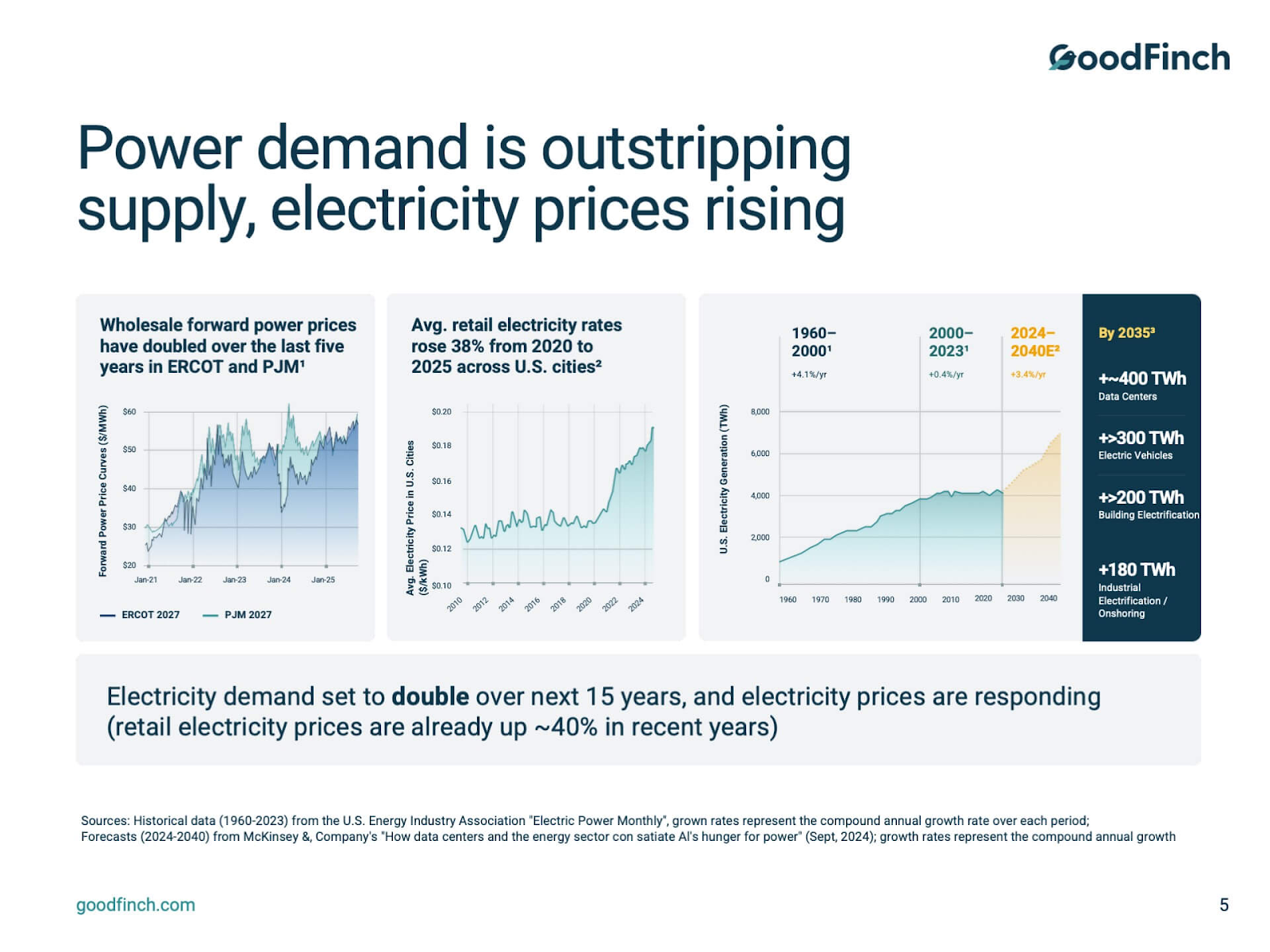
We built the deck around three storytelling pillars: market timing (why now — the dislocation created a window), platform differentiation (why GoodFinch: their operational edge across solar and EV), and proof via track record(disciplined data visuals, not walls of numbers). Complex financial and operational ideas got translated into clear, investor-ready narrative, designed for both live meetings and diligence follow-ups.
The result: that deck became the core fundraising asset for Fund VI, supporting early investor engagement and advancing diligence conversations, including a reported $300M strategic commitment. As Nick Franchot, Partner at GoodFinch, put it: "What stood out immediately was how quickly the team understood both the task and our industry." See the full GoodFinch project here.
This is the confusion we untangle more than any other. A company builds an investor pitch deck, then starts sending it to sales prospects. Or they create a "company overview" and use it for everything from partnership conversations to enterprise procurement meetings.
Sales presentations and pitch decks look similar. They are fundamentally different types of presentation.
A pitch deck says: Here's why our company is worth investing in. A sales deck says: Here's how we solve your specific problem. The entire orientation flips. In fundraising, you're the subject. In sales, the buyer is.
What buyers and executives expect:
HBR's guidance on presenting to the C-suite emphasizes that you must lay out the problem and prove ROI clearly — if you don't dramatize the problem and quantify value, executives disengage. Prezent.ai's 2025 guidance explicitly warns that generic, un-personalized decks undercut trust and effectiveness. The sales deck is a conversation, not a monologue.
The pitfalls that kill sales presentations:
This is exactly the kind of challenge our sales deck design work is built around — turning complex value stories into buyer-facing conversations that actually close.
Other presentation types in this family: commercial and business development decks, partnership decks, capabilities decks, and corporate overview decks all share the sales-adjacent logic. The audience isn't investing in your equity — they're deciding whether to work with you. That means credibility, clarity, and relevance matter more than vision and ambition.
Google positioned Business Messages as the missing link between brands and shoppers who prefer typing over talking. The deck opened with concrete pain-point statistics — customers abandoning phone calls, long hold times driving buyers to competitors — then shifted into a series of "What if you could…?" scenarios that reframed the problem as an opportunity.
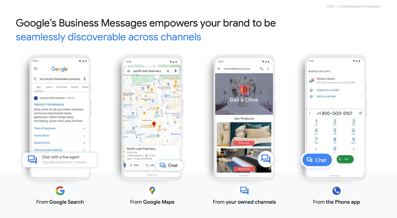
From there, it walked through how the tool integrates into Search, Maps, and owned channels at every stage of the buying journey. Rather than dumping features, each slide mapped a specific use case to a different customer segment, making the relevance immediate.
Why it worked: It followed the sales deck playbook almost to the letter. It started with the buyer's frustration, quantified the problem with real data, and then showed seamless integration with tools the buyer already uses every day. The deck never asked "isn't our product impressive?" — it asked "wouldn't your customers' lives be easier?" That's the orientation shift that separates a sales deck from a company overview.
Some presentations aren't about raising money or closing a sale. They're about making a complicated idea accessible — turning something dense, technical, or multi-layered into something a non-specialist can follow and act on.
This category includes deep tech and biotech decks, healthcare presentations, product demos, product launch presentations, training decks, and education materials.
What these audiences expect:
Deloitte-style presentation frameworks — context, analysis, recommendation — apply powerfully here. Every slide needs one clear message and an obvious "so what." Qubit Capital's 2025 guidance on simplifying complex ideas stresses that decks fail when they try to explain everything at once instead of focusing on one core concept per slide.
For training and education presentations, add: structured learning flow, visual reinforcement at each stage, and editable outputs for future reuse. These decks are often longer — forty, sixty, even a hundred slides — and the discipline isn't about cutting slides. It's about making each one earn its place.
The pitfalls specific to complex-topic presentations:
Learning how to structure a presentation for maximum clarity matters more in this category than in any other — because the content is working against you if the structure doesn't do the heavy lifting.
This is where even experienced leaders stumble. They take their investor deck, swap in some KPIs, and present it to their board. Or they bring a dense strategy document and read through it slide by slide. Board decks and executive presentations are a distinct genre — they're not fundraising decks with updated numbers. They're decision-making tools.
What boards and C-suite audiences expect:
HBR's "How to Blow a Presentation to the C-Suite" is direct: executives expect three questions answered in the first sixty seconds — What problem are we solving? Why does it matter now? What do you need from me? McKinsey's 2024 communication research reinforces this — boards typically spend less than 10% of their time together, and that time must drive decisions, not status updates.
McKinsey's Pyramid Principle applies here: lead with the governing thought (your recommendation), then support it with two to three logically grouped reasons and evidence. Don't build up slowly. Answer first, prove second.
The pitfalls that undermine executive and board presentations:
For teams building corporate presentations and internal strategy decks, this structural shift from "storytelling" to "decision-enabling" is the single most important thing to get right.
If your team presents regularly, and Decktopus' 2026 data shows that 83% of professionals create or deliver presentations at least a few times per month, then you don't just need decks. You need a system.
One enterprise client came to us because their sales team was sending fifteen different versions of the same deck, each off-brand and inconsistent. Another needed a master template system that could flex across forty-four course offerings. These aren't one-off projects. They're presentation infrastructure.
What a presentation system typically includes:
McKinsey's 2024 communications research notes that organizations with strong communication practices can see up to 21x larger returns — and a big part of that is consistency and quality at scale, not just one brilliant presentation once a year.
The pitfalls of not having a system:
AI is accelerating this shift. Decktopus' 2026 survey found that only 5.8% of professionals say they never use AI for presentations, and nearly half expect 76 to 99% of creation to be AI-assisted within two to three years. But AI works best when it has a system to work within — modular, well-structured, brand-consistent foundations that make automated creation actually useful instead of generically mediocre.
The presentation software market is projected to reach $18.54 billion by 2032, according to Coherent Market Insights. Presentations aren't a side task. They're core business infrastructure — and the types of business presentation you choose to build say as much about your strategic clarity as the content inside them.
If you're looking at this and realizing you've been trying to do three of these jobs with one deck, that's not a failure. That's the starting point. Now you know what each type of presentation is supposed to do, what structure it follows, and where the pitfalls hide. The next step is building the right one for the room you're actually walking into.
If this is where you are right now, we're happy to talk it through.


The most common types of business presentation fall into five categories: fundraising presentations (pitch decks, teaser decks, LP decks), sales presentations (sales decks, partnership decks, capabilities decks), complex-explanation presentations (deep tech, product demos, training), board and executive presentations (board packs, leadership updates, strategy decks), and presentation systems (templates, modular libraries, multi-version packages). Each follows a different structural logic depending on the audience and decision being driven. For a deeper look, see our guide on how to structure a presentation.
A pitch deck is designed to earn an investor's interest — it follows story-market-traction-ask logic and focuses on the size of the opportunity. A sales deck is designed to solve a buyer's problem — it follows buyer-pain-solution-ROI-next-step logic and focuses on the prospect's world, not yours. Sending an investor deck to a sales prospect is one of the most common mistakes we see. The audience, the structure, and the definition of success are different for each type of presentation.
It depends on your stage and your audiences. An early-stage startup might only need a pitch deck and a one-pager. A growth-stage company typically needs a pitch deck, a sales deck, and a board deck at minimum. Enterprise teams often need all five categories — plus a system that keeps them consistent. The key insight is that one deck rarely serves every audience well. Building two or three purpose-built presentations almost always outperforms stretching one across every context.
In rare cases, a well-built corporate overview can flex across a few contexts. But in practice, trying to make one deck serve investors, buyers, board members, and internal teams leads to a presentation that speaks to everyone and persuades no one. Investors want narrative and market opportunity, boards want recommendations and risk analysis, buyers want ROI and relevance to their specific problem. The most effective approach is a portfolio of presentations that share a visual identity but diverge in structure for each audience.


867 BOYLSTON ST
BOSTON, MA 02116


