


Use of Funds Slide: The Structure and Credibility Signals Investors Expect
Published on:
The use of funds slide answers a question no other slide answers directly: how you plan to allocate capital. Not how excited you are about your market. Not how strong your team looks on paper. Whether you actually know what the money needs to accomplish, and in what order.
Author: Tanya Slyvkin, CEO & Founder, Whitepage Studio

TL;DR
It is one of the most overlooked slides in a deck. A 2025 fundraising analysis found it missing or visibly weak in roughly 56% of decks reviewed (DocSend/Foundersuite, 2025). It is also the slide investors use to judge whether you can be trusted with the capital.
Four real company examples below — the pitch decks of Artisan, Hype, Seam.so, and micro1 — show how startups at different stages approach this slide. What they share is a clear link between capital and outcome.
- Every category should answer: what happens, and what does it unlock?
- Match format to stage. Pre-seed needs milestone clarity more than financial precision.
- Design for a 10-second read. Investors average under 2.5 minutes per deck.
What Do Investors Actually Look for on a Use of Funds Slide?
Most founders build this slide last. The deck is almost done (problem, market, traction, team) and then someone says, "shouldn't we add a slide about the money?" That sequencing is the first mistake. The slide works as a test of how clearly you think about money. When founders bolt it on at the last minute, investors can usually tell.
It exists for specificity and logic. Not a polished infographic. Not five decimal places. A clear answer to three questions every investor is silently running:
- How much are you raising, and what round is it? The funding stage anchors everything else. A $1M ask reads differently at pre-seed than at Series A.
- What are the funds for? Specific categories, with dollar amounts and percentages.
- What does this round achieve? The milestones that get you to your next raise, or to default-alive.
DocSend's 2024 slide-level data (via PitchGrade) found investors spent approximately 52 seconds on financial slides, second only to the team slide. When an investor is interested, they slow down here. A vague slide can erode confidence at the moment they are deciding.
Two angles that often get missed:
Risk mitigation. Every investor reads this slide with one unspoken worry: will they burn through this? A disciplined allocation, sequenced sensibly, pre-empts the worry before it surfaces. Founders who name the constraint they are buying down (capacity, regulatory, time-to-market) tend to land better than founders who just list categories.
Investment terms and ROI. Some founders surface round terms or an expected-return line near this slide. At later stages with sophisticated investors, a brief note on round structure can help. At earlier stages, it usually clutters more than it clarifies. One guardrail: do not promise investment returns. It reads as naive.
Not a budget report. A strategic argument. The strongest versions show not just where money goes, but what it needs to accomplish, and by when.
What investors consistently want to see:
- Total raise amount, clearly stated, not buried in subtext.
- 3 to 5 spending categories, with both dollar amounts and percentages.
- Runway: how long does this round buy you?
- Milestones unlocked: what will you be able to prove by the time you raise again?
That last point is the one most founders skip, and the one investors weigh most heavily. They are not just evaluating where the money goes, they are evaluating whether you understand what it needs to accomplish.
How Should You Structure a Use of Funds Slide?
The structure that works across stages is simpler than most founders expect. It maps to a single formula:
"We need [amount] to acquire [resources] to accomplish [outcome]."
Three steps:
- Funding amount and stage. Pre-seed lands roughly in $0 to $500K, seed around $500K to $3M, Series A from $3M up. Match the figure to the stage you claim. A "seed round of $250K" or a "pre-seed of $5M" makes investors stop reading and start questioning the framing.
- Use of funds. Three to five categories, each tied to a milestone, not a function.
- Outcomes and milestones. What this round buys you, and the proof you carry into the next raise.
A note on valuation: it generally does not belong on this slide. Valuation is negotiated in person, and investors raise it only if seriously interested. Putting it on the deck anchors the conversation in the wrong place, or filters out investors who would have engaged at a different number.
A naming rubric for line items
The biggest credibility lever is how you name each category. Most founders default to function labels ("Sales 20%", "Marketing 15%") that tell investors almost nothing.
The rubric that works: verb + outcome + timeframe.
- Weak: "Sales (20%)"
- Strong: "Hire a head of sales and two AEs to reach $1M ARR by Q4 2025"
The strong version has a hire, an outcome, and a timeframe. The investor can picture what happens if they fund this line, and what they are owed at the next conversation.
Two categories founders often omit
- Regulatory and compliance. Especially relevant in fintech, biotech, and any regulated vertical. Leaving it off implies you have not modelled the cost of operating legally, which is a fast way to lose a sophisticated investor's trust.
- Operational runway and reserves. A small reserve (5 to 10%) signals you understand plans slip and timelines stretch. Slides with zero buffer can look optimistic in a way that hurts credibility.
Add an assumptions footnote
A one-line "assumptions, as of [date]" strip at the bottom is a small move with outsized credibility benefit. It signals the numbers are auditable, that you know they will shift, and that you have versioned your thinking.
A clean format that holds up at most stages:
Total raise: $3M / 18-month runway. Assumptions as of Q1 2025.
We worked with a fintech founder once: early traction, differentiated product, a team worth backing. The use of funds slide was a single donut chart, four unlabeled segments, no amounts, no timeline, no milestones. Every follow-up included the same question: "What exactly are you planning to do with the money?" A clear slide usually settles that question before it is asked.
We rebuilt around three specific hires, a clear product milestone, and a 16-month runway. The follow-ups changed noticeably, from "tell me more about your plan" to "walk me through the product roadmap."
Use-of-Funds Allocation by Sector: AI, Biotech, Fintech, Consumer
Investors read each sector's deck with default expectations about where money should go. A consumer deck with 70% of spend on R&D reads as confused. A biotech deck with no trial costs reads as unserious. Sector defaults give you a starting template, but every line still needs to map to a milestone.
AI and Deep Tech
Compute is often the single largest line item, and investors expect it sized against a specific model or capability. "$400K for compute to train v2 on 1B tokens and reach benchmark parity with [baseline]" reads stronger than "Cloud infrastructure 30%."
Biotech
Tranche-based fundraising is common, with capital releasing against trial milestones. The slide often shows tranche structure ("Tranche 1: IND-enabling studies; Tranche 2 unlocks on Phase 1a readout") rather than a flat allocation.
Fintech
Compliance and licensing are non-negotiable. Investors will check you have modelled the cost of money transmitter licenses, BSA/AML programs, or whatever your regime requires. Leaving the category off is a credibility hit.
Consumer
Allocation is typically front-loaded on demand testing and performance marketing. Investors want to see CAC assumptions, payback periods, and a clear plan for what the money buys in customer acquisition.
Think of these as starting templates. If your sector default is "60% marketing" and you are spending 60% on engineering, that can work — but the slide and narrative need to justify why.
For more on how sector and stage shape the broader pitch, check out our pitch deck design service.
Make the Number Reconcile with Your Ask, Financials, and Milestones
The use of funds slide does not live in isolation. The number on it must agree with three other slides:
- The ask slide. The total raise should match exactly. If the ask says $3M and the use of funds adds to $3.2M, the deck loses credibility before the conversation starts.
- The financial projections. Categories and amounts should be consistent with the burn implied by your projections. If you are showing $300K monthly burn but planning 18-month runway off a $3M raise, the math does not work.
- The traction or why-now milestones. If your traction slide claims $1M ARR by Q4, the use of funds slide needs to show the sales spend that gets you there.
When these three disagree, the deck reads as rushed or unrigorous. Either is fatal in a partner meeting.
The three-way check
Before you send the deck:
- Does the use of funds total equal the ask total? Exactly, not approximately.
- Does the implied monthly burn match your projections?
- Are the milestones the same ones you claim elsewhere?
Most founders skip this step. The investors who matter run it for you.
Frame runway around the next milestone
The cleaner framing is "runway to the milestone that de-risks the next round," not "18 months." Aim for 18 to 24 months to a milestone that meaningfully changes what you can charge for valuation. A round that buys 12 months and gets you nowhere is a harder sell than one that buys 18 months and a clear graduation point.
Pre-empt the partial-raise question
A live question on most calls: "What happens if you only close $1.5M of the $3M?" Have a one-line stance ready. The strongest founders design rounds to be partial-raise resilient: the first tranche funds the most credibility-building milestone.
Be ready for the live questions
The slide reliably provokes the same four questions:
- How long will this round last? Answer in months and in milestones.
- Why are you spending so much on X? Answer with the constraint that X removes.
- Who is your lead investor? Answer honestly, including "we are still building the syndicate" if that is the case.
- How many other investors are committed? Answer with a real number, not a wave at "interest."
Early pre-seed decks without a financial model can state assumptions in place of projections. A footnote like "Assumes 8 hires by month 12 at average $140K loaded cost; revenue not modeled" beats a fake spreadsheet every time.
For related reading, see our breakdowns of the market size slide and the problem and solution narrative. If you want a second set of eyes on whether your deck reconciles, our pitch deck consulting service is built for it.
How AI-Stage Diligence Reads Your Use-of-Funds Slide
More investors now run inbound decks through AI screening before a human partner opens them. The pattern is still emerging (not every fund does this, and the ones that do still let a human make the final call) but it is reshaping what "machine-readable" looks like.
A clean, machine-readable slide tends to share four traits:
- Labelled percentage and dollar pairs per category. "Engineering 40% / $1.2M" is parseable. A donut chart with values only in the legend is not.
- No buried "Other" bucket. A 19% "Other" line gets flagged as ambiguity.
- Text is text, not locked in an image. If your slide is a single rasterized graphic, parsers cannot read it.
- One screen, one number set. Charts that need a legend on the next slide do not survive automation.
One guardrail: do not over-optimise for the machine. The human partner is still the decision-maker, and a slide that reads like a JSON object loses the room.
Real Use of Funds Slide Examples: What These Startups Got Right
Real funded decks are more instructive than any framework. Four examples (pre-seed through Series A), each taking a different approach, each working for a specific reason.
Artisan - Pre-Seed, $2-4M: The Multi-Stage Roadmap Format
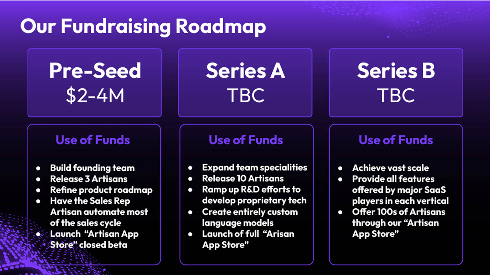
Artisan's slide does not just show use of funds for the current raise. It maps capital deployment across three stages: Pre-Seed ($2-4M), Series A, and Series B, laying out what each round builds toward before later amounts are determined.
Why this works: At pre-seed, investors are not funding a complete plan. They are funding a team's ability to think clearly about what happens in what sequence. Pre-seed: build the founding team, launch three product SKUs, begin automating sales, launch the app store in closed beta. Series A: expand the catalog, ramp R&D, develop proprietary models, open the full app store. Series B: scale to hundreds of products, reach feature parity with major SaaS players.
No percentages. No dollar breakdowns. But the milestone logic holds up to scrutiny, and at this stage that matters more than financial precision. Investors can see the compounding rationale, and evaluate whether the founder has thought about the journey, not just the ask.
The design choice: Three equal-weight cards, one per round. The amount is prominent on the current raise, "TBC" for the others. Honest about uncertainty without being vague about intent.
What to borrow: If you are pre-seed and your plan is still evolving, a stage-based format with strong milestone logic can be more credible than a premature allocation table.
micro1 - Pre-Seed, $1.1M: The Single-Thesis Slide
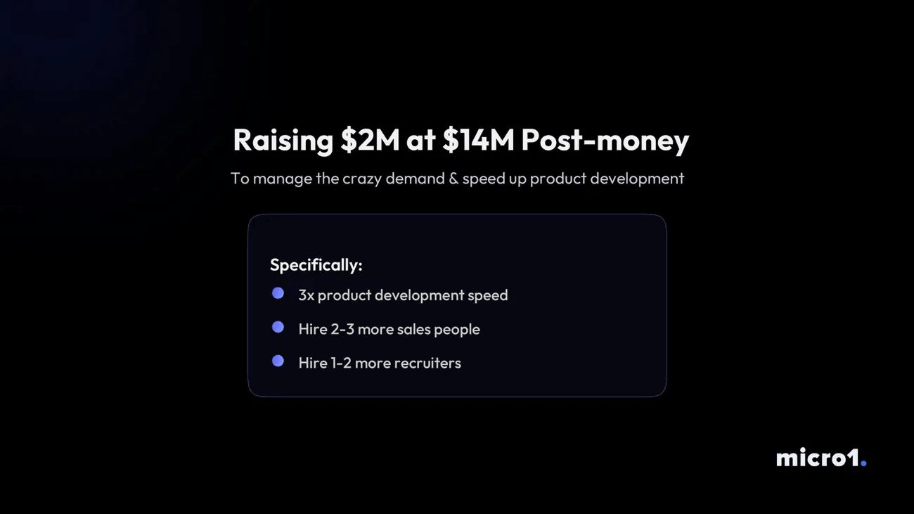
micro1 went as minimal as the slide can go, and made it work. The headline states the raise and valuation directly. The subtitle does the strategic heavy lifting: "To manage the crazy demand and speed up product development." Then three bullets: 3x product development speed, hire 2-3 more sales people, hire 1-2 more recruiters.
Why this works: The slide has a thesis, not a budget. The subtitle is not filler. It answers the investor's silent question before they ask it: why now, why this amount, why these hires? Demand exists. The constraint is capacity. The raise removes the constraint.
At pre-seed, that argument is often more convincing than a detailed allocation table. Investors funding early-stage companies are evaluating your judgment about what the business needs now.
The design choice: Dark background, centered layout, one contained box for the specifics. The visual weight lands on the raise amount and the thesis line, exactly where it should.
What to borrow: Lead with WHY before you show WHAT. If you have a clear demand signal, make it the frame for the entire slide. The strategic rationale belongs in the headline, not in a footnote.
Seam.so - Seed, $2.5M: The Strategic Ask Format
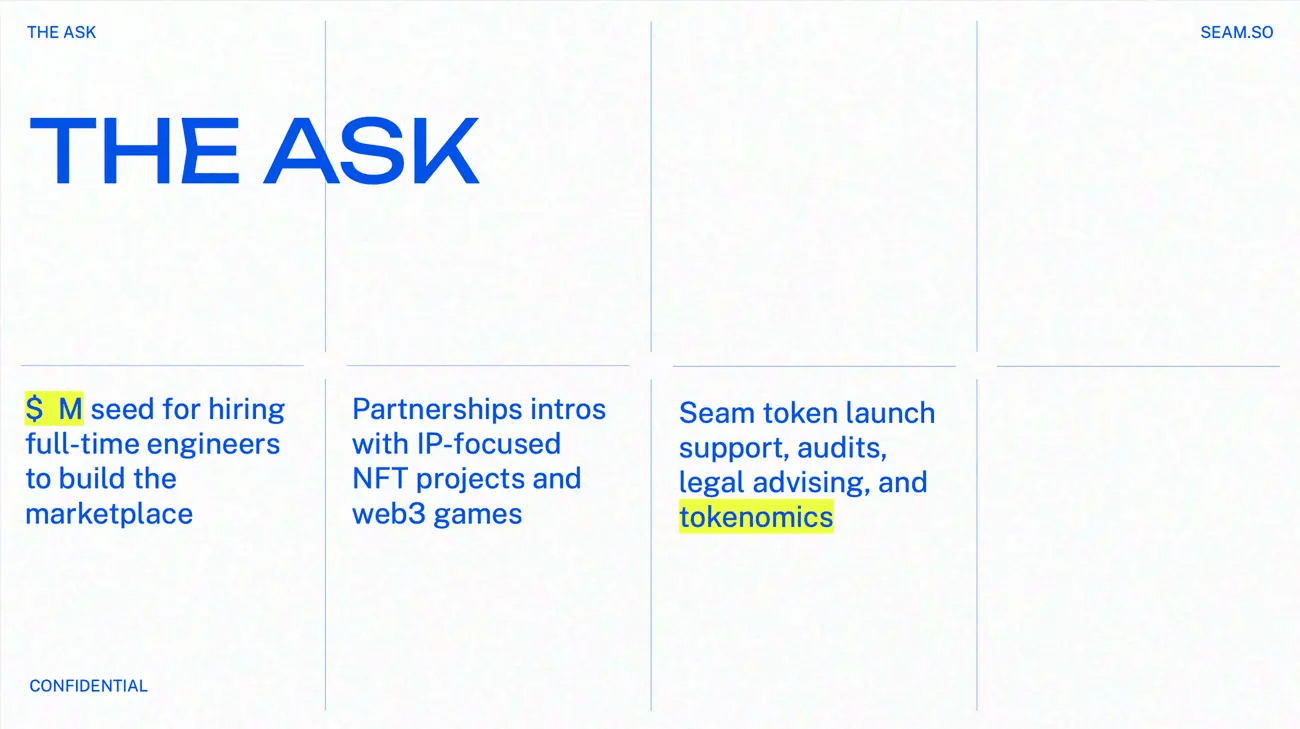
Seam.so's slide is titled "The Ask" and reframes the concept entirely. Instead of one ask, there are three columns: a financial ask (capital for full-time engineers to build the marketplace), a strategic ask (partnership intros with IP-focused NFT projects and web3 games), and an operational ask (token launch support, audits, legal, tokenomics).
Why this works: In web3 fundraising, the right investors bring more than capital. Seam.so is raising from people who can unlock specific ecosystems, and the slide makes that explicit. The signal: we know what you are worth beyond the check.
The format also demonstrates sophisticated fundraising thinking. Founders who can articulate what they need from investors strategically, not just financially, build better investor relationships.
The design choice: Clean white grid layout, high-contrast heading, three-column structure. Equal visual weight for financial and non-financial asks, reinforcing that both matter.
What to borrow: If your investors bring strategic value that is genuinely important (network, partnerships, technical credibility) make that explicit. It differentiates your raise and shows you have thought about fit, not just capital.
Hype - Series A, $10M: The Visual-First Allocation
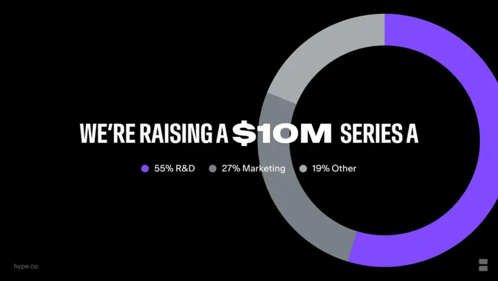
Hype's slide leads with the headline in bold all-caps, unmissable, and uses a large donut chart to communicate allocation at a glance: 55% R&D, 27% Marketing, 19% Other.
Why this works (and where it could be stronger): At Series A, the assumption is that product-market fit is established. The R&D-heavy allocation sends a clear signal: scaling the product, not the brand. That is the right message for this stage, and it lands fast visually.
The donut earns its place because the split is large enough to read clearly. 55/27/19 is immediately legible in a way that similar-sized slices would not be.
The weakness: "19% Other" is the one vague element on an otherwise confident slide. At Series A, investors have enough sophistication to notice it and wonder what it covers. A more specific third category (G&A, reserve, partnerships) would close the gap.
What to borrow: Donut charts work when your category split is significant and your labels are meaningful. Pair them with a strong headline and keep legends minimal. If you have a catch-all category, name it more specifically. "Other" tends to undermine an otherwise clean slide.
These four examples show there is no single right format. What they share is intentionality: each slide reflects a deliberate choice about what the investor needs to understand, and how fast. For more on how stage shapes structure, see our pre-seed pitch deck examples.
What Are the Most Common Mistakes on a Pitch Deck Use of Funds Slide?
The mistakes cluster around one root: treating the slide as a budget rather than a business argument.
Vague category labels. "Sales," "Marketing," "Operations" with no detail on what actually happens. Pitch Guide's 2024 analysis points the same way: specificity is the difference. "$200,000 to hire a head of sales and two agents by Q4, focused on our five target accounts" beats "20% for sales" in most cases.
No milestone connection. The spend is listed, but there is no answer to "so what?" Categories without outcomes make the ask feel arbitrary.
Wrong stage logic. Heavy brand spend before product-market fit. Large team buildout before repeatable sales. A well-built slide shows you understand what needs to happen first.
Too much visual complexity. DocSend's 2023 year-end data clocked average investor time per deck at 2 minutes 24 seconds, an all-time low. An ornate chart does not signal sophistication. It signals you made the investor work harder than needed.
Disconnection from the rest of the deck. The slide should echo your problem and solution narrative, reinforce your market size argument, and justify your ask. When those threads are loose, the story frays.
The equal 33/33/33 split. Three categories at exactly a third signals no real prioritisation. 35/32/33 reads as considered. 33/33/33 reads as a placeholder no one stress-tested.
Unexplained or generous founder salary. A $200K+ founder salary on a $1.5M seed is a quiet red flag. It raises a question about how you weigh personal runway against company runway. If genuinely justified (dependents, taking a 50% pay cut from market) say so explicitly.
Asking a vague range. "$500K to $1M" sounds flexible. It reads as undecided. A committed number with a clear "what we can do at the minimum / at the full raise" framing beats a soft range.
An oddly precise number. "$734,500" looks reverse-engineered. Round to a defensible figure ($750K, $1M, $2.5M) unless there is a structural reason for the odd number (tranche threshold, regulatory minimum). Precision without rationale undermines credibility.
When Should You Leave the Use of Funds Slide Out of Your Deck?
Some founders, particularly those sharing decks via cold outreach, omit it from the distributed version. The logic is sound: a detailed breakdown exposes your operational plan and can date badly if priorities shift before the round closes.
Most experienced operators land on two versions. A leaner deck for broad distribution that folds use of funds into the ask slide as a brief summary. A fuller version for live meetings and diligence.
What you should not do is skip the thinking. Investors will ask. The answer needs to be ready, specific, and defensible.
VCWire's mid-2024 analysis of DocSend data tracked pitch deck interactions up 19.2% year over year. More decks in circulation. The bar for financial clarity keeps rising. Founders who treat this slide as a checkbox are competing against founders who treat it as a strategic argument. That gap shows up in conversations, and eventually in term sheets.
The founders who close rounds are not always the ones with the most traction or polish. They are the ones who have thought carefully about what they are asking for, why they need it now, and what it will get them. Done well, it can answer all three quickly.
If you are preparing for a raise and not sure your deck is telling the right story, we are happy to talk it through.
FAQ
Is a use of funds slide always necessary in a pitch deck?
Not strictly. Some founders omit it from cold-outreach versions and bring the detail into live meetings. What you cannot skip is the underlying thinking. Investors will ask where the money goes, and the answer needs to be specific, defensible, and consistent with the rest of the deck.
Where in the deck should the use of funds slide go?
Near the end, alongside or immediately after the ask slide. By that point the investor has seen the problem, solution, market, and traction. Placing it earlier tends to feel premature.
How much detail should a use of funds slide have?
Enough to be specific, not so much that it becomes a spreadsheet. Three to five categories, each with a dollar amount, a percentage, and a milestone, is usually the right density. Save deeper detail (monthly burn, hire-by-hire breakdowns) for the financial model and diligence. For help calibrating, see our pitch deck design service.
What is a good use of funds breakdown by percentage?
It depends on sector and stage. AI and deep tech often lead with compute and senior technical hires. Biotech leans on trials and regulatory. Fintech weights compliance and licensing. Consumer focuses on demand testing and performance marketing. The percentages matter less than whether the allocation matches what your sector's investors expect, and whether every line ties to a milestone. See the sector allocation section above.
How many months of runway should a use of funds slide cover?
The common target is 18 to 24 months. The better framing is "runway to the milestone that de-risks the next round," not months in isolation. A round that buys 18 months and gets you to default-alive or a meaningful valuation step-up is stronger than one that buys 24 months and ends where you started.
What are the most common use of funds slide mistakes?
The recurring ones: vague category labels, no milestone connection, wrong stage logic, equal splits that signal no prioritisation, unexplained founder salaries, vague ranges, and oddly precise figures that look reverse-engineered. See the common mistakes section for the full list.
Should you include your valuation on the use of funds slide?
Generally, no. Valuation is negotiated in person, and most modern decks leave it off entirely. Putting a number on the deck anchors the conversation in the wrong place and can filter out investors who would have engaged at a different price. If interested, they will ask.
What It's Like To Work With Us
reviews

867 BOYLSTON ST
BOSTON, MA 02116


